Lab 9: Geospatial visualizations
In this lab, we will:
- Learn how to embed a Mapbox map into a webpage
- Learn to add data-driven layers within a Mapbox canvas.
- Learn to add custom SVG overlays on Mapbox maps and adapt to the map’s panning and zooming
- Practice creating visualizations with large datasets of real-world data, by importing, parsing, filtering and binding to elements on the page.
Table of contents
- Check-off
- Lab 9 Rubric
- Lab Session
- What will we make?
- Step 0: Start a new Svelte project
- Step 1: My first map
- Step 2: Adding bike lanes
- Step 3: Adding bike stations
- Step 4: Visualizing station demand
- Step 5: Interactive data filtering
- Step 6: Visualizing traffic flow
- Step 7: Adding isochrones
- Step 8: Add your new project to your list of projects!
Check-off
To receive a lab checkoff, please submit your work asynchronously by filling out this form. TAs will review your lab and post your grade. If you do not pass, you will be able to fix any issues and resubmit or receive help in an office hour until the deadline.
Lab 9 Rubric
To successfully complete this lab check-off, ensure your work meets all of the following requirements:
General
- Your implementation of this lab is a project accessible from your portfolio webpage.
Map
- Upon loading the page, the map loads and is centerd around the Cambridge area.
- Bikelanes in Boston and Cambridge are visible and not too prominent.
- Both sets of bikelanes are added as Mapbox layers to the map.
- BlueBike stations are all visible and fetched using
d3.csv() - The stations move when panning through the map
- Size of station markers is determined by a squareroot scale and visualize the total demand of the station.\
Slider-based Filter
- Filter moves all the way from left to right
- When there’s no filtering there is an appropriate text and when filtering is on, the time of day is shown.
- When changing the filter slider, the size of the station markers changes according to the total demand/traffic at that time.
- When changing the filter slider, the color of the station markers changes according to the total positive or negative demand at a given time and station.
- Filtering is smooth rather than slow and in fits.
Legend
- The colors of the legend match the colors of the station markers depending on their total demand/traffic.
- Styling has been applied to the legend.
Isochrones
- Users can select a station which dims all the others (or applies some sort of highlighting to the selected station).
- The isochrones for that station load upon click
- Filtering, marker size/color is not affected while a station is selected
Lab Session
This week is a bit different. After we introduce the lab and core concepts, rather than a lab work session, we will have a GIS workshop in Google Colab, in which we will learn how to display all tax parcels within a radius of an MBTA stop using census data. We are releasing the first two steps of the lab early so you can prepare for the in-person lab workshop on Thursday 3-4 PM in 45-102 (regular lab hours). The reminder of the lab, the rubric, and the check-off form will be posted on Thursday as usual.
This lab is focusing on teaching you the necessary skills to start working with geospatial data which, for housing, is indispensable. The slides will quickly touch on this lab’s content, but then present a workshop in how to prepare your GeoData effectively for use with your interactive data visualization on the web.
💥 Workshop preparation
If you plan to attend the lab in-person and want to follow along on your own machine, please get yourself set-up for the hands-on workshop. To do so, you will need the following:
- Make sure you can access a Google account and Google Colab.
- Complete Steps 0 & 1 below on your computer before the lab.
Slides
Please find the slides here and the companion Google Colab workbook, along with solutions (Colab and Svelte files) here.
What will we make?
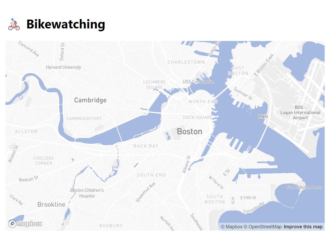
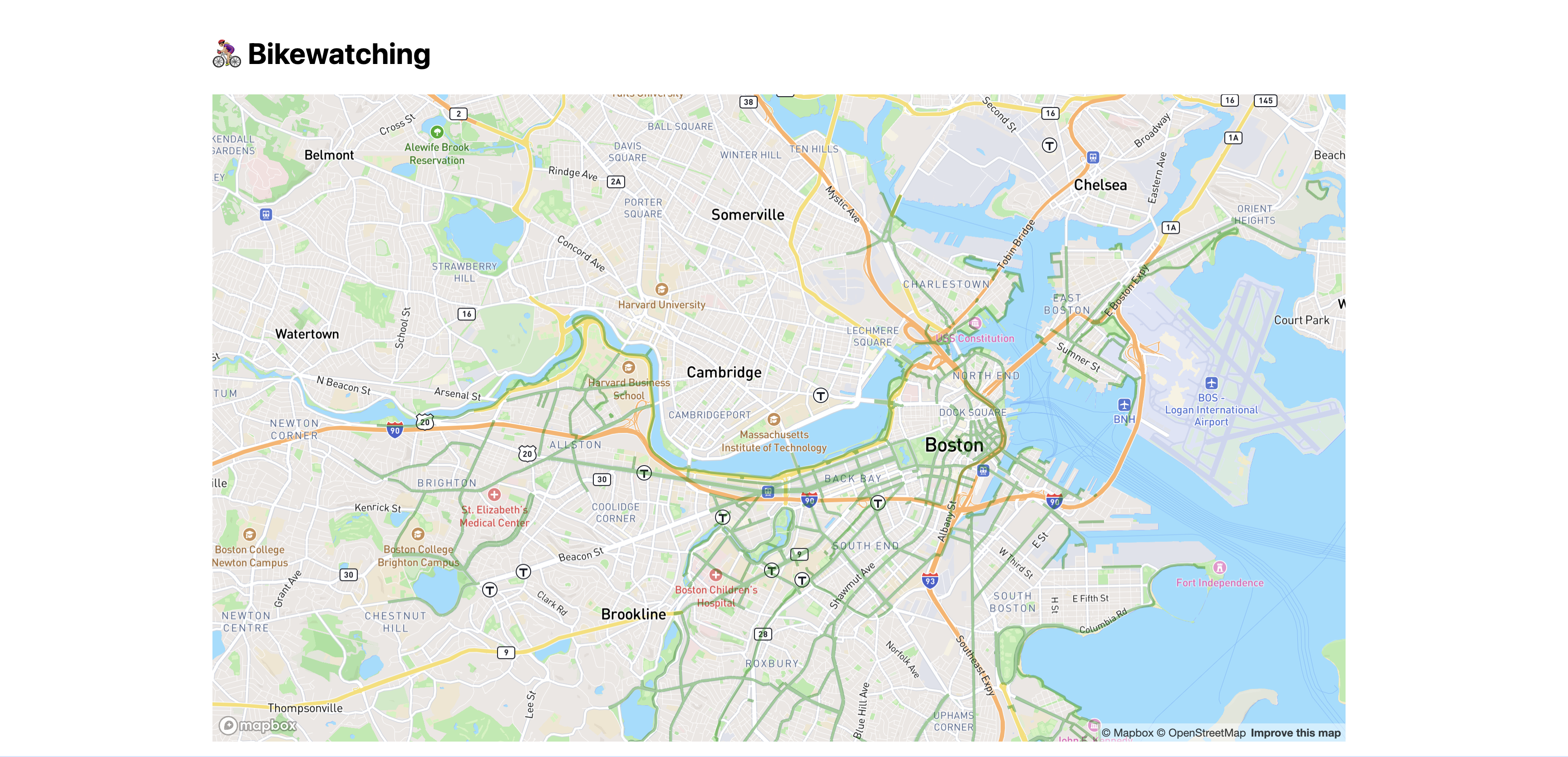
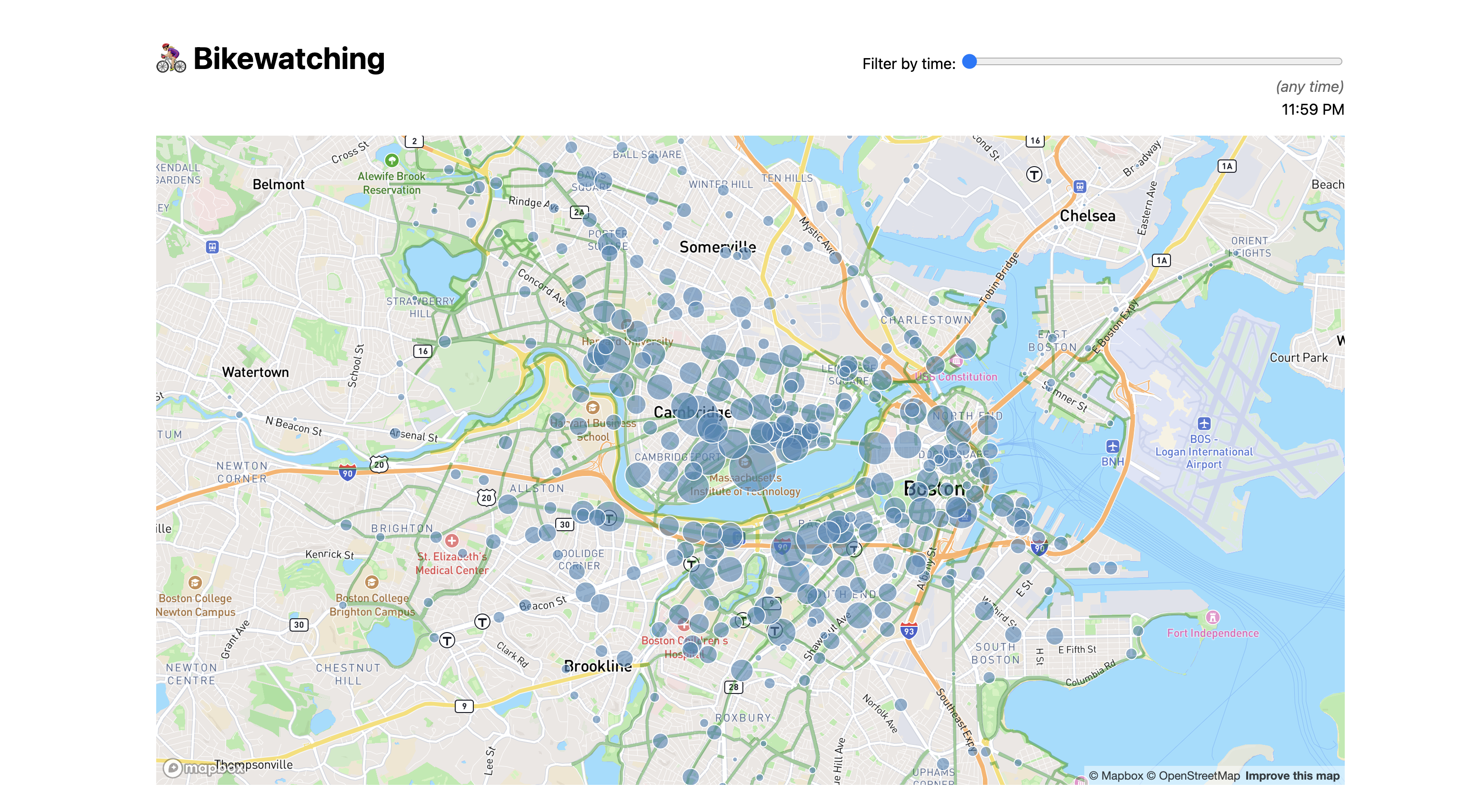
In this lab, we will be building an immersive, interactive map visualization of bike traffic in the Boston area during different times of the day. If you follow the workshop, you’ll also learn how to visualize big data easily. You can find a sample of both here and of the bike traffic app in the screencast below:
- The underlying map shows Boston area roads and labels of neighborhoods. You can pan and zoom around as you would with services like Google Maps.
- The green lines show bike lanes. We will be importing two datasets from the city governments of Boston and Cambridge for this.
- The circles represent individual BlueBike stations. The size of each circle represents the amount of traffic at each station, while the color represents whether most traffic is entering or leaving the station. We will be using two datasets from BlueBikes to analyze bike traffic from about 260,000 individual rides from March 2024.
- There is a slider at the top right that allows the user to filter the data for traffic at specific times of the day, and the circles will change size and color accordingly.
- Clicking on one of the stations allows you to view the 5, 10, 15, and 20 minute isochrones (iso means “equal” and chrones mean “time”, but more to that later).
There is a lot of room for styling and customization in this lab, and you are free to choose colors and themes that you prefer. So the screenshots and videos here are for reference only and your version can differ in appearance (but should be functionally the same!).
Step 0: Start a new Svelte project
Step 0.1: Create a new repository and push it to GitHub
TL;DR: Make sure your repo is private before you push your access token to GitHub! We will be adding your Mapbox API key to the code. In general, we try to avoid committing API keys or other secrets to your code since they’ll stay in your git history forever and can be exploited if exposed. In a production setting, we would instead of hardcoding secrets, opt for setting them as environment variables. This is standard practice in professional workflows, often managed through CI/CD tools like GitHub Actions. However, this is beyond the scope of this class. Still curious? Check out how GitHub actions handle secrets (optional reading).
In this lab, we will be working on a new project and thus a new repository (that we will subsequently list on our projects page). Follow the steps in the Appendix of lab 3 again to set up a new Svelte project from scratch. If you prefer to repeat the process using the template in step 1 of the same lab, do so and remove all the folders in src/routes so you’re left with only one home top-level +page.svelte. Use a new repo name this time. I called mine bikewatching, but you may want to get more creative with bike-related puns. 😉
Step 0.2: Publish your new project to GitHub Pages
Also follow step 3 from the same lab to set up GitHub Pages for your new project.
Step 0.3: Start local server
Run npm run dev --open to start the local server and open the project in your browser.
Step 0.4: Edit src/routes/+page.svelte
Replace the content of src/routes/+page.svelte with a heading of your project name and a brief description of what it does. Commit and push the change, and make sure the website updates accordingly.
Step 0.5: Add basic styling
Create a CSS file for global styles in src/lib called global.css and add the following content:
body {
	font: 100%/1.5 system-ui, sans-serif;
	display: flex;
	flex-flow: column;
	max-width: 80em;
	min-height: 100vh;
	box-sizing: border-box;
	margin: auto;
	padding: 1em;
}
Then, in your src/routes/+page.svelte file, import the CSS file by adding this in a <style> element:
@import url("$lib/global.css");
At this point, you should be seeing something like this:

Step 0.6: Add a bike favicon (optional)
To distinguish open tabs from your project, you can customize its favicon.
In your static directory, add a favicon.svg file with the following content:
<svg xmlns="http://www.w3.org/2000/svg" viewBox="0 0 100 100">
<text y=".9em" font-size="90">🚴🏼♀️</text>
</svg>
Feel free to use any emoji you want. Then edit src/app.html to change favicon.png to favicon.svg here:
<link rel="icon" href="%sveltekit.assets%/favicon.png" />
You may also want to add a <title> with your project title, as a fallback for pages that don’t specify one.
It should look like this: 
You can now delete static/favicon.png if you want to keep things tidy, since we’re not using it anymore and its just the standard Svelte logo.
Step 1: My first map
Step 1.0: Create a Mapbox account
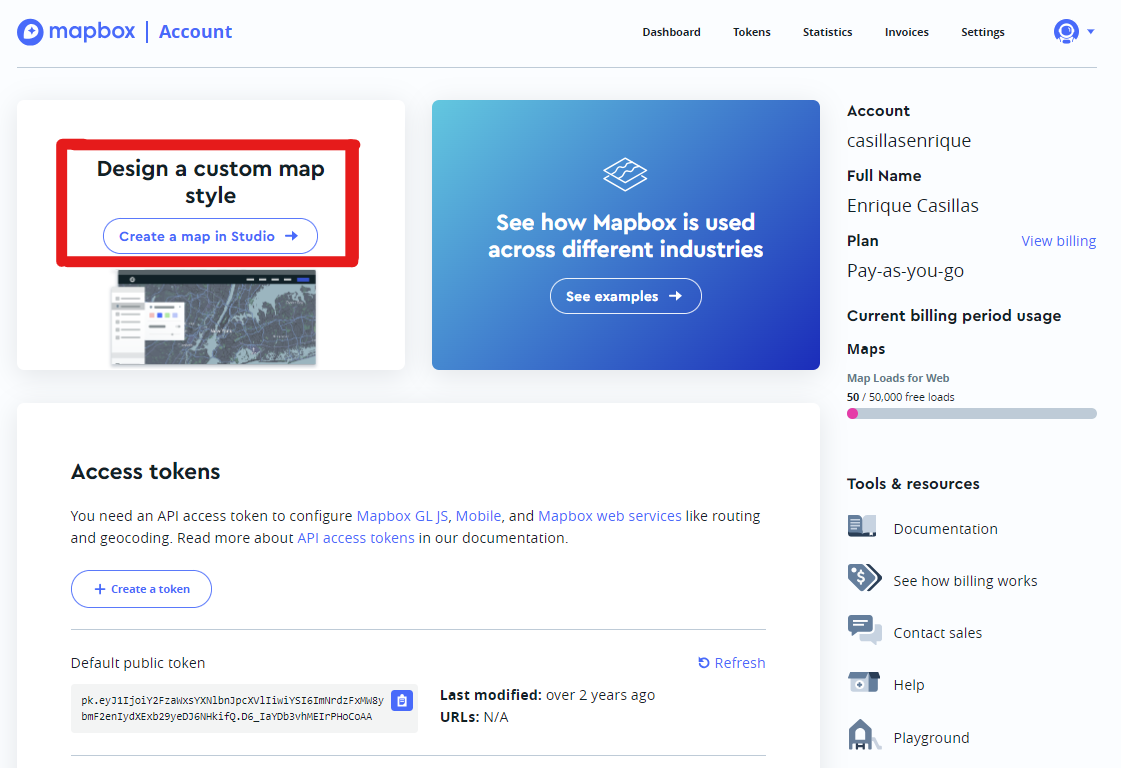
Go here to get to the signup page of Mapbox and create an account using your MIT email for their education program. We will be using the free service tier which carries no charge. To make sure that you won’t have to add any credit card information please select as account type Business - for your work, school or organization, verify your email, and, if prompted, use 77 Massachusetts Avenue as your company’s (MIT) address.
Still, if for some reason Mapbox pompts you for billing information, please rest assured, that this lab stays well within the frie usage limits. However, if you cannot or do not feel comfortable sharing your billing information with Mapbox, please inform one of the course staff members via the course staff email.
Step 1.1: Install Mapbox.js
In your project directory, run the following command to install the Mapbox.js library:
npm install mapbox-gl@3.20.0
Step 1.2: Add an element to hold the map
We will largely follow the steps outlined in Mapbox’s official docs about Svelte integration.
Let’s create an element to receive our map and bind it to a variable (we’ll need to reference that when we tell Mapbox to create a map there):
<div id="map" />
We also want to add some CSS to ensure the map will have sufficient height:
#map {
	flex: 1;
}
Try giving the map a background color to make sure it’s taking up the space you expect:
Step 1.3: Import Mapbox and connect it to our account
In order to use Mapbox, we first need to import its JS and CSS. In your src/routes/+page.svelte file, inside your <script> tag, add this:
import mapboxgl from "mapbox-gl";
import "../../node_modules/mapbox-gl/dist/mapbox-gl.css";
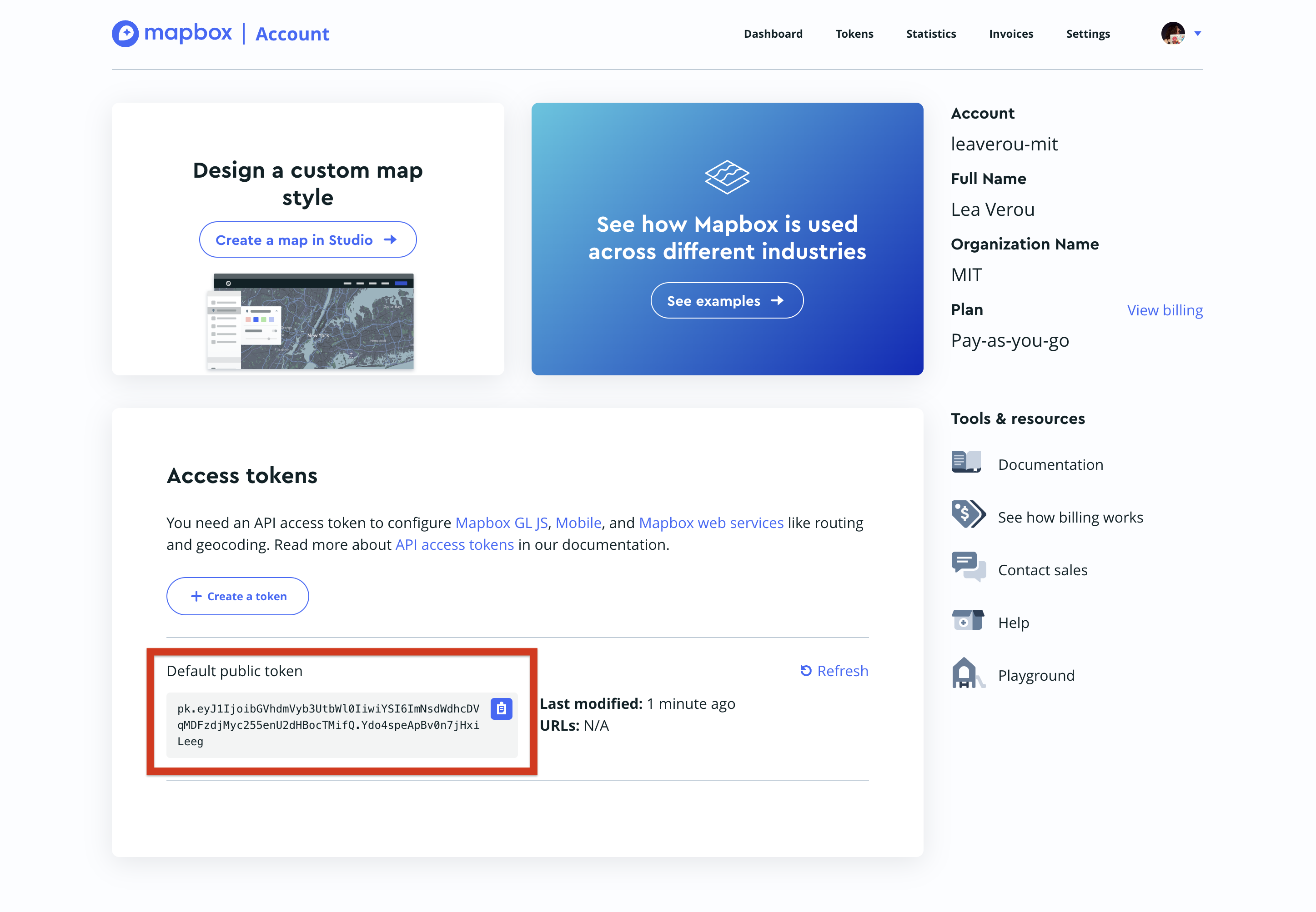
Then, we need to connect our account to it, by setting up our access token:
mapboxgl.accessToken = "your access token here";
After having completed Step 1.0 above, you should be able to find your access token on your Mapbox’s account page:
Step 1.4: Create the map
To create the map, we create a new mapboxgl.Map object with settings that specify things like:
- which HTML element will hold the map? (
container) This can be either an element reference, or a string with the element’s ID (which is what we will use) - What will the basemap look like? (
style) - Map extent:
- What latitude and longitude will the map be centered on? (
center: [longitude, latitude]) - How zoomed in will the map start off and what will be the min & max zoom allowed? (
zoom,minZoom,maxZoom)
- What latitude and longitude will the map be centered on? (
We want to do that only in the browser, so we will use the onMount lifecycle function, which we need to import separately from svelte:
import { onMount } from "svelte";

onMount(() => {
	let map = new mapboxgl.Map({
		/* options */
	});
})
In terms of what values to apply to options:
- For the
containerkey, we want to specify an id so we don’t have to worry about element references ("map"in our case). - For the style, I used
"mapbox://styles/mapbox/streets-v12"but you are welcome to choose any other style you like. Keep in mind that the busier the style, the harder it will be to see your data drawn on top of it. - For the initial map representation:
- I used
12for thezoomattribute - You can then also specify a centerpoint within the Cambridge / Boston area through the
centerkey. See below for how to find the latitude and longitude of any location using Google maps.
- I used
To find the coordinates of a location, you can enter it on Google Maps, and then right click and select the first option:
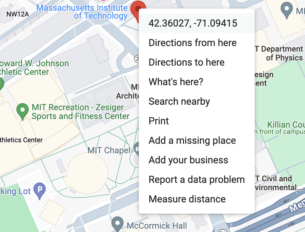
Another way is via the URL, it’s the part after the @: 
Note that you will need to specify them in the reverse order, as Mapbox expects longitude first.
If everything went well, you should have a map of Boston already! 🎉
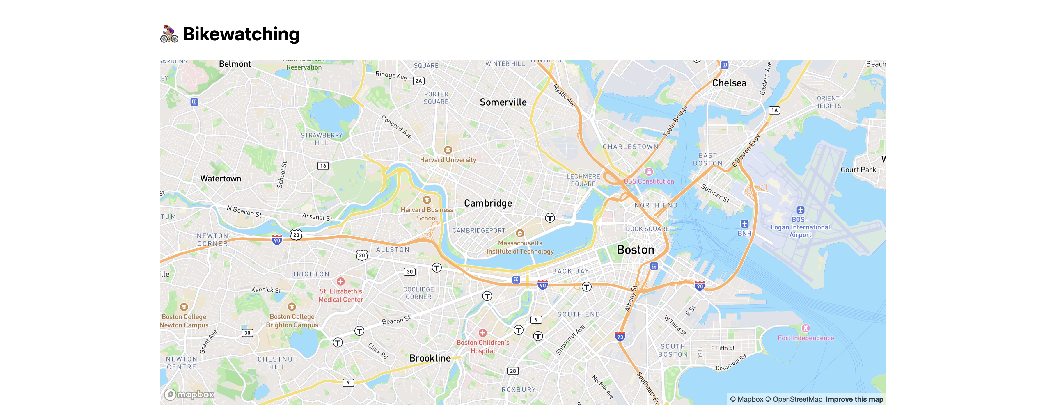
Try panning and zooming around to see the map in action.
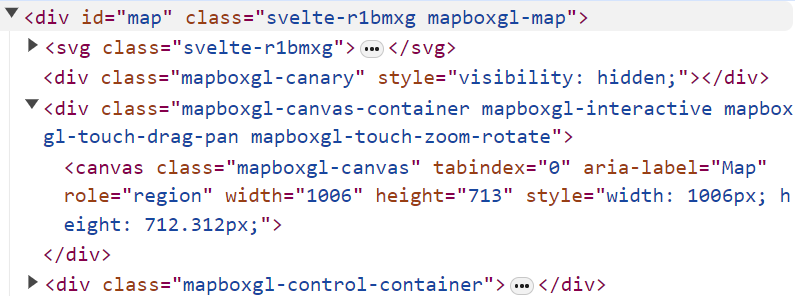
Right click your map element and inspect it using the dev tools. Notice how Mapbox has added a bunch of elements to the DOM to render the map, including a <canvas> element that it uses to draw the map.
Don’t like how your map looks? Try the optional step below!
Step 1.5: Customizing the map (optional)
The map style in its current form is quite functional as it shows a lot of useful waypoints and detail. However, sometimes we’d like to create a more stylized map to create a cohesive design language across our website, or simply to draw readers in with a unique design.
Luckily, Mapbox provides a way to fully customize your map style using Mapbox Studio. To access Mapbox Studio, go back to your Mapbox account page and click “Create a map in Studio”.
Next, create a new style.
From here, you are free to create a style however you’d like! As a starting point, many high quality map visualizations end up using a monochrome style, which you can find by clicking on “Classic template”, then “Monochrome”. Once you’ve selected a variant from the list of styles, click on the “Customize” buttom to add further customization, which will open up the actual studio, shown below.
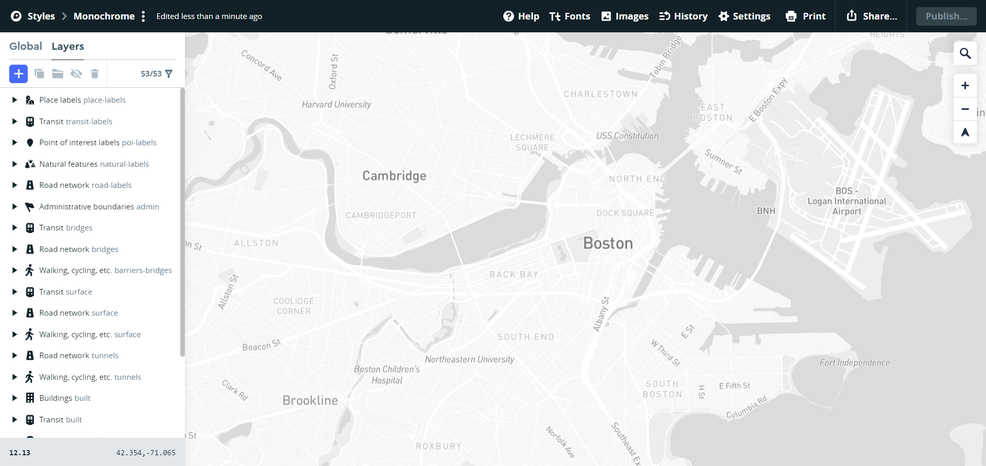
Mapbox styles are made up of layers and components (e.g. natural features, streets, points of interest, transit nodes, etc.). These items have properties which can be edited, such as the color or font, and can even be removed for a cleaner look. For example, if you wanted to make the color of the bodies of water a more natural blue color in this monochrome example, you could click on the “Land & water water” layer in the left panel and simply adjust the color in the color picker.
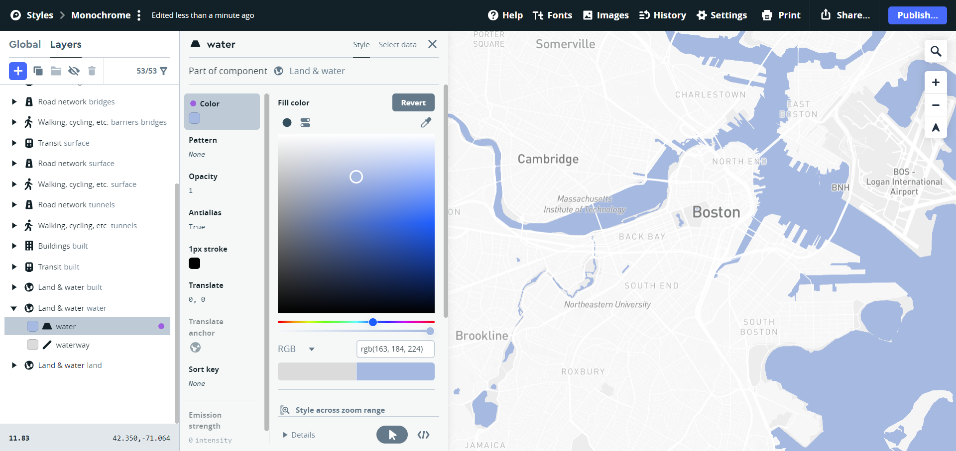
Once you are done playing around with the style, you can publish it so that it can be referenced in your code where you define the map, as you did in Step 1.4. To do so, click “Publish” in the top right corner of the studio interface:

Then, click on the three dots next to your style name to find the style URL (it will look something like this: mapbox://styles/casillasenrique/clukyyerk007v01pb6r107k1o).
Copy it and paste this URL in your style property when defining the mapboxgl.Map object. You should now see that your map uses your custom style!
Now, each time you edit your map style in Mapbox Studio and re-publish it, the updated style will automatically be applied in your website (note that sometimes the style takes a couple of minutes to update after publishing). If for some reason it’s not loading, try to access your page in incognito mode, clear your cache, or repeat the above steps in the exact order (if you call the style URL before publishing, your browser will associate in its cache the default map with that style URL).
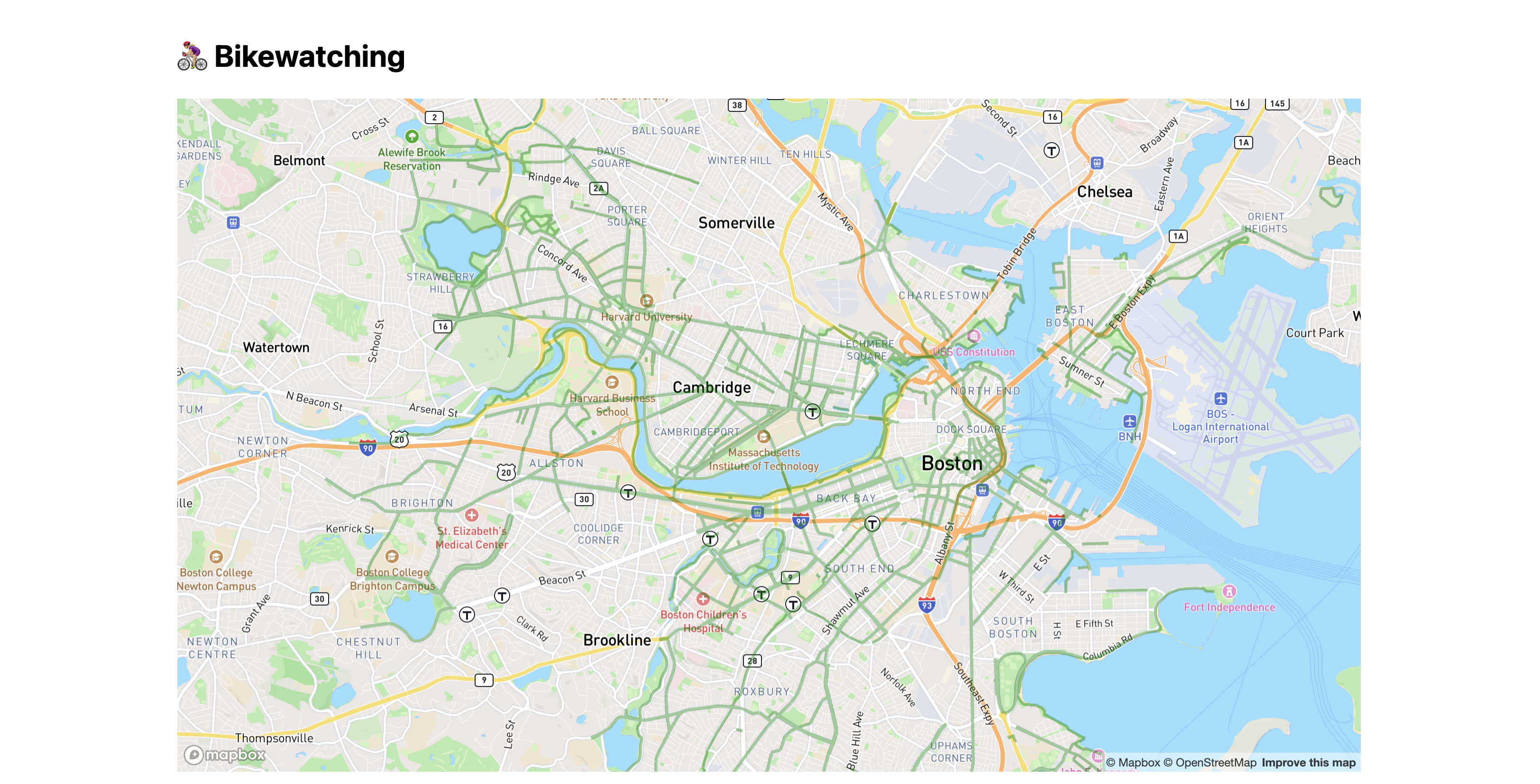
Step 2: Adding bike lanes
Step 2.0: Getting familiar with the data
The City of Boston provides an open dataset with bike lanes in the city. The dataset is in GeoJSON format, which is just JSON that follows a specific structure, designed to represent geographical data.
Download the dataset, open it in VS Code, and examine its structure.
Try pressing Cmd + Shift + P to open the command palette, and then select “Format document” to make the JSON more readable.
Step 2.1: Import the data
Mapbox provides an addSource function to connect the map with an external data source. However, to use any of that, we first need to wait for the map to be loaded itself and for its "load" event to fire. Usually, we try to avoid nesting all of our logic into one big onMount call. Thus, let’s create an async function and put everything we have so far in our onMount call there (a little hint, it starts with async function functionName() {...}). Once it contains everything that is in onMount so far, let’s then add this snippet after the map creation:
await new Promise(resolve => map.on("load", resolve));
This way, we ensure that the execution is “blocked” until the map is all loaded up and ready to receive further instructions. After that, we can add the source:
map.addSource("boston_route", {
    type: "geojson",
    data: "https://bostonopendata-boston.opendata.arcgis.com/datasets/boston::existing-bike-network-2022.geojson?outSR=%7B%22latestWkid%22%3A3857%2C%22wkid%22%3A102100%7D",
});
Now, simply call this async function (that you have just defined) in onMount. If you want a sneak-peek on how I did it, here you go:
map initialization
async function initMap() {
    // We assign a value to the `map` variable here
    // but the variable should be defined outside the
    // scope of this function
    map = new mapboxgl.Map({
        container: 'map',
        center: [-71.09415, 42.36027],
        zoom: 12,
        style: "mapbox://styles/mapbox/streets-v12",
    });
    await new Promise(resolve => map.on("load", resolve));
    map.addSource("boston_route", {
        type: "geojson",
        data: "https://bostonopendata-boston.opendata.arcgis.com/datasets/boston::existing-bike-network-2022.geojson?outSR=%7B%22latestWkid%22%3A3857%2C%22wkid%22%3A102100%7D",
    });
}

onMount(() => {
    initMap();
});
What is boston_route? It’s just a name we made up to refer to this data source. You can name it anything you want, but it should be unique to this source.
This won’t produce much of a visible result. To actually see something, we need to actually use the data to draw something.
Step 2.2: Drawing bike lanes on the map
One way to add something to our map is to use the map.addLayer() method to add a layer to our map that visualizes the data source.
The code will look like this:
map.addLayer({
    id: "SOME_ID", // A name for our layer (up to you)
    type: "line", // one of the supported layer types, e.g. line, circle, etc.
    source: "boston_route", // The id we specified in `addSource()`
    paint: {
        // paint params, e.g. colors, thickness, etc.
    },
});
You should experiment with the different types of layers and paint properties to see what you can come up with, but chances are you’ll settle on "line", to draw a network of bike routes as lines.
Without any painting properties (i.e. an empty paint object), your map will look like this: 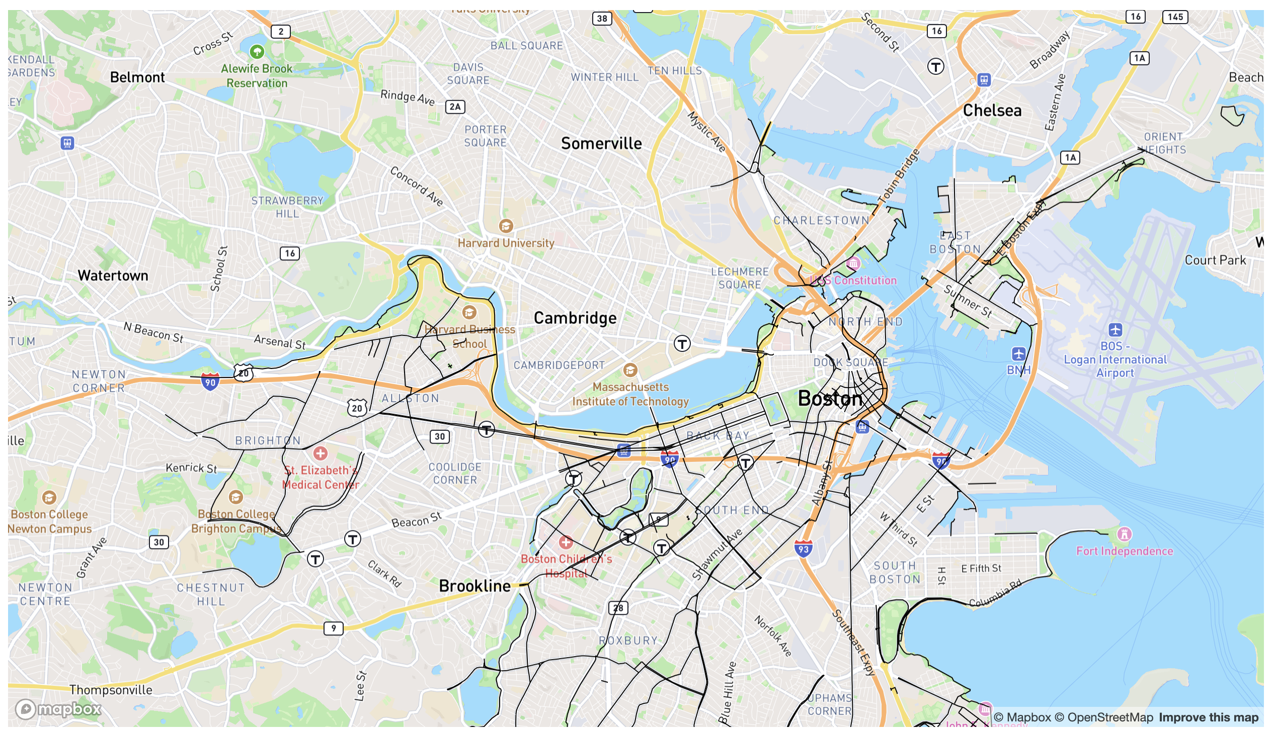 .
.
Step 2.3: Styling the bike lanes
You should look at the reference to see what you can do with the paint property, but chances are you will need at least the following:
line-colorto set the color of the lines (see caveat below)line-widthto make the lines thicker (default is1)line-opacityto make the lines translucent (0 is fully transparent, 1 is fully opaque). This is recommended so that the lines blend in to the rest of the map smoothly instead of obscuring it.
Mapbox does not yet understand newer color formats like oklch(). You can see the docs on what it accepts, but at the time of writing it’s basically named colors (e.g. green), hex codes (e.g. #32D400), hsl() and rgb(). You can convert any valid CSS color to the closest rgb() or hsl() equivalent using this tool. If it shows two versions, you want the one marked “gamut mapped”.
Since these are properties in a JS object, and they contain hyphens, we need to wrap them in quotes, e.g. "line-color": "green", not line-color: "green".
The exact styling is up to you. I went with a translucent green (40% opacity), and a line width of 3, which looked like this:
Step 2.4: Adding Cambridge bike lanes
Notice that our map right now only shows bike lanes from Boston. What about the numerous Cambridge ones?!
Fortunately, the City of Cambridge also provides bike lane data as a GeoJSON file.
Follow a similar process as steps 2.0 - 2.3 to visualize Cambridge bike lanes as well. It should look like this:
At this point, you have likely ended up specifying your line styles twice: one in the Boston layer, and one in the Cambridge layer. This means that if we want to tweak them, we need to do it as many times as our layers. A good idea at this point (but entirely optional) is to specify the styling as a separate object that you reference in both places.
Step 3: Adding bike stations
As you probably know, Bluebikes is a bicycle sharing program in the Boston area. They make many datasets publicly available, including real-time and historical data. The first Bluebikes dataset we will use in this lab is station information, which is a JSON file with names, IDs and coordinates (among other info) for each station.
We have made a copy of this data in https://vis-society.github.io/labs/9/data/bluebikes-stations.csv. This is a CSV file where every row has the following properties:
Number: a code like “L32001”NAME: the station’s name, like “Railroad Lot and Minuteman Bikeway”Lat: the station’s latitude, e.g. 42.41606457Long: the station’s longitude, e.g. -71.15336637Seasonal Status: whether the station is seasonal or not with statuses like “Year Round”, “Winter storage” etc.Municipality: e.g. “Cambridge”, “Arligton”, etc.Total Docks: the number of docks at the station as a number, e.g. 11
We will be using the latitude and longitude data to add markers to our map for each station.
While we could use Mapbox’s addSource() and addLayer() functions to plot the stations as another layer on the map canvas (like we just did with bike lanes), we will try a different approach here so we can learn how to combine the two visualization methods we have already learned: Mapbox and D3. We will be adding an SVG layer on top of our map to hold the station markers, and use D3 to fetch and parse the data, and to draw the markers.
Step 3.1: Fetching and parsing the CSV
Install d3 as we have done before:
npm install d3
Then, in your src/routes/+page.svelte file, import d3 and fetch the CSV file using d3.csv(), as we did in lab 6 and lab 7. You don’t need to download this file and include in your project, you can just fetch it directly from that URL. Let’s call the variable that will hold the station data stations. Optimally, you do that fetching in a separate async function which you call before or after initializing the map, to keep with the modular paradigm.
Make sure that the data is being fetched correctly by logging it to the console. That way you can also explore its structure.
Step 3.2: Overlaying SVG on the map
We will start by appending an <svg> element on our map container:
<div id="map">
    <svg></svg>
</div>
If you preview your app right now, you won’t see anything different. However, if you right click on the map, you should be able to see the <svg> element we just inserted in the dev tools:
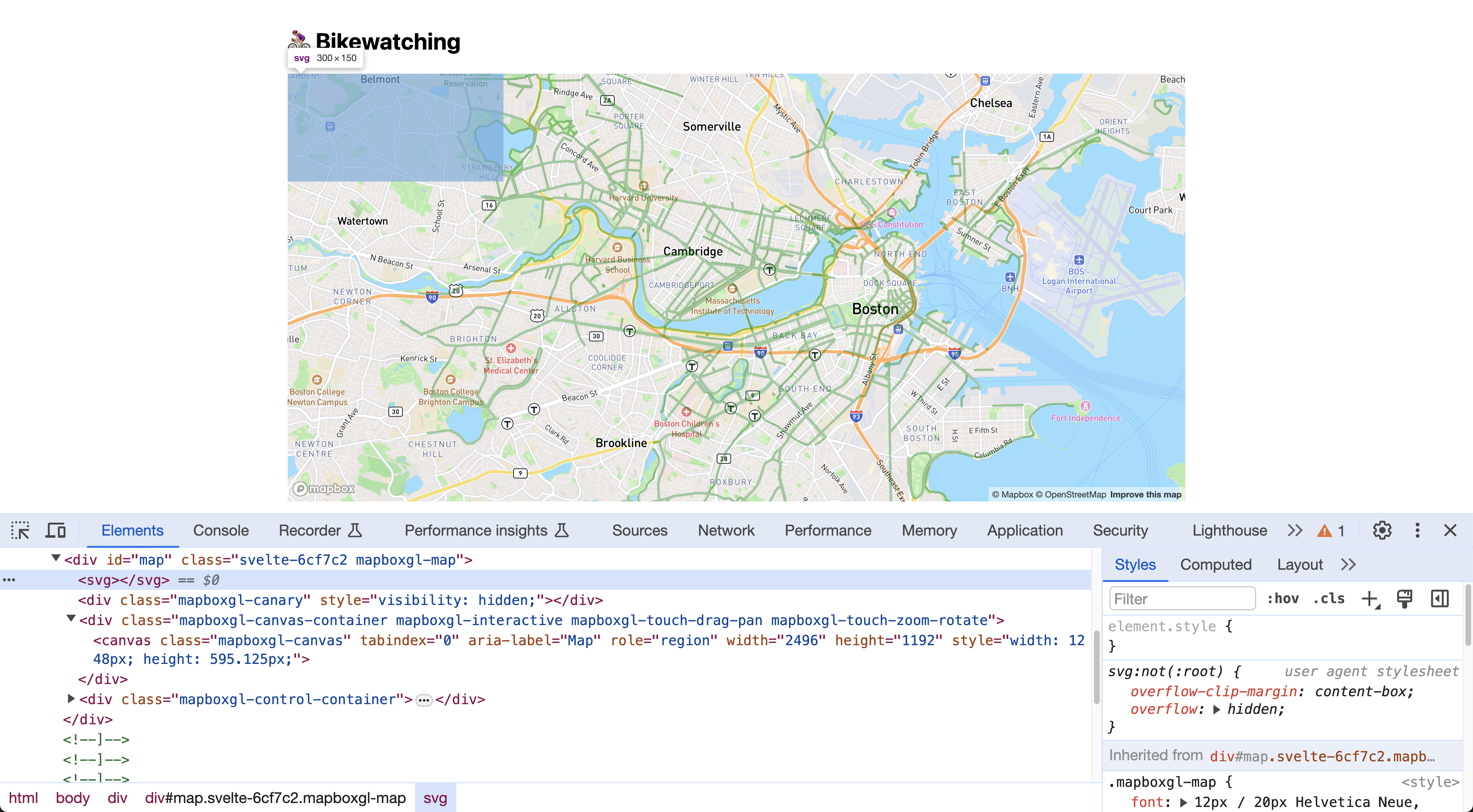
However, it doesn’t have the right size: it’s just a small rectangle in the top left corner. Worse yet, it’s actually rendered under the map, which becomes obvious if we give it a background color (placed below #map):
#map svg {
    background: yellow;
    opacity: 50%;
}
Let’s fix all of that, by applying the following declarations:
position: absoluteandz-index: 1so we can position it on top of the map (z-indexdoes not work without positioning)width: 100%andheight: 100%to make it fill the map containerpointer-events: noneso that we can still pan and move the map
Make sure you’re now seeing something like this:
And then remove the background and opacity declarations — they were only there as debugging aids, we don’t need them for the actual visualization.
Step 3.3: Adding station markers
This step is similar to making the scatterplot in the previous lab: we just need to append a bunch of circles to the SVG element, each representing a station.
The only tricky part here is positioning them so that they line up with the map. Fortunately, Mapbox has a great built-in function map.project(), which takes longitude and latitude values and returns the relative map coordinates in pixels.
Why not just use D3 scales for this? map.project() takes into account many things: panning, zooming, even rotation. It’s certainly possible to calculate this manually, but it’s non-trivial.
First, if you haven’t done that already, we need to move some variables inside the onMount() callback and the async functions to the document level so that they are visible and accessible to the HTML template too (i.e. change their scope). So instead of doing this:
async function myFunction () {
    let foo =  /* calculate foo */
}

onMount(async () => {
    let bar = /* calculate bar */
});
We now want to do this:
let foo;
let bar;

async function myFunction () {
    foo =  /* calculate foo */
    // you can use bar here too now!
}

onMount(async () => {
    bar = /* calculate bar */
    // you can use foo here too now!
});
We need to do this for both stations (so we can loop over them in the HTML template), and map (so we can use map.project() to calculate coordinates). Initialize stations to [] so that you don’t get an error before the data is fetched.
Now let’s define a helper function to return the circle center from latitude and longitude for every station:
function getCoords (station) {
    let point = new mapboxgl.LngLat(+station.Long, +station.Lat);
    let {x, y} = map.project(point);
    return {cx: x, cy: y};
}
In our template, we add an {#each} block to loop over the stations and append an SVG <circle> for each one, very much like we did in the previous lab. You can use any radius (r attribute) and fill/stroke color(s) you like (I used a radius of 5 and a fill of steelblue).
While we could do something like this for the circle center:
<circle cx={ getCoords(station).cx }
        cy={ getCoords(station).cy }
        r="5" fill="steelblue" />
A better way is to take advantage of a special syntax called spread attributes, which allows us to set multiple attributes at once. This works, because we have defined the output of the getCoords function to be an object with keys cx and cy, and the ... makes sure to map those to the keys <circle> expects for the position:
{#each stations as station}
    <circle { ...getCoords(station) } r="5" fill="steelblue" />
{/each}
If everything went well, you should see something like this:
Step 3.4: Adjusting station markers when map is zoomed/panned
Our map looks great when everything is stationary, but it all breaks down if we try to pan, zoom, rorate, or even resize the window: The stations are “stuck” in the same position like splatters on a window!
To fix this, we need to reposition the stations every time the map moves.
Normally, Svelte’s reactivity takes care of updating state whenever needed without us having to worry about it (beyond making statements reactive). However, because our code depends on side effects, Svelte’s reactivity does not work as expected. What are side effects in this context? When you look at
getCoords(station)it looks like the result depends onstation— and it does. But that’s not the full story. It also depends on things that are not visible by simply looking at the code, such as the current state of the map (zooming, panning, etc.). These are side effects. When the dependencies are not visible in the code, we need to take care of updating the state ourselves.
Mapbox fires many events on map as we interact with it. Most useful in this case is the move event, which is fired whenever the map is moved (panned, zoomed, rotated, etc.). But how do we force Svelte’s to re-run getCoords() when the move event fires?
Svelte provides a {#key} block that can be used to force a re-render when a variable changes. We can easily do that by defining a variable that we increment every time the move event is fired. Let’s define our variable in the JS:
let mapViewChanged = 0;
Then we use a move event listener (using Mapbox’s own .on() function for events):
$: map?.on("move", evt => mapViewChanged++);
and then we wrap the code drawing the stations with:
{#key mapViewChanged}
    <!-- render stations here -->
{/key}
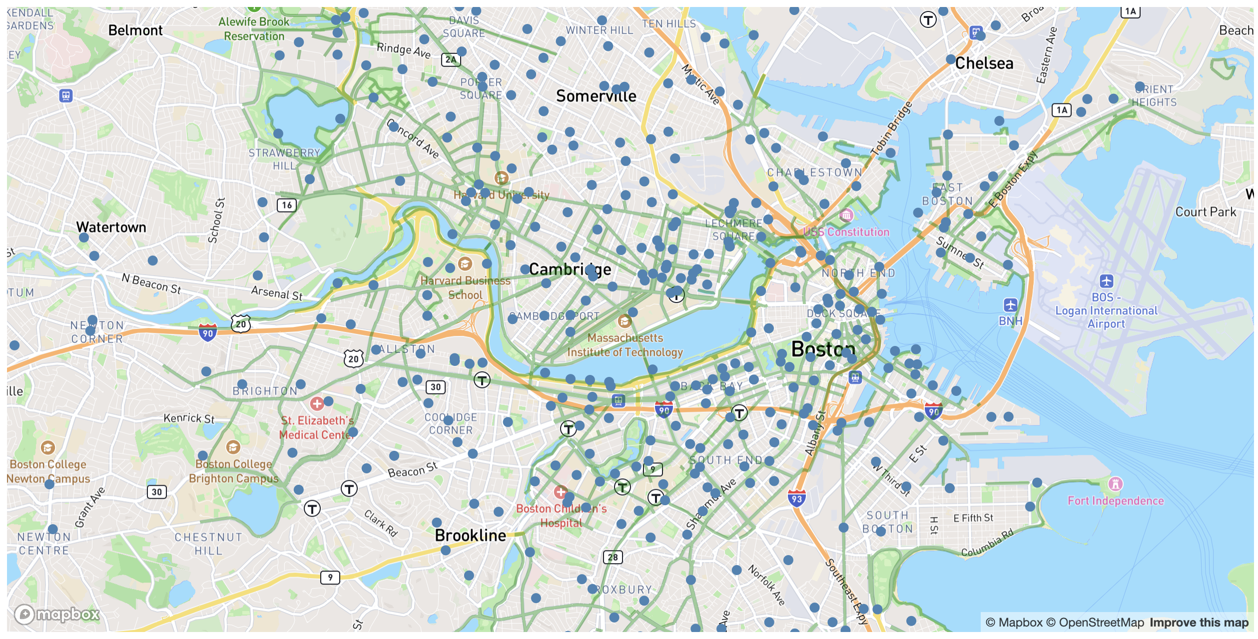
If everything went well, you should now see the stations move around as you pan and zoom the map:
Some of you may have wondered why we needed to use {#key} at all. We could have gotten the exact same result by adding mapViewChanged as a dummy parameter in getCoords(), i.e. pass it as an argument to the function even though the function does not use it in any way. We just use {#key} because it makes our intent more clear, while the dummy parameter approach is more of a hack and could make it look like our code has a bug, rather than this being intentional. It also means it could break in the future if Svelte becomes smarter about detecting dependencies.
We are currently drawing all the stations in the Bluebikes network, even though we can only actually see a few. You can explore tweaking the code to only draw stations that are currently visible on the map which should make it faster.
Step 4: Visualizing station demand
Marking the station position is nice, but doesn’t tell a very interesting story. What patterns could we uncover if we set the size of the circles according to the amount of demand, i.e. arrivals and departures, or traffic, at each station?
A copy of the Bluebikes traffic data from March 2024 is available at https://vis-society.github.io/labs/9/data/bluebikes-traffic-2024-03.csv. This is quite a large file (21 MB) containing more than 260,000 entries with the following fields:
ride_id: A unique id of the ridebike_type:electricorclassicstarted_at: the date and time the trip started in ISO 8601 format (e.g."2019-12-13 13:28:04.2860")ended_at: the date and time the trip ended in ISO 8601 format (e.g."2019-12-13 13:33:57.4370")start_station_id: the ID of the station where the trip started (e.g.A32000)end_station_id: the ID of the station where the trip ended (e.g.A32000)is_member: whether the rider is a member or not (1or0)
This is a simplified version (less fields and deduplicated) of the dataset that Bluebikes provides to reduce filesize.
Step 4.1: Importing and parsing the traffic data
Just like the previous step, we will use d3.csv() to fetch the traffic data. You can fetch it directly from the URL, without downloading and hosting it yourself, and you can do so either in the async function you have defined, in onMount or in a separate async function that you can call in onMount - the world is your oyster. Let’s call the variable that will hold the traffic data trips.
Step 4.2: Calculating traffic at each station
Now that we have read the data into a JS object, we can use it to calculate station traffic volumes (arrivals and departures per station).
As we have in the previous labs, we will use d3.rollup() (or d3.rollups()) to calculate arrivals and departures.
First, we calculate them separately, like this:
departures = d3.rollup(trips, v => v.length, d => d.start_station_id);
// TODO arrivals
We are calculating departures and arrivals inside onMount since we only need to calculate them once. However, you should make sure to declare the arrivals and departures variables outside onMount() so you can access them in your reactive code later! Note, that these variables will be of type Map, which means the station ID will be the key and the corresponding value the respective size of arrivals / departures / total traffic.
Now, we want to add arrivals, departures, totalTraffic (which is just the sum of arrivals and departures for a given station) properties to each station in the stations array we have previously defined, which we can do like this after both stations and trips have loaded:
stations = stations.map(station => {
    let id = station.Number;
    station.arrivals = arrivals.get(id) ?? 0;
    // TODO departures
    // TODO totalTraffic
    return station;
});
Here, the map maps the function we have defined inside the {...} to each element station in the stations array. It’s a convenient function to quickly apply transformations to all elements in an array without needing ot explicitly loop over each.
You can log stations in the console after to make sure the properties have been added correctly.
Step 4.3: Size markers according to traffic
Now, we can use this data structure to size the markers on the map according to the traffic at each station. Currently, all our circle radii are hardcoded. We should decide what the minimum and maximum radius should be (I went with 0 and 25), and then create a D3 scale to map our data domain [0, d3.max(stations, d => d.totalTraffic)] to this range of circle radii.
However, there is a catch: if we just use a linear scale to calculate the circle’s radius, we will end up misrepresenting the data: for example, stations that have double the traffic would appear 4 times larger since the area of a circle is proportional to the square of its radius (A = πr²). We want to use the circle area to visualize the variable, not the circle radius.
To fix this, we will use a different type of scale: a square root scale. A square root scale is a type of power scale that uses the square root of the input domain value to calculate the output range value.
Thankfully, the API is very similar to the linear scale we used before, the only thing that changes is that we use a different function name:
$: radiusScale = d3.scaleSqrt()
    .domain([0, d3.max(stations, d => d.totalTraffic) || 0])
    .range([0, 25]);
Where || 0 ensures that, if d3.max is undefined, the domain becomes [0,0]. Then, we can use this scale to calculate the radius of each circle in the SVG by passing the station traffic as a parameter to radiusScale(). You can do this by editing the r attribute of your <circle> element from its hardcoded value r="5" to r={radiusScale(station.totalTraffic)}.
If we look at our map right now, it looks like this:
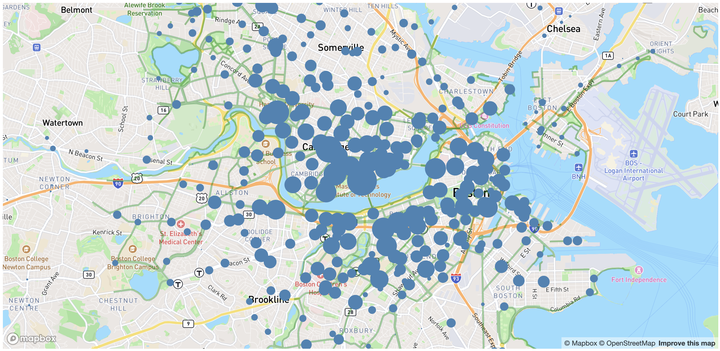
Because our dots are opaque and overlapping, it’s hard to see the actual traffic patterns. Add a CSS rule for circle inside your svg rule, and experiment with different fill-opacity values and strokes to improve this. I used a steelblue fill, a fill-opacity of 60%, and a stroke of white, and this was the result: 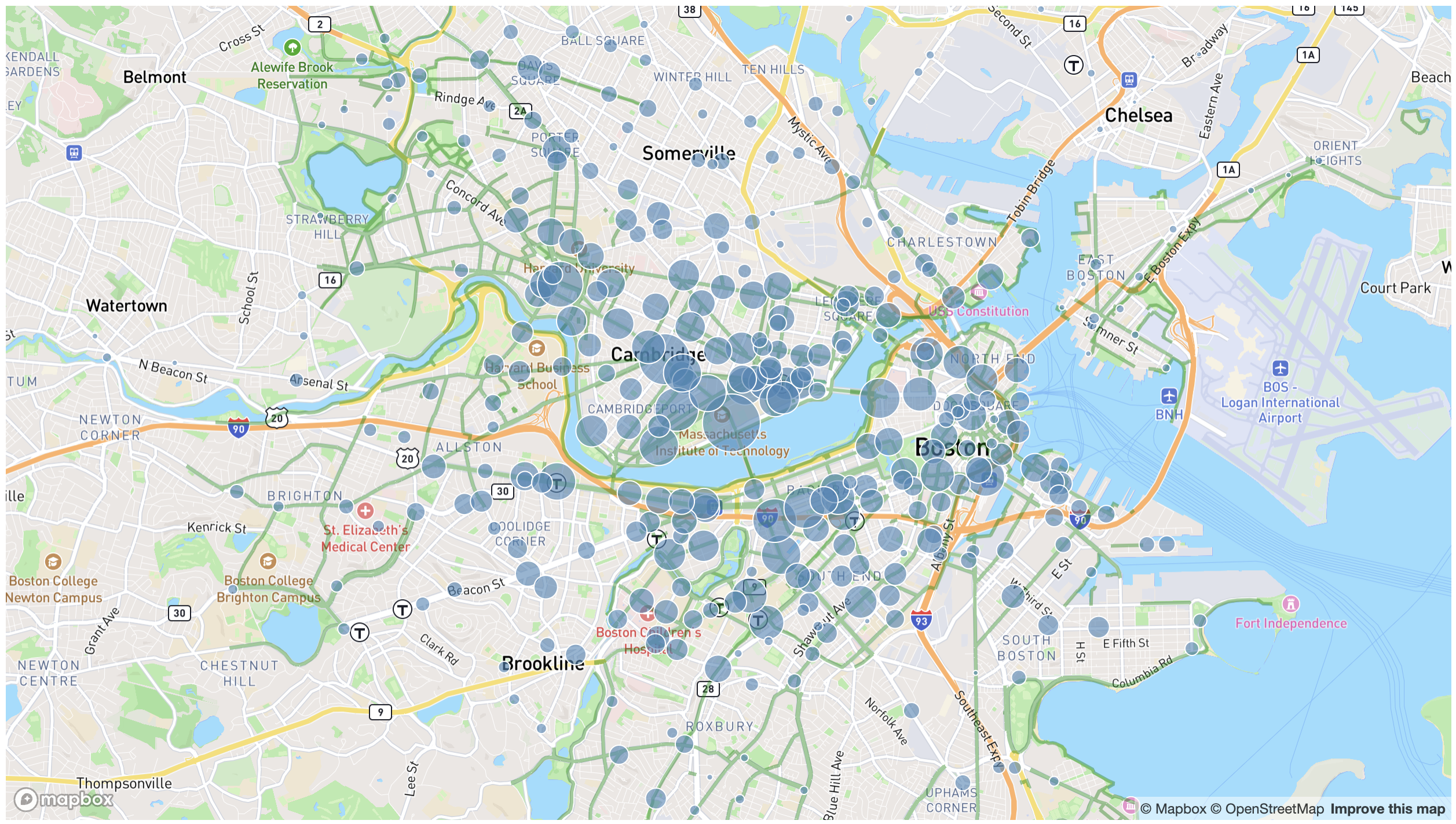
Step 4.4: Adding a tooltip with exact traffic numbers (optional)
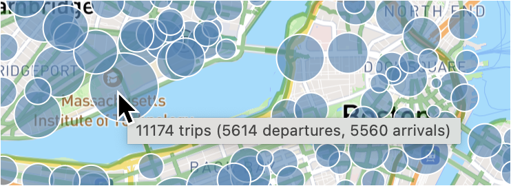
In addition to providing additional info, it helps us debug as well to be able to see the number of trips that each circle represents. We could add a tooltip in the same way we did in the previous lab but that’s fairly involved. Here we will do the quick and dirty way and use the default browser tooltips. To create those, all it takes is adding a <title> element inside each <circle> element with the number of trips:
<circle> <!-- (omitting attributes here) -->
    <title>{station.totalTraffic} trips ({station.departures} departures, { station.arrivals} arrivals)</title>
</circle>
Note, how we went from a single tag annotation <circle/> to an open and closing tag form with <circle>...</circle>. We have applied pointer-events: none to the whole <svg>, so to be able to see our tooltips we need to override that on circles, by adding pointer-events: auto to our CSS rule for circle.
Note that both SVG and HTML have a <title> element, but they are false friends, as they do different things!
Step 5: Interactive data filtering
Even with the styling improvements, it’s hard to make sense of all this data as currently displayed all at once. Let’s add some interactive filtering with a slider for arrival/departure time.
Step 5.1: Adding the HTML and CSS for the slider
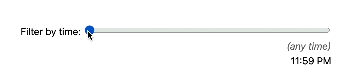
The first step is to add the HTML for our time filter, which includes the following elements:
- A slider (
<input type=range>) with a min of -1 (no filtering) and a max of 1440 (the number of minutes in the day). - A
<time>element to display the selected time. - An
<em>(any time)</em>element that will be shown when the slider is at -1. - A
<label>around the slider and<time>element with some explanatory text (e.g. “Filter by time:”).
Where you put it on the page is up to you. I added it under the <h1> and wrapped both with a <header>, to which I applied a display: flex, gap: 1em, and align-items: baseline to align them horizontally, then gave the label a margin-left: auto to push it all the way to the right.
Make sure to place the <time> and <em> on their own line (e.g. via display: block) otherwise the contents of the <time> updating will move the slider and it will look very jarring.
You would also want to style the <em> differently, e.g. with a lighter color and/or italic, to make it clear that it’s a different state.
Right now, it won’t be doing much since it’s not linked with any variable or acting on anything - it’s more of a placeholder for now to get some more functionality later on! Here is a sample rendering of what you should have at this point:
Step 5.2: Reactivity
Now that we’ve added our static HTML and CSS, let’s connect it with our code by having the slider update a variable that we can use to filter the data and to show the currently selected time in the <time> element.
First, let’s create a variable to hold the slider value, called timeFilter, that we initialize (outside any function) to -1 so that no filtering is done by default.
let timeFilter = -1;
Then we can use bind:value on the slider to reactively update timeFilter as the slider is moved.
Lastly, we need to display the selected time in the <time> element, which also serves as validation that we’ve done the plumbing correctly.
For that, let’s define a reactive variable that converts the number of minutes since midnight to a human-readable time string (using date.toLocaleString()):
$: timeFilterLabel = new Date(0, 0, 0, 0, timeFilter)
                     .toLocaleString("en", {timeStyle: "short"});
Then, all we need to do is print out timeFilterLabel via a reactive expression ({}) in the <time> element.
It looks like this now:
Lastly, we want to display the <em> element only when the slider is at -1 and the <time> only when it is not, using a Svelte {#if} block.
Here is my code (minus the styling and the additional timeFilter variable defined in the script element) that extends my previous <h1> for BikeWatch:
<header>
    <h1>🚲 BikeWatch</h1>
    <label>
        Filter by time:
        <input type="range" min="-1" max="1440" bind:value={timeFilter} />
        {#if timeFilter !== -1}
            <time style="display: block">
                {timeFilterLabel}
            </time>
        {:else}
            <em style="display: block">(any time)</em>
        {/if}
    </label>
</header>
Step 5.3: Filtering the data
Our slider now looks like a filter, but doesn’t actually do anything. To make it work there are a few more things we will be doing together in this step (this is just to lay out a plan, continue reading!):
- Writing out the logic to filter the data, by creating
filteredXXXversions of each of our root variables:- A
filteredTripsdata structure that contains the trips that correspond to the filter. filteredArrivalsandfilteredDeparturesdata structures that contain thearrivalsanddeparturesdata after filtering (note, thatfilteredTotalTrafficis not needed since we can calculate that one from the other two).- A
filteredStationsdata structure with stations containing data that corresponds to the applied filter (i.e. filtered arrivals, departures, and total traffic).
- A
- Updating our HTML template to use these new data structures instead of the original ones.
The trip data includes dates and times as strings, which are not directly comparable to the number of minutes since midnight that we have from the slider. To compare the two, we need to convert the date and time strings to a number of minutes since midnight.
We will do this in two steps. First, we will replace the start and end date strings of each trip with Date objects.
We only need to do this once, so we can do this in onMount() (or another async function that we call in onMount), right after trips has been fetched. Since trips is such a large dataset, we want to avoid setting it twice, so we will instead use the then() method of the Promise returned by d3.csv(). To then convert each time and date string, we just do new Date(dateTimeString) (assuming dateTimeString is the date & time string we are trying to convert):
trips = await d3.csv(TRIP_DATA_URL).then(trips => {
    for (let trip of trips) {
        trip.started_at = // TODO: convert this attribtue to a Date object
        trip.ended_at = // TODO: convert this attribtue to a Date object
    }
    return trips;
});
Now, we can define a function that takes a Date object and returns the number of minutes since midnight:
function minutesSinceMidnight (date) {
    return date.getHours() * 60 + date.getMinutes();
}
Then, we can use this function to filter the data to trips that started or ended within 1 hour before or after the selected time:
$: filteredTrips = timeFilter === -1? trips : trips.filter(trip => {
    let startedMinutes = minutesSinceMidnight(trip.started_at);
    let endedMinutes = minutesSinceMidnight(trip.ended_at);
    return Math.abs(startedMinutes - timeFilter) <= 60
           || Math.abs(endedMinutes - timeFilter) <= 60;
});
Now, we need to create the new data structures that we alluded to before, corresponding to arrivals, departures, and stations but only for the filtered trips. We can call them filteredArrivals, filteredDepartures, and filteredStations.
For filteredArrivals and filteredDepartures, all we need to do is copy the statements that set the original variables (arrivals and departures), convert them to reactive statements, and replace trips with filteredTrips. It would look something like this:
// ...
$: filteredDepartures = d3.rollup(filteredTrips, v => v.length, d => d.start_station_id);
$: filteredArrivals = d3.rollup(filteredTrips, v => v.length, d => d.end_station_id);
// ...
For filteredStations, we don’t actually need to do any filtering of the stations array (since it’s unlikely that there are stations with zero arrivals and departures for any given time), but we do need an array that contains updated data for station.arrivals, station.departures and station.totalTraffic that correspond to the filtered trips.
This is where we need to be careful: if we simply do
$: filteredStations = stations.map(station => {...})and set properties onstation, we will have modified our original station objects since in JS, objects are passed around by reference! To avoid this, before we set any property on these objects, we need to clone them. We can do that by doing this before we modifystation:station = {...station};
It should then look similar to this:
$: filteredStations = stations.map(station => {
    const id = station.Number;
    const arr = filteredArrivals.get(id) ?? 0;
    const dep = filteredDepartures.get(id) ?? 0;
    return {
        ...station,
        arrivals: arr,
        departures: dep,
        totalTraffic: arr + dep
    };
});
Last, we want to have bigger circles, since there’s fewer data. We can do that by changing the scale when a filter is applied, by making the scale conditional, i.e. instead of using a static [0, 25] as the range, we use [0, 25] when timeFilter is -1 and e.g. [3, 30] otherwise. You will find the conditional operator useful for this.
Make sure you go back and refactor your code to now use your filtered versions of the variables rather than their original version!
The result right now should look like this:
Step 5.4: Performance optimizations (optional if you don’t have this problem)
Notice that moving the slider now does not feel as smooth as it did before we implemented the filtering. This is because every time we move the slider, we filter the trips, which is a relatively expensive operation given that we have over a quarter of a million of them! Worse, every time we do this filtering, nothing else can happen until the filtering ends, including things like the browser updating the slider position! This is commonly referred to as “blocking the main thread”.
There are many ways to improve this. Throttling and debouncing are two common techniques to limit the rate at which a certain (expensive) piece of code is called in response to user action.
These are “brute force” in the sense that they work regardless of what the expensive operation or the user action is, but they can adversely affect the user experience, since they make the UI update less frequently. However, depending on the case, there are often ways to optimize the operation itself (e.g. by caching repetitive work), without any negative impact on the user experience.
In this case, we can make the filtering a lot less expensive by presorting the trips into 1440 “buckets”, one for each minute of the day. Then, instead of going over 260k trips every time the slider moves, we only need to go over the trips in the 120 buckets corresponding to the selected time.
We start by defining two top-level variables to hold the departure and arrival “buckets”, which will be arrays with 1440 elements initially filled with empty arrays:
const departuresByMinute = Array.from({length: 1440}, () => []);
const arrivalsByMinute = Array.from({length: 1440}, () => []);
Notice, how we use const here? Since we know that our array will be of size 1440 and that that won’t change, it is actually much more performant to tell Svelte, that it is a constant.
Then, in onMount() (or a corresponding async function that you call in onMount), in the same callback where we converted trip.started_at and trip.ended_at to Date objects, we add:
let startedMinutes = minutesSinceMidnight(trip.started_at);
departuresByMinute[startedMinutes].push(trip);

// TODO: Same for arrivals
Why not use d3.group() or d3.groups()? These return different data structures and as you will see below, using an array of arrays simplifies our code a lot as we can use array.slice() to get a whole time range.
Now let’s use our awesome new data structures to make our code faster!
First, we can get rid of filteredTrips, as we will be calculating filteredDepartures and filteredArrivals directly from departuresByMinute and arrivalsByMinute respectively.
Let’s discuss calculating filteredDepartures and you can apply the same logic to filteredArrivals. For a first approximation, we can replace filteredTrips, with departuresByMinute.slice(timeFilter - 60, timeFilter + 60).flat().
There are two methods in this you may not have seen before:
array.slice(start, end)returns a new array with the elements fromstart(inclusive) toend(exclusive).array.flat()“flattens” an array of arrays, so that the result is a single array with all the elements of the subarrays.
Let’s now enjoy the fruits of our labor by moving the slider really fast — it should now be smooth as butter! (or at least, much smoother than before)
But …there is one bug. Can you spot it? Our code works great for times between 1 AM and 11 PM. However for times where the 2 hour window spans midnight, it doesn’t work so well: minMinute will be negative, or maxMinute will be greater than 1440. While array.slice() actually does accept negative numbers and numbers greater than the array length, it doesn’t do what we want in this case.
In these cases, we basically want two separate array.slice() operations: one for the times before midnight and one for those after, that we then combine.
Let’s create a helper function to do just that:
function filterByMinute (tripsByMinute, minute) {
    // Normalize both to the [0, 1439] range
    // % is the remainder operator: https://developer.mozilla.org/en-US/docs/Web/JavaScript/Reference/Operators/Remainder
    let minMinute = (minute - 60 + 1440) % 1440;
    let maxMinute = (minute + 60) % 1440;

    if (minMinute > maxMinute) {
        let beforeMidnight = tripsByMinute.slice(minMinute);
        let afterMidnight = tripsByMinute.slice(0, maxMinute);
        return beforeMidnight.concat(afterMidnight).flat();
    }
    else {
        return tripsByMinute.slice(minMinute, maxMinute).flat();
    }
}
Then, in the calculation for filteredDepartures, we use filterByMinute(departuresByMinute, timeFilter) instead of our previous filteredDepartures.slice().flat() operation. Don’t forget to do the same for filteredArrivals like so:
$: filteredDepartures = d3.rollup(filterByMinute(departuresByMinute, timeFilter), v => v.length, d => d.start_station_id);
$: filteredArrivals = d3.rollup(filterByMinute(arrivalsByMinute, timeFilter), v => v.length, d => d.end_station_id);
If everything goes well, it should now look like this:
Here they are side by side:
Step 6: Visualizing traffic flow
Currently, we are visualizing traffic volume at different times of the day, but traffic direction also changes! In the morning, stations in downtown and near MIT campus tend to have a lot of arrivals, while in the evening they tend to see a lot of departures.
In this step, we will use circle color to visualize traffic flow at different times of the day.
Step 6.1: Make circle color depend on traffic flow
While it may seem that using a continuous color scale gives us more information, humans are very poor at associating continuous color scales with quantitative data (as we will see in the upcoming Color lecture), so using only three colors will actually make the traffic flow trends more salient.
To do this, we will use a quantize scale, which is like a linear scale but with a discrete output range. We will use this scale to map a continuous number from 0 to 1 to a discrete number in the array [0, 0.5, 1]. It looks like this:
let stationFlow = d3.scaleQuantize()
    .domain([0, 1])
    .range([0, 0.5, 1]);
Notice that this is not a reactive statement, since it does not depend on any variables.
Then, on our circles, we calculate the ratio of departures to total traffic, map it to our discrete scale, and assign the result to a CSS variable:
<!-- Other attributes ommitted -->
<circle style="--departure-ratio: { stationFlow(station.departures / station.totalTraffic) }">
Then, in our CSS rule for circle we can use this variable to set the fill color:
--color-departures: steelblue;
--color-arrivals: darkorange;
--color: color-mix(
    in oklch,
    var(--color-departures) calc(100% * var(--departure-ratio)),
    var(--color-arrivals)
);
fill: var(--color);
If everything went well, our current map looks like this:
Step 6.2: Adding a legend
Our visualization looks pretty cool, but it’s very hard to understand what the three colors mean. We can fix this by adding a legend to the map.
Let’s first add some HTML for the legend after our map container:
<div class="legend">
    <div style="--departure-ratio: 1">More departures</div>
    <div style="--departure-ratio: 0.5">Balanced</div>
    <div style="--departure-ratio: 0">More arrivals</div>
</div>
There are many ways to style this as a legend, but the following apply to most of them:
- Move the
--color-departures,--color-arrivals, and--colorvariables to a new rule so that it applies to both#map circleand.legend > div. - Apply flexbox to the legend container to align the items horizontally.
- Apply
margin-blockto the legend container to give it some space from the map.
Here are some example styles and a few pointers on how to implement them, but you’re welcome to experiment and come up with your own design:
Design 1: Blocks

One advantage of this is that it generalizes more nicely to more than 3 colors, and it’s fairly simple.
- Here each child
<div>hasflex: 1to make them take up equal space. - The gap is only
1px; just enough to prevent the colors from touching. - Note that
text-alignis different for each swatch. - Specify significantly more horizontal padding than vertical, otherwise they will not look even
- If you have used different colors, make sure to pick the text color accordingly to ensure sufficient contrast.
Design 2: Separate swatches & labels

This is a little more advanced but looks much more like an actual legend. One downside of it is that it’s harder to generalize to more than 3 colors, as it looks like a legend for a categorical variable.
- Uses a
::beforepseudo-element withcontent: ""to create the swatches. - Uses an additional element for the “Legend:” label
- Each child
<div>also uses flexbox - Make sure the gap on child
<div>is significantly smaller than the gap on the parent.legendto create the effect of the swatches being connected to the labels (design principle of proximity).
Here is the final result:
Step 7: Adding isochrones
So, we have an awesome map already, but we wanted to show you one more concept before we part for this lab. Isochrones have gained importance over the past years, especially since the rise of the famous 15-minute city concept (which has been around for a few thousand years, jfy). Isochrones (ἴσος for “equal” and χρόνος for “time” from old Greek) have been pivotal to the modern foundations of this concept. The idea is simple, everything along an isochrone line is reachable in a certain time (such as 15 minutes). The area that that line then describes are all the places reachable within that timeframe. A simple example is this one:
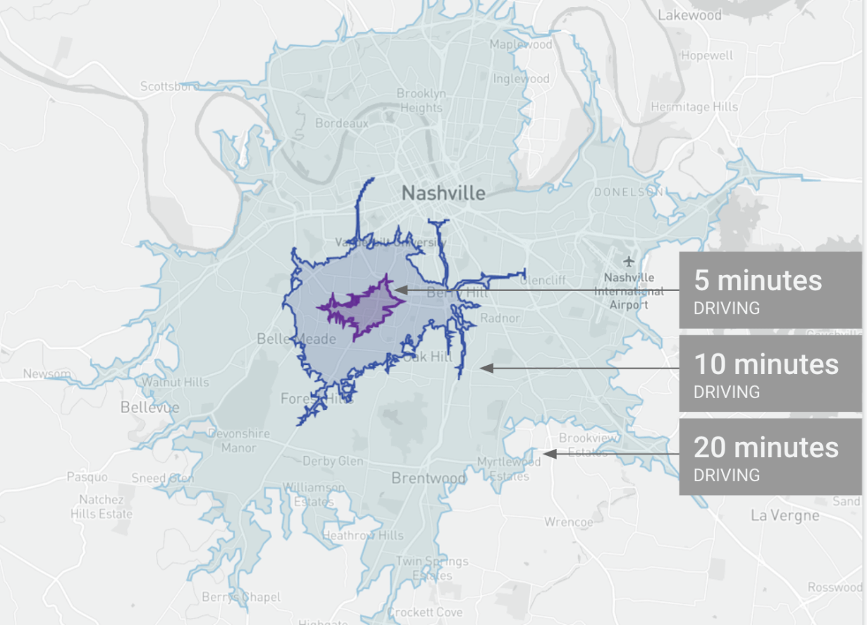
In the picture, the isochrones show the geographic locations reachable by driving. However, the same can be done for other modalities such as walking and biking! Also note, how this picture resembles a topographic map, i.e. one showing elevation contours - the concepts are similar, one is about lines of same height, while ours represents lines of same time.
Fortuntely, we don’t need to compute these ourselves. Instead, we can use Mapbox’s Isochrone API, which allows us to get the relevant contours and areas. If you want to give it a try, Mapbox has provided a convenient sandbox to understand the basic interactions that are possible.
Step 7.1: Requesting isochrones from mapbox
First, let’s try to get the information we want to display from the Mapbox Isochrone API. To do so, we add the following to the end of our <script> element:
const urlBase = 'https://api.mapbox.com/isochrone/v1/mapbox/';
const profile = 'cycling';
const minutes = [5, 10, 15, 20];
const contourColors = [
    "03045e",
    "0077b6",
    "00b4d8",
    "90e0ef"
]
let isochrone = null;

async function getIso(lon, lat) {
    const base = `${urlBase}${profile}/${lon},${lat}`;
    const params = new URLSearchParams({
        contours_minutes: minutes.join(','),
        contours_colors: contourColors.join(','),
        polygons: 'true',
        access_token: mapboxgl.accessToken
    });
    const url = `${base}?${params.toString()}`;

    const query = await fetch(url, { method: 'GET' });
    isochrone = await query.json();
}
While this might look a bit complex, it really isn’t anything other than a urlBase such as the one defined on top, with some parameters attached. These parameters are often part of the URLs you use everyday such as resource ids and queries. As you can see, the url variable is composed of the base and the params after a sneaky ? indicating that the URL’s parameters are about to start. This is a much more readable and maintainable way to compose such URLs rather than working directly with a string.
Notice, how we pass both the different isochrone times using minutes, as well as the contourColors. All that does is to tell the API which isochrones it should generate and what colors it should attribute to each one to simplify our lifes later on. Feel free to play around with them once we get the isochrones onto our map!
Now, let’s add right below this function a test call, which will trigger the function and, together with the console.log(data), will give us an idea of what data we can expect:
getIso(-71.09415, 42.36027);
When re-loading your page, you should be able to see the following now:
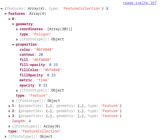
Turns out, that the API call returns us a GeoJSON file similar to the ones that we have been loading for the bike paths before. However, instead of adding them as map layers to the basemap, we’ll use D3 also this time to plot them on the map. Have a look at the properties that come with each entry in the returned GeoJSON array. Are there some familiar ones? Keep them in mind for now since we’ll need them later!
You can now remove the test call and the console.log(data) in the getIso function.
Step 7.2: Selecting a station
As you have probably noticed, the map is already pretty busy with all those circles and the fact that their size and color change depending on our filtering. Overlaying isochrones straight on top might be a bit much. To reduce the cognitive load, we can keep only the selected station highlighted and reduce the opacity of all the others (similar to what we did last time in step 4.1 of lab 7).
To do so, we create a new variable:
let selectedStation = null;
And set / reset that variable in our circle elements along with setting a class attribute which will allow us to distinguis between selected and non-selected stations (if one is selected):
<circle
    <!-- other attributes omitted -->
    class={station?.Number === selectedStation?.Number ? "selected" : ""}
    on:mousedown={() => selectedStation = selectedStation?.Number !== station?.Number ? station : null}
>
Note how we don’t directly compare station objects, but rather use the station’s Number as a unique identifier. Using ? we also make sure that this check and assignment is not triggered if selectedStation is null, helping us to avoid errors.
Similar to last time, we can leverage CSS to then deal with their formatting by adding inside our #map svg {...} style, below circle {...} the following:
#map svg {
    circle {
        ...
        transition: opacity 0.2s ease; /* optional */
    }

    /* Dims other circles when one is selected */
    &:has(circle.selected) circle:not(.selected) {
        opacity: 0.3;
    }
}
To make the whole end up in a smooth transition, I also added a transition attribute in the circle’s style. If everything goes well, you’ll be able to do the following on your map:
Step 7.3: Loading the isochrones
Now that we have a variable holding the isochrones upon loading (see the last line of getIso above), we just have to render them in our <svg> element. To do so, we’ll make use of SVG’s <path> element (we could also use polygon but that doesn’t allow for holes or non-convex shapes, which leads to nothing being shown at all if we cannot guarantee that that will not be the case with our geometries). However, D3 doesn’t directly understand the geographic data in a GeoJSON (similar to the latitudes and longitudes in our stations). Thus, we define a function geoJSONPolygonToPath, which allows us to convert geographic polygons into a data format that D3’s <path> can understand:
function geoJSONPolygonToPath(feature) {
    const path = d3.path();
    const rings = feature.geometry.coordinates;

    for (const ring of rings) {
        for (let i = 0; i < ring.length; i++) {
            const [lng, lat] = ring[i];
            const { x, y } = map.project([lng, lat]);
            if (i === 0) path.moveTo(x, y);
            else path.lineTo(x, y);
        }
        path.closePath();
    }
    return path.toString();
}
You can simply add this to the end of your <script> tag below the variable definitions and getIso. Note, that this function creates an empty path object, extracts the coordinates from the geometry in the GeoJSON we pass to it, and then iterates through it, coordinate by coordinate, to trace where the path goes next. We call these rings, since a polygon is defined by its outlines and once we’ve reached the end of the polygon, we close the path, i.e. we connect the end with the beginning using a straight line. In the end, we cast all of this to a String which can then be passed to <path>’s d attribute.
Now, we are ready to add the following to our <svg> in order to render the path we create from each geographic feature:
<div id="map">
    <svg>
        {#key mapViewChanged}
            {#if isochrone}
                {#each isochrone.features as feature}
                    <path
                            d={geoJSONPolygonToPath(feature)}
                            fill={feature.properties.fillColor}
                            fill-opacity="0.2"
                            stroke="#000000"
                            stroke-opacity="0.5"
                            stroke-width="1"
                    >
                        <title>{feature.properties.contour} minutes of biking</title>
                    </path>
                {/each}
            {/if}
            {#each filteredStations as station}
                <circle > <!-- other attributes omitted -->
                    ...
                </circle>
            {/each}
        {/key}
    </svg>
</div>
Notice, that we have instantiated an iterator over each feature in the isochrone’s features array, similar to what we have done to stations before. We also only trigger this #each block in case isochrone exists, i.e. is not null. Finally, we use the colors that are attributed to each isochrone (remember, we have defined that in variables minutes and contourColors), and add a <title> to show our users what time frame each isochrone represents (5, 10, 15, 20 minutes of biking).
7.4: Putting it all together
The only thing that is missing now, is that we want to reset the isochrones when we unselect a station. Thus, in our <script> tag, we can add this reactive block:
$: if (selectedStation) {
    getIso(+selectedStation.Long, +selectedStation.Lat);
} else {
    isochrone = null;
}
This simply triggers getIso when there is a selectedStation (and passes it the numerically casted longitude and latitude of the station), and sets it to null if there’s no selectedStation.
Another thing that is nice, is that we added a <title> element to guide our users. Similar to what we did with <circle>, we’ll also have to update the <path>’s CSS to include pointer-events: auto;. Simply put that below the circle dimming logic within the #map svg {...} rule.
Now, let’s see how our map is doing!
Step 8: Add your new project to your list of projects!
Now that you have made this cool app to visualize bike traffic in the Boston area, time to claim credit for your work! Go back to your portfolio website, and add a new entry for this project, with a nice screenshot.
You should also add a url field to each project, and add a link to it in the template (for projects that have a url field).
If you installed mapbox-gl as the most recent version — that is, using npm install mapbox-gl instead of npm install mapbox-gl@3.20.0, which may have happened if you started working on the lab on or before an edit on April 11 — you might see an issue in deployment where the map background doesn’t appear. This is because the most recent version of mapbox-gl, 3.21.0 released last week, has a compatibility issue with vite. To fix this, you’ll want to pin the previous version of the package within your package.json. Open your package.json, find the line that specifies a dependency on "mapbox-gl": "^3.21.0"". Edit to this:"mapbox-gl": "3.20.0"
Be sure to remove the carat (^) as the carat means “compatible with,” so if your build has already used 3.21.0, it won’t downgrade; specifying 3.20.0 without a carat forces a downgrade to use that specific version. Commit and push your package.json, and everything should deploy properly!