Lab 6: D3 I (Data wrangling, scales, and axes)
In this lab, we will learn:
- What SVG is and how to draw shapes with it
- How to use D3 to wrangle and transform data
- How to build bar charts using D3 scales and axes
- How to create reactive visualizations driven by real data
- How to annotate charts to highlight specific insights
Table of contents
Check-off
To receive a lab checkoff, please submit your work asynchronously by filling out this form. TAs will review your lab and post your grade. If you do not pass, you will be able to fix any issues and resubmit or receive help in an office hour until the deadline.
Lab 6 Rubric
To successfully complete this lab check-off, ensure your work meets all of the following requirements:
General
- Same functionality from Labs 4-5
- Successfully deployed to GitHub Pages
- Year visible on each project card in both Home page and Projects page
Setup (Step 0.2)
- Meta page is created and reachable from the navbar
loc.csvis successfully generated in thestaticfolderloc.csvis excluded from committed files via.gitignore
Vertical bar chart on Projects page (Steps 2-3)
- Bar chart is visible at the top of the Projects page
- Has a different colored bar for each year in your projects data
- Y-axis shows only whole numbers (no decimals)
- Has a chart title, x-axis label, and y-axis label
- Has a legend with color swatches matching the bars, displayed side by side with the chart
- Has an annotation with a leader line highlighting the year with the most projects
Horizontal bar chart on Meta page (Step 4)
- Bar chart is visible on the Meta page
- Shows lines of code per programming language from
loc.csv - Has a chart title, x-axis label, and y-axis label
- Has a legend with color swatches matching the bars
- Has an annotation with a leader line pointing to the language with the most lines of code
D3 was also covered in Monday’s lecture, so it can be helpful for you to review the material from it.
This lab is a little more involved than some of the previous labs, because it’s introducing the core technical material around data visualization. A robust understanding of these concepts will be invaluable as you work on your final projects, so spending time practicing them for the lab will be time well spent.
Step 0: Prerequisites and setup
Step 0.1: Show year in each project card
Since we have the year data of our projects, we should show it in the project list. That way we can also more easily verify whether our code in the rest of the lab works correctly.
Edit the <Project> component (in src/lib/Project.svelte) to show the year of the project. You can use any HTML you deem suitable and style it however you want.
Step 0.2: Setting up
We will need D3 throughout this lab. If you have not already installed it, do so now by running the following command in the terminal:
npm install d3
Step 0.2.1: Adding a new page with meta-analysis of the code in our project
In this lab, we will be computing and visualizing different stats about our codebase. We will display these in a new page on our website. Create a routes/meta/+page.svelte file, add some content in it (e.g. a heading, a description), and add it in the navigation bar.
Step 0.2.2: Adding code analysis script
In this step you will install our code analysis script which will analyze the code of our app and generate a CSV file with statistics about it, including lines of code per file, per language, and per commit.
First, open the terminal and run this to install the package:
npm install elocuent -D
Then run this command to generate the CSV:
npx elocuent -d static,src -o static/loc.csv
If you’re on Windows, put static,src in quotation marks: "static,src"
Getting an error? (Windows users)
With recent versions of Node.js on Windows, you may see the following error:
> npm exec elocuent -- -d "static,src" -o static/loc.csv
npm info using npm@10.7.0
npm info using node@v22.2.0
node:internal/child_process:512
      this.emit('error', new ErrnoException(err, 'kill'));
                         ^

Error: kill EPERM
    at ChildProcess.kill (node:internal/child_process:512:26)
    at default (file:///C:/PATH_TO_YOUR_REPO/node_modules/elocuent/src/index.js:90:12)
    at process.processTicksAndRejections (node:internal/process/task_queues:95:5)
Emitted 'error' event on ChildProcess instance at:
    at ChildProcess.kill (node:internal/child_process:512:12)
    at default (file:///C:/PATH_TO_YOUR_REPO/node_modules/elocuent/src/index.js:90:12)
    at process.processTicksAndRejections (node:internal/process/task_queues:95:5) {
  errno: -4048,
  code: 'EPERM',
  syscall: 'kill'
}

Node.js v22.2.0
This is due to process management issues with recent Node.js versions on Windows, and can be fixed by swithing to an older version of Node to run this command, like so:
nvm install 20
nvm use 20
Try rerunning the command and hopefully it will complete with no errors.
If everything went well, you should now have a file called loc.csv in your static folder. Its content should look like this (showing first 30 lines):
First 30 lines of loc.csv
file,line,type,commit,author,date,time,timezone,datetime,depth,length
static/style.css,1,css,74bb5de3,Ane Zuniga,2026-02-19,13:03:04,-05:00,2026-02-19T13:03:04-05:00,0,6
static/style.css,2,css,74bb5de3,Ane Zuniga,2026-02-19,13:03:04,-05:00,2026-02-19T13:03:04-05:00,0,62
static/style.css,3,css,74bb5de3,Ane Zuniga,2026-02-19,13:03:04,-05:00,2026-02-19T13:03:04-05:00,0,59
static/style.css,4,css,74bb5de3,Ane Zuniga,2026-02-19,13:03:04,-05:00,2026-02-19T13:03:04-05:00,0,76
static/style.css,5,css,74bb5de3,Ane Zuniga,2026-02-19,13:03:04,-05:00,2026-02-19T13:03:04-05:00,0,0
static/style.css,6,css,74bb5de3,Ane Zuniga,2026-02-19,13:03:04,-05:00,2026-02-19T13:03:04-05:00,0,0
static/style.css,7,css,74bb5de3,Ane Zuniga,2026-02-19,13:03:04,-05:00,2026-02-19T13:03:04-05:00,0,5
static/style.css,8,css,74bb5de3,Ane Zuniga,2026-02-19,13:03:04,-05:00,2026-02-19T13:03:04-05:00,0,24
static/style.css,9,css,74bb5de3,Ane Zuniga,2026-02-19,13:03:04,-05:00,2026-02-19T13:03:04-05:00,0,16
static/style.css,10,css,74bb5de3,Ane Zuniga,2026-02-19,13:03:04,-05:00,2026-02-19T13:03:04-05:00,0,19
static/style.css,11,css,74bb5de3,Ane Zuniga,2026-02-19,13:03:04,-05:00,2026-02-19T13:03:04-05:00,0,13
static/style.css,12,css,74bb5de3,Ane Zuniga,2026-02-19,13:03:04,-05:00,2026-02-19T13:03:04-05:00,0,0
static/style.css,13,css,74bb5de3,Ane Zuniga,2026-02-19,13:03:04,-05:00,2026-02-19T13:03:04-05:00,0,0
static/style.css,14,css,74bb5de3,Ane Zuniga,2026-02-19,13:03:04,-05:00,2026-02-19T13:03:04-05:00,0,48
static/style.css,15,css,74bb5de3,Ane Zuniga,2026-02-19,13:03:04,-05:00,2026-02-19T13:03:04-05:00,0,5
static/style.css,16,css,74bb5de3,Ane Zuniga,2026-02-19,13:03:04,-05:00,2026-02-19T13:03:04-05:00,0,8
static/style.css,17,css,74bb5de3,Ane Zuniga,2026-02-19,13:03:04,-05:00,2026-02-19T13:03:04-05:00,0,7
static/style.css,18,css,74bb5de3,Ane Zuniga,2026-02-19,13:03:04,-05:00,2026-02-19T13:03:04-05:00,0,13
static/style.css,19,css,74bb5de3,Ane Zuniga,2026-02-19,13:03:04,-05:00,2026-02-19T13:03:04-05:00,0,0
static/style.css,20,css,74bb5de3,Ane Zuniga,2026-02-19,13:03:04,-05:00,2026-02-19T13:03:04-05:00,0,0
static/style.css,21,css,74bb5de3,Ane Zuniga,2026-02-19,13:03:04,-05:00,2026-02-19T13:03:04-05:00,0,30
static/style.css,22,css,74bb5de3,Ane Zuniga,2026-02-19,13:03:04,-05:00,2026-02-19T13:03:04-05:00,0,5
static/style.css,23,css,74bb5de3,Ane Zuniga,2026-02-19,13:03:04,-05:00,2026-02-19T13:03:04-05:00,0,5
static/style.css,24,css,74bb5de3,Ane Zuniga,2026-02-19,13:03:04,-05:00,2026-02-19T13:03:04-05:00,0,8
static/style.css,25,css,74bb5de3,Ane Zuniga,2026-02-19,13:03:04,-05:00,2026-02-19T13:03:04-05:00,0,7
static/style.css,26,css,74bb5de3,Ane Zuniga,2026-02-19,13:03:04,-05:00,2026-02-19T13:03:04-05:00,0,14
static/style.css,27,css,74bb5de3,Ane Zuniga,2026-02-19,13:03:04,-05:00,2026-02-19T13:03:04-05:00,0,11
static/style.css,28,css,74bb5de3,Ane Zuniga,2026-02-19,13:03:04,-05:00,2026-02-19T13:03:04-05:00,0,22
static/style.css,29,css,74bb5de3,Ane Zuniga,2026-02-19,13:03:04,-05:00,2026-02-19T13:03:04-05:00,0,0
You can find a description of the metadata stored here.
Why are we using CSV instead of e.g. JSON? CSV is more efficient for data that has many rows, since we don’t need to repeat the names of the properties for every row.
Step 0.2.3: Exclude CSV from committed files
Since we are now generating the script on the server as well, there is no reason to include it in our commits. Add static/loc.csv to your .gitignore file.
A .gitignore file tells Git which files to ignore when tracking changes in your repository. Any file listed in .gitignore will not be staged, committed, or pushed to GitHub — it exists only on your local machine (or is generated fresh on the server during each build). This is useful for files that are either auto-generated (like loc.csv), contain sensitive information (like API keys), or are too large to store in version control.
If you have already committed it, you will need to first delete the file, commit & push the deletion and the addition to .gitignore, and only after that re-run the script to re-generate it.
Step 1: Data wrangling with D3
Data wrangling means reshaping raw data into a form that is ready for visualization or analysis. Real-world datasets are rarely in the exact shape we need — rows may need to be grouped, values aggregated, or fields transformed. D3 provides a set of powerful array helpers that make these transformations concise and readable.
In this step, we will practice wrangling on a small predefined dataset with known values, so you can verify your output against a standard answer. The same pattern will then carry directly into Step 3, where we apply it to your actual project data.
Step 1.1: Add the predefined data file
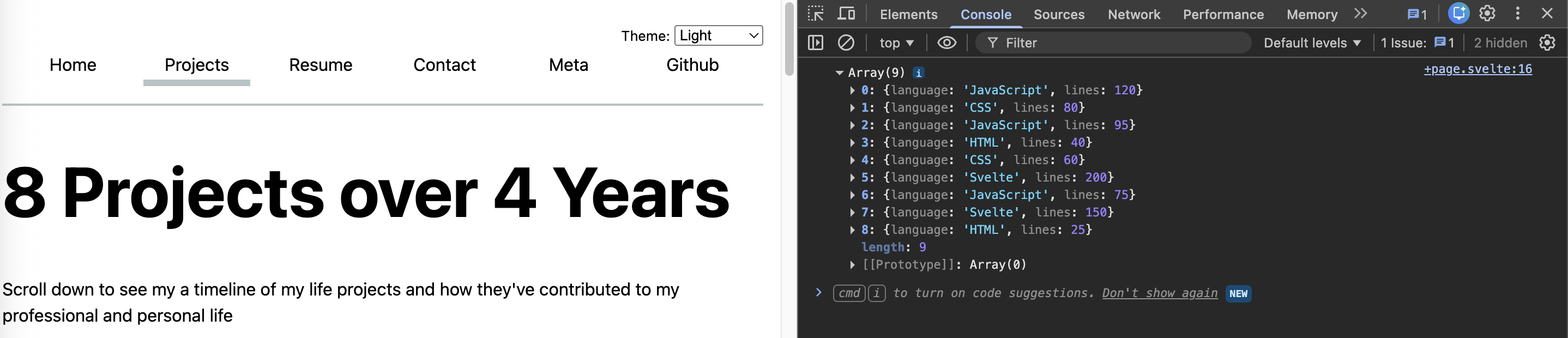
Create a new file static/lab6_example.json with the following content:
[
  { "language": "JavaScript", "lines": 120 },
  { "language": "CSS", "lines": 80 },
  { "language": "JavaScript", "lines": 95 },
  { "language": "HTML", "lines": 40 },
  { "language": "CSS", "lines": 60 },
  { "language": "Svelte", "lines": 200 },
  { "language": "JavaScript", "lines": 75 },
  { "language": "Svelte", "lines": 150 },
  { "language": "HTML", "lines": 25 }
]
We provide this small predefined file so everyone works with the same known input, making it easy to verify the output.
Step 1.2: Load the JSON with d3.json()
We need to load the JSON file we just created into our projects page so we can work with the data. We will use the d3.json() function from the d3-fetch module, which provides helpers for fetching and parsing data files.
Add the following to the script block of your projects page (src/routes/projects/+page.svelte):
import { onMount } from 'svelte';
import * as d3 from 'd3';

let rawData = [];

onMount(async () => {
    rawData = await d3.json('/lab6_example.json');
    console.log(rawData);
});
Let’s unpack what this code does:
d3.json()fetches the file at the given path and parses it as JSON, returning the result as a JavaScript array or object.- We wrap the call in
onMountso it only runs in the browser after the component has mounted, not during server-side rendering. - We store the result in
rawDataso we can use it in the next step.
Why onMount? In Svelte, some code runs on the server before the page is sent to the browser (server-side rendering). Calling fetch at that stage can cause issues in production since the server doesn’t have access to the browser’s network. onMount guarantees the code only runs client-side.
Once the data loads, open your browser’s developer tools and click on the Console tab. You should see an array of 9 objects logged there. Click on the ▸ icon next to it to expand it and inspect the individual objects — they should match the structure of your JSON file.
This pattern — load the data, inspect it in the console to confirm it looks right, then remove the debug log — is a good habit for any data loading step.
Step 1.3: Wrangle the data with d3.rollups()
Our dataset has multiple rows per language — for example, there are three JavaScript entries with different line counts. What we actually want for our bar chart is one value per language: the total number of lines. We need to group the rows by language and sum the line counts within each group. This is exactly what d3.rollups() does.
Update your onMount to also compute the wrangled data:
let wrangled = [];

onMount(async () => {
    rawData = await d3.json('/lab6_example.json');
    wrangled = d3.rollups(
        rawData,
        v => d3.sum(v, d => d.lines),
        d => d.language
    );
});
d3.rollups() takes three arguments here:
rawData— the input array of data records, e.g. rows like{ language: "JavaScript", lines: 120 }. This is the dataset we want to group and reduce.v => d3.sum(v, (d => d.lines))— the reducer function, applied once per group.vis the array of all records that share the same language. We pass it tod3.sum(), which takes two arguments of its own:v— the array to sum over, which is the group of records from above(d => d.lines)— an accessor function that tellsd3.sum()which value to extract from each record.dis a single record, and.linespulls out its numeric value.
The reducer function is not limited to summing. You could use d3.mean() to average the values, v => v.length to simply count the number of rows in each group, or any other custom function.
Now display the result in your template so you can verify it visually:
<section>
    <h2>Data wrangling result</h2>
    <pre>{JSON.stringify(wrangled, null, 2)}</pre>
</section>
The expected output should look like this (order of entries may vary):
[
  ["JavaScript", 290],
  ["CSS", 140],
  ["HTML", 65],
  ["Svelte", 350]
]
- JavaScript: 120 + 95 + 75 = 290
- CSS: 80 + 60 = 140
- HTML: 40 + 25 = 65
- Svelte: 200 + 150 = 350
Exercise: Computing percentages
Instead of summing the raw line counts per language, compute what percentage of the total lines each language represents. For example, if JavaScript has 290 lines out of 845 total, it represents about 34% of the codebase.
You will need to know the total number of lines across all rows — think about how you can compute that before calling d3.rollups(). Display this result in your template alongside the previous one.
Step 2: Creating a bar chart with D3
So far we have been wrangling data in JavaScript. Now we will actually draw something. In this step we will build a bar chart from scratch using D3 and SVG, starting from a blank component and adding one piece at a time: first the bars, then the axes, then the colors, then the legend.
By the end of this step, you will have a fully functional bar chart component that you can drop into any page and feed any data.
Step 2.1: Create a <Bar> component
To keep the code manageable, we will build the bar chart in its own separate component called <Bar>, rather than putting everything in the projects page.
Create a new file src/lib/Bar.svelte and add some placeholder text:
Hello from Bar.svelte
Then in your projects page (src/routes/projects/+page.svelte), import the component inside the script tags:
import Bar from '$lib/Bar.svelte';
And use it in the HTML:
<Bar />
Save and check that the placeholder text appears on your projects page. Once you see it, delete the placeholder text from Bar.svelte — from here on we will be building the real component.
Step 2.2: Create the SVG element
Everything we draw in this lab will live inside an <svg> element. SVG (Scalable Vector Graphics) is the drawing technology D3 uses under the hood — instead of pixels, it works with shapes described by their geometry (rectangles, paths, circles, etc.), embedded directly in the page as HTML-like elements.
In Bar.svelte, add <script> tags at the top, import D3, and define the chart dimensions:
import * as d3 from 'd3';

let width = 400;
let height = 300;
Then add the SVG element in the template:
<svg viewBox="0 0 {width} {height}">
</svg>
The viewBox attribute defines the internal coordinate system of the SVG. "0 0 {width} {height}" means the origin (0, 0) is at the top left, which is natural for a chart with axes.
Finally, add a <style> block to prevent the SVG from growing too large and to avoid clipping shapes that extend slightly outside its bounds:
svg {
    max-width: 100%;
    height: auto;
    overflow: visible;
}
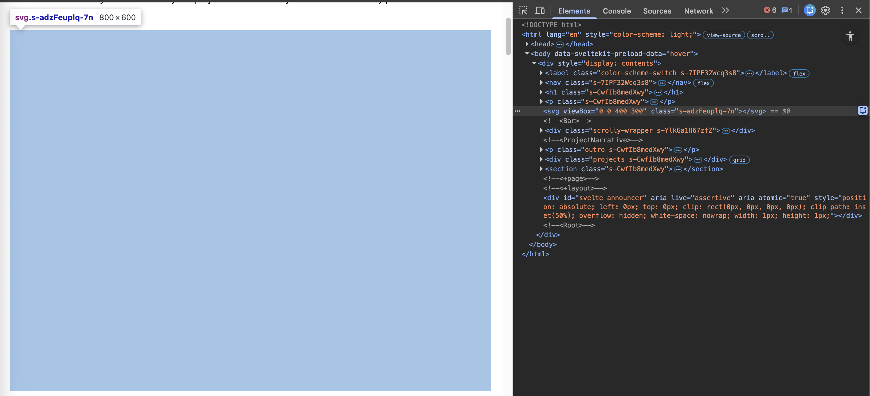
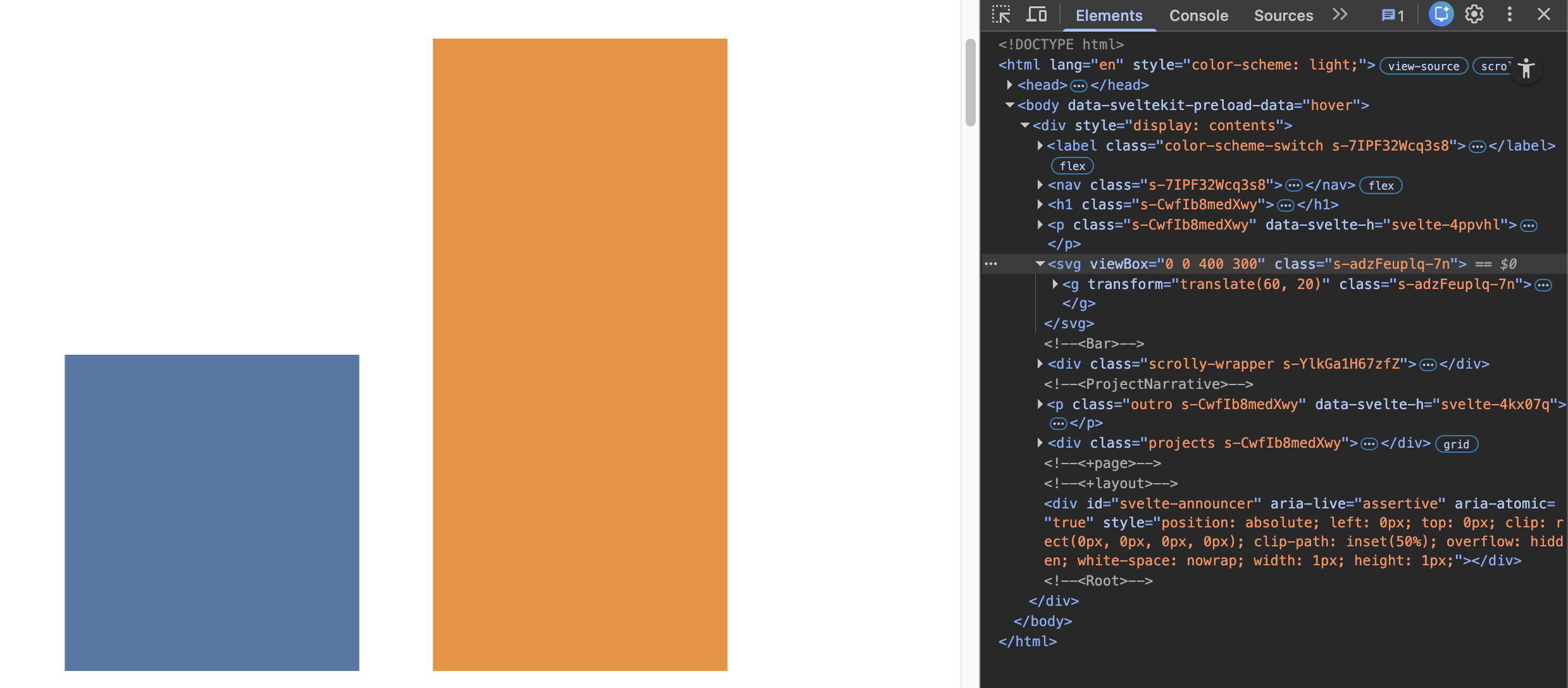
At this point your page will show a blank white rectangle — that is expected! We will start filling it in the next step.
Step 2.3: Draw bars with D3 scales
Let’s draw some actual bars. We will start with two hardcoded data points so we can see something on the screen quickly, and expand to real data later.
Add this to the script block of Bar.svelte:
let data = [
    { label: "A", value: 10 },
    { label: "B", value: 20 }
];
Scales
Before we can draw bars, we need to convert data values into pixel positions. A D3 scale is a function that maps values from a data domain (e.g. 0 to 100) to a visual range (e.g. 0 to 400 pixels). We use scales so that bar lengths and positions are driven by data instead of hardcoded numbers.
For a vertical bar chart we need two scales:
xScalemaps the category labels to horizontal positions. We used3.scaleBand()which divides the available width evenly among the categories and adds padding between bands.yScalemaps the quantitative value (bar height) to vertical pixels. We used3.scaleLinear()since the values are numbers.
We also define margins first, to leave room for axes:
let margin = { top: 20, right: 20, bottom: 30, left: 60 };
let innerWidth  = width  - margin.left - margin.right;
let innerHeight = height - margin.top  - margin.bottom;
Then define the scales as reactive declarations:
$: xScale = d3.scaleBand()
    .domain(data.map(d => d.label))
    .range([0, innerWidth])
    .padding(0.2);

$: yScale = d3.scaleLinear()
    .domain([0, d3.max(data, d => d.value) || 1])
    .range([innerHeight, 0]);

$: colorScale = d3.scaleOrdinal(d3.schemeTableau10)
    .domain(data.map(d => d.label));
Let’s unpack what each scale does:
xScale
.domain(data.map(d => d.label))— the list of category labels, e.g.["A", "B", "C"]. Each label gets its own band..range([0, innerWidth])— divides the available width evenly among the bands, from left to right..padding(0.2)— adds a gap between bands equal to 20% of the band width. Without this, bars would be flush against each other.
yScale
.domain([0, d3.max(data, d => d.value) || 1])— the input range of the scale, from0to the largest value in the data. The|| 1is a fallback in case the data is empty, to avoid a broken scale..range([innerHeight, 0])— maps those values to pixels.
Notice the range for the yScale is reversed: innerHeight corresponds to 0 and 0 corresponds to the maximum value. This is because SVG’s y-axis points downward, so we need to flip it to make bars grow upward.
colorScale
.domain(data.map(d => d.label))— the list of labels that the scale will assign colors to.d3.schemeTableau10is a built-in palette of 10 distinct colors. CallingcolorScale(d.label)returns the CSS color assigned to that label, and will always return the same color for the same label.
The $: prefix marks a reactive declaration in Svelte. These statements automatically re-run whenever their dependencies change (e.g. when data updates), keeping your scales and chart in sync with the data at all times.
Drawing the bars
Each bar in our chart is a <rect> SVG element. A <rect> is defined by four attributes:
xandy— the position of its top-left cornerwidth— how wide it is (this is the band width fromxScale)height— how tall it is (this is what encodes the data value)
We want one <rect> per data point, so we use an {#each} block to loop over data and draw a rectangle for each entry. We use our scales to convert the data values into pixel positions:
x={xScale(d.label)}— asksxScalewhere this label’s band startsy={yScale(d.value)}— asksyScalehow far from the top the bar startswidth={xScale.bandwidth()}— the width of each band (all bands have the same width)height={innerHeight - yScale(d.value)}— the distance from the bar’s top to the bottom of the chart area. This is the trickiest part: sinceyScalealready flips the axis, the bar height isinnerHeightminus the bar’s y position.fill={colorScale(d.label)}— the color assigned to this label
We wrap all the bars in a <g> element shifted by the margins, leaving room for the axes we will add in the next step:
<svg viewBox="0 0 {width} {height}">
    <g transform="translate({margin.left}, {margin.top})">
        {#each data as d}
            <rect
                x={xScale(d.label)}
                y={yScale(d.value)}
                width={xScale.bandwidth()}
                height={innerHeight - yScale(d.value)}
                fill={colorScale(d.label)}
            />
        {/each}
    </g>
</svg>
Save and check your page — you should see two colored bars growing upward from the bottom. They will look a bit bare without axes, but we will add those in the next step.
Step 2.4: Add axes
Without axes, a bar chart is just a collection of colored rectangles — there is no way to read off actual values or understand what the categories are. We need to add a horizontal x-axis showing the category labels and a vertical y-axis showing the quantitative scale.
D3 can generate axes automatically from our scales using d3.axisBottom() and d3.axisLeft(). These functions take a scale and produce tick marks, tick labels, and a baseline line — all as SVG elements injected directly into the DOM.
To do this, D3 needs a reference to the actual DOM elements where the axes will be rendered. In Svelte, bind:this does exactly that: it gives us a variable that points to the real DOM node so D3 can find it and inject content into it.
Start by declaring two empty variables that will hold references to the axis container elements:
let xAxis, yAxis;
Then add two empty <g> elements to your SVG — one for each axis — and bind them to those variables. The x-axis sits at the bottom of the chart area (shifted down by margin.top + innerHeight) and shows the category labels. The y-axis sits at the left edge (shifted right by margin.left) and shows the quantitative values:
<svg viewBox="0 0 {width} {height}">
    <g transform="translate({margin.left}, {margin.top + innerHeight})"
       bind:this={xAxis} />
    <g transform="translate({margin.left}, {margin.top})"
       bind:this={yAxis} />
    <g transform="translate({margin.left}, {margin.top})">
        {#each data as d}
            <rect ... />
        {/each}
    </g>
</svg>
The axis <g> elements must come before the bars <g> in the markup. SVG paints elements in document order, so anything that appears later is drawn on top. We want the bars on top of the axes, not the other way around.
Now add a reactive block that tells D3 to render the axes into those elements whenever the scales change:
$: if (xAxis && yAxis) {
    d3.select(xAxis).call(d3.axisBottom(xScale));
    d3.select(yAxis).call(d3.axisLeft(yScale));
}
Let’s unpack what this code does:
$: if (xAxis && yAxis)— we wrap this in a reactive block so it re-runs wheneverxScaleoryScalechange. Theifguard ensures we only run this after the<g>elements exist in the DOM (i.e. after the component has mounted).d3.select(xAxis)— selects the DOM node we bound toxAxisso D3 can operate on it..call(d3.axisBottom(xScale))—d3.axisBottom()creates an axis generator configured to draw a bottom-oriented axis fromxScale. SincexScaleis now ascaleBand, D3 will automatically place one tick label per category.d3.axisLeft(yScale)— same idea, but for a left-oriented axis fromyScale, which now shows the quantitative values.
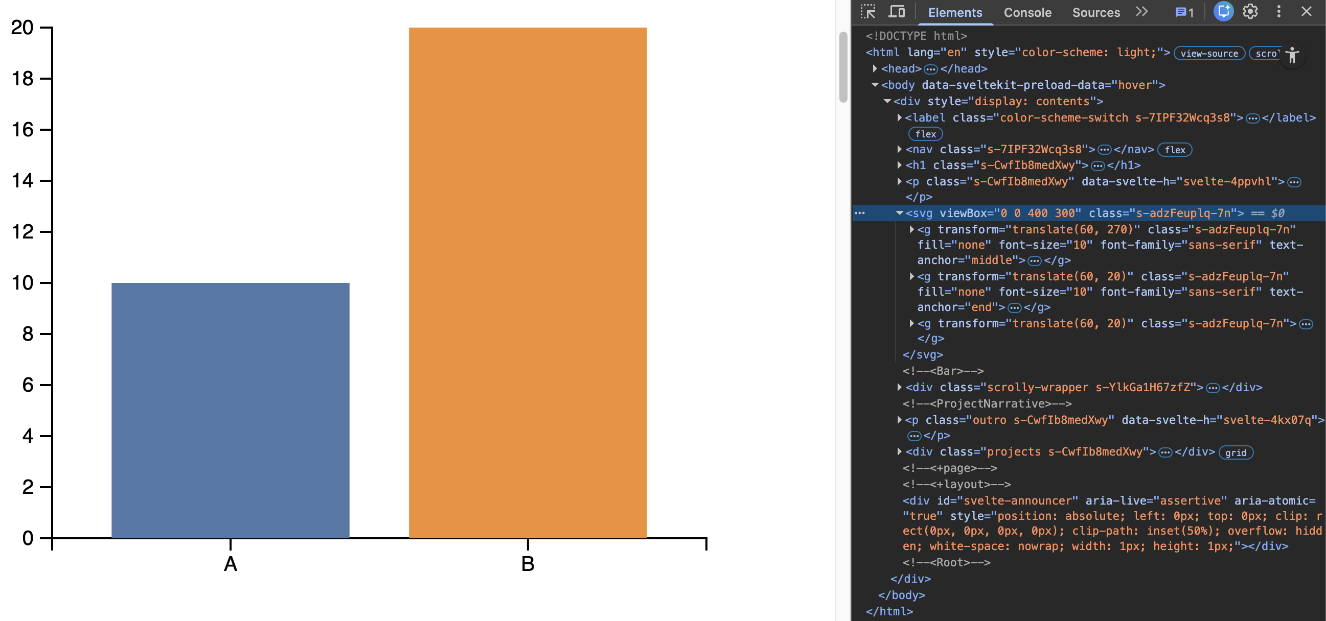
Save and check your page — you should now see category labels on the x-axis and numeric tick marks on the y-axis.
Step 2.5: More data and colors
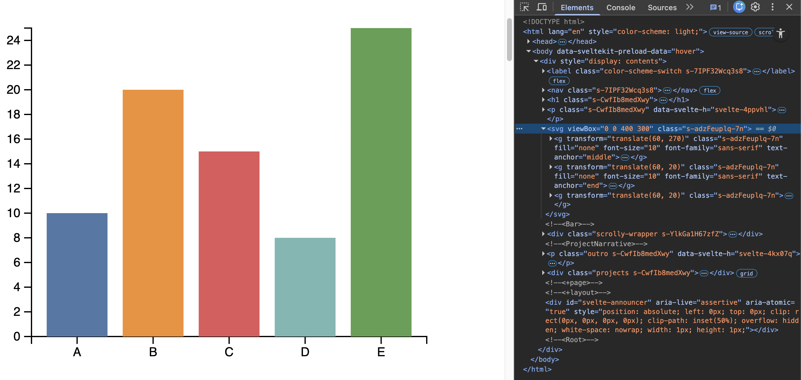
Two bars is a good start, but let’s verify the chart works with more data. Replace the hardcoded data array with this:
let data = [
    { label: "A", value: 10 },
    { label: "B", value: 20 },
    { label: "C", value: 15 },
    { label: "D", value: 8 },
    { label: "E", value: 25 }
];
The chart should automatically adjust — the y-axis will grow to accommodate the new categories, and each bar will get a distinct color from the colorScale. This is the reactive system at work: because xScale, yScale, and colorScale are all declared with $:, they re-run whenever data changes.
The d3.schemeTableau10 color scheme provides 10 distinct colors. If you have more than 10 categories the scheme will repeat — you can explore other schemes in the D3 scale-chromatic docs.
Step 2.6: Add a legend
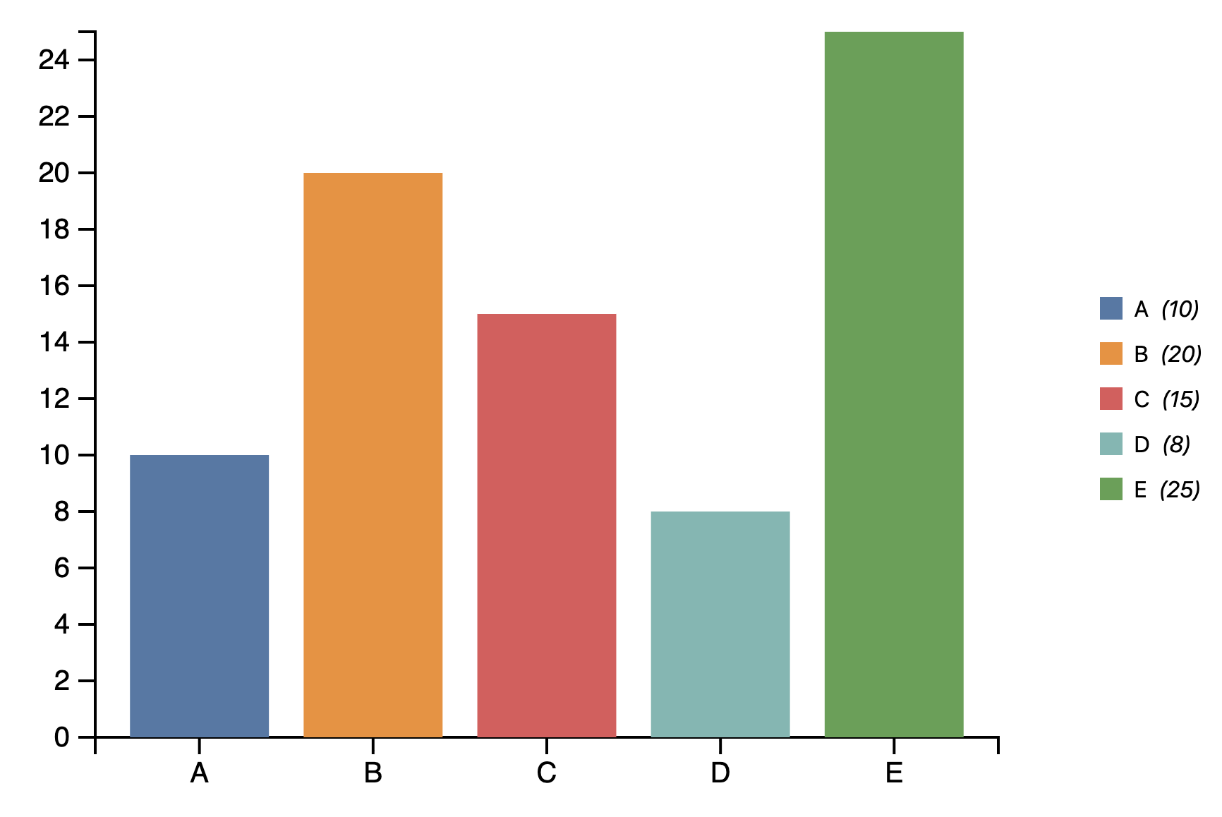
The colors returned by colorScale are plain CSS colors, so we can build the legend with regular HTML and CSS — no extra D3 needed.
Wrap both the <svg> and the legend in a container <div>, and add a <ul> with one <li> per data point. We pass the color via a CSS custom property --color so the swatch can pick it up:
<div class="container">
    <svg viewBox="0 0 {width} {height}">
        <!-- axes and bars as above -->
    </svg>
    <ul class="legend">
        {#each data as d}
            <li style="--color: {colorScale(d.label)}">
                <span class="swatch"></span>
                {d.label} <em>({d.value})</em>
            </li>
        {/each}
    </ul>
</div>
Now style it in your <style> block. You have freedom here, but aim for:
.container—display: flexso the chart and legend sit side by side.legend—flex: 1so it fills available width, making it responsive.swatch— a small square withbackground-color: var(--color)li—display: flexwithalign-items: centerso the swatch and text are vertically aligned
To honor the design principle of Proximity, use a smaller gap between the swatch and label inside each <li> than the gap between items in the legend grid.
Step 3: Plotting actual project data
So far our bar chart has been using hardcoded data defined inside Bar.svelte itself. This was useful for building and testing the chart in isolation, but it means the component is only useful for one specific dataset.
In this step we will make the chart reusable by turning data into a prop, and then drive it with real data from your projects — specifically, the number of projects per year. This is also where the d3.rollups() pattern from Step 1 pays off: we will use the exact same function to transform your project list into the shape the bar chart expects.
Step 3.1: Make data a prop
A prop is a variable declared with export, which tells Svelte that its value should come from outside the component rather than being defined inside it.
In Bar.svelte, replace the hardcoded data array with this single line:
export let data = [];
The = [] is the default value — if no data is passed in, the component will render an empty chart rather than crashing.
If you save now, the bar chart will disappear from the page since no data is being passed in yet. That is expected — we will fix that in the next step.
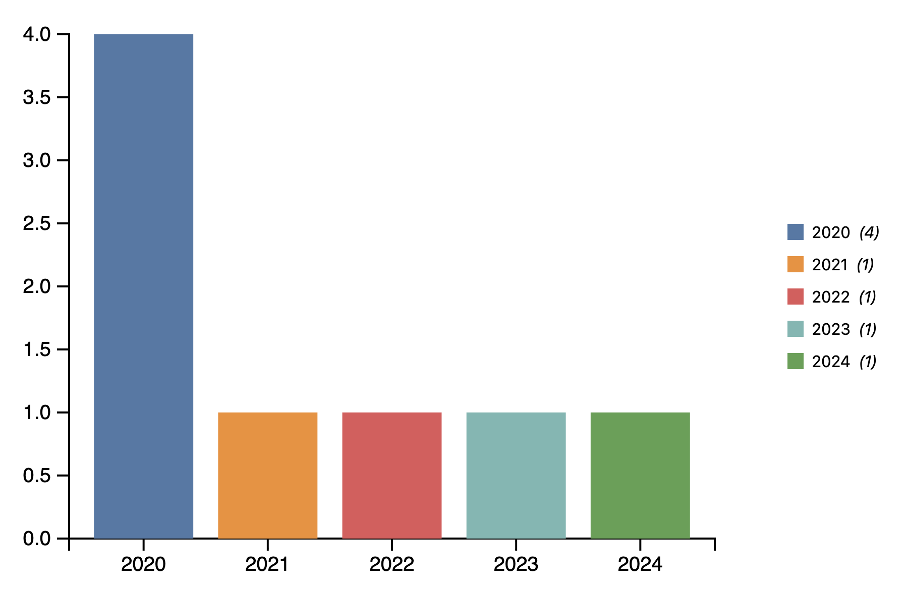
Step 3.2: Pass project data (projects per year)
Now we need to compute the data to pass to <Bar>. We want one bar per year, where the bar length represents the number of projects in that year. In other words, we need to group our projects by year and count how many fall into each group.
This is exactly the d3.rollups() pattern from Step 1 — the only differences are the dataset (projects instead of rawData) and the reducer (v => v.length to count rows instead of summing a value).
Add this reactive declaration to your projects page script block:
$: barData = d3.rollups(projects, v => v.length, d => d.year)
    .map(([year, count]) => ({ label: String(year), value: count }));
Let’s unpack what this code does:
d3.rollups(projects, v => v.length, d => d.year)— groups the projects array by year, and for each group counts the number of rows withv => v.length. The result is an array of[year, count]pairs, e.g.[["2024", 3], ["2023", 4], ["2022", 2]]..map(([year, count]) => ({ label: String(year), value: count }))— converts each[year, count]pair into the{ label, value }shape that<Bar>expects.
We convert the year to a string with String(year). scaleBand expects categorical (string) values — if years come from JSON as numbers, passing them directly can cause subtle bugs, so converting to string is safer.
Then pass it to the <Bar> component in your template:
<Bar data={barData} />
Save and check your page — the bar chart should now show one bar per year in your project data, with the bar length reflecting how many projects exist in that year.
Step 3.3: Styling and finishing touches
Our bar chart is functional, but there are a few things worth polishing before we call it done.
Fix the y-axis tick format
Look at your y-axis — you may notice it shows decimal numbers like 0.5, 1.5, etc. This happens because D3 automatically chooses tick intervals, and with a small number of projects it may land on fractional values. Since a project count is always a whole number, showing decimals is misleading and looks unprofessional. We want to force the ticks to show only whole numbers, and only draw tick marks where a label actually appears.
Update your reactive axis block:
$: if (xAxis && yAxis) {
    d3.select(xAxis).call(d3.axisBottom(xScale));
    d3.select(yAxis).call(
        d3.axisLeft(yScale)
            .tickFormat(d => Number.isInteger(d) ? d : "")
            .tickValues(d3.range(0, d3.max(data, d => d.value) + 1))
    );
}
.tickFormat(d => Number.isInteger(d) ? d : "")— for each tick valued, if it is a whole number we show it, otherwise we return an empty string which hides the label entirely..tickValues(d3.range(0, d3.max(data, d => d.value) + 1))— instead of letting D3 choose where to place ticks automatically, we explicitly provide one tick per whole number from0up to the maximum value in the data. This means tick marks only appear where a label is actually shown, with no phantom ticks at fractional positions.
Add a chart title
A chart without a title forces the reader to figure out what they are looking at from context alone. Adding a title makes the chart self-contained — someone can glance at it and immediately understand what it shows without reading the surrounding text.
We add a <text> element inside the SVG to serve as the title. SVG has its own text element which we can position and style directly:
<text
    x={margin.left + innerWidth / 2}
    y={margin.top / 2}
    text-anchor="middle"
    class="chart-title">
    Projects per Year
</text>
x={margin.left + innerWidth / 2}— centers the title horizontally over the chart area.y={margin.top / 2}— positions it in the top margin space, above the bars.text-anchor="middle"— aligns the text around its center point rather than its left edge, which is what makes the centering actually work.
Style it in your <style> block:
.chart-title {
    font-size: 1em;
    font-weight: bold;
    fill: currentColor;
}
Add axis labels
Even with tick marks, a reader should not have to guess what the axes represent. Axis labels make the units and variables explicit — is the y-axis counting projects, people, dollars? Without a label, the reader has to infer it. With one, the chart speaks for itself.
We add axis labels as <text> elements, one per axis, placed inside the <g> that handles the margin translation:
<!-- x-axis label -->
<text
    x={innerWidth / 2}
    y={innerHeight + margin.bottom + 10}
    text-anchor="middle"
    class="axis-label">
    Year
</text>

<!-- y-axis label -->
<text
    x={-(innerHeight / 2)}
    y={-margin.left + 30}
    text-anchor="middle"
    transform="rotate(-90)"
    class="axis-label">
    Number of Projects
</text>
The x-axis label is straightforward — centered horizontally below the axis. The y-axis label is trickier because it needs to run vertically alongside the axis, so we rotate it by -90 degrees. An important consequence of rotate(-90) is that the x and y coordinates are also rotated, so:
x={-(innerHeight / 2)}— after rotation, this controls the vertical position and centers the label along the axis heighty={-margin.left + 15}— after rotation, this controls how far left of the axis the label sits
Style both labels in your <style> block:
.axis-label {
    font-size: 0.8em;
    fill: currentColor;
}
Save and check your page — you should now have a titled, labeled bar chart with clean integer tick marks on the y-axis.
Step 3.4: Adding an annotation
Our bar chart now looks clean and readable, but we can make it even more informative by highlighting a specific data point with an annotation. Annotations draw the reader’s attention to something noteworthy — in this case, the year with the most projects.
Find the year with the most projects
First we need to find which bar has the highest value. We can use d3.greatest() from the d3-array module, which scans an array and returns the element with the highest value according to an accessor function — consistent with the D3 wrangling pattern we have been using throughout this lab.
Add this reactive declaration to your Bar.svelte script block:
$: maxBar = d3.greatest(data, d => d.value);
Let’s unpack what this does:
data— the array of{ label, value }objects we are already using to draw the bars.d => d.value— the accessor function that tellsd3.greatest()which field to compare. It will scan every bar and return the full{ label, value }object for the one with the highestvalue.
d3.greatest() is the counterpart of d3.least(), which returns the element with the lowest value. Both are part of the d3-array summarization helpers we used in Step 1 alongside d3.sum() and d3.mean()
Draw the annotation
Now we can use maxBar to draw three things on the chart: a highlight outline around the tallest bar, a leader line pointing out from it, and a text label at the end of the line. This approach keeps the annotation text out of the crowded chart area and makes it easy to read without overlapping the title or axes.
First, increase margin.right to give the annotation text enough room on the right side of the chart:
let margin = { top: 40, right: 150, bottom: 80, left: 60 };
Then add the following inside the margin <g>, after the {#each} block that draws the bars:
{#if maxBar}
    <!-- highlight outline around the tallest bar -->
    <rect
        x={xScale(maxBar.label)}
        y={yScale(maxBar.value)}
        width={xScale.bandwidth()}
        height={innerHeight - yScale(maxBar.value)}
        fill="none"
        stroke="currentColor"
        stroke-width="2"
    />
    <!-- leader line -->
    <line
        x1={xScale(maxBar.label) + xScale.bandwidth()}
        y1={yScale(maxBar.value) + (innerHeight - yScale(maxBar.value)) / 2}
        x2={xScale(maxBar.label) + xScale.bandwidth() + 30}
        y2={yScale(maxBar.value) + (innerHeight - yScale(maxBar.value)) / 2}
        stroke="currentColor"
        stroke-width="1"
    />
    <!-- annotation text at end of leader line -->
    <text
        x={xScale(maxBar.label) + xScale.bandwidth() + 35}
        y={yScale(maxBar.value) + (innerHeight - yScale(maxBar.value)) / 2}
        dominant-baseline="middle"
        class="annotation">
        Year with most projects
    </text>
{/if}
Let’s unpack what this code does:
- The
<rect>draws a transparent outline on top of the tallest bar usingfill="none"and a solidstroke, sitting perfectly on top of the bar by reusing the same position and size calculations. - The
<line>draws the leader line starting at the right edge of the bar (x1={xScale(maxBar.label) + xScale.bandwidth()}) and extending30pxto the right. Bothy1andy2are set to the vertical midpoint of the bar:yScale(maxBar.value) + (innerHeight - yScale(maxBar.value)) / 2. - The
<text>starts35pxfrom the bar edge (5px more than the line) to leave a small gap between the line tip and the text.dominant-baseline="middle"vertically centers the text on the line. {#if maxBar}— guards against errors ifdatais empty on first render, whenmaxBarwould be undefined.
Add the annotation style to your <style> block:
.annotation {
    font-size: 0.7em;
    fill: black;
    font-style: italic;
}
Save and check your page — the tallest bar should now have a black outline with a leader line and label pointing out from its right side.
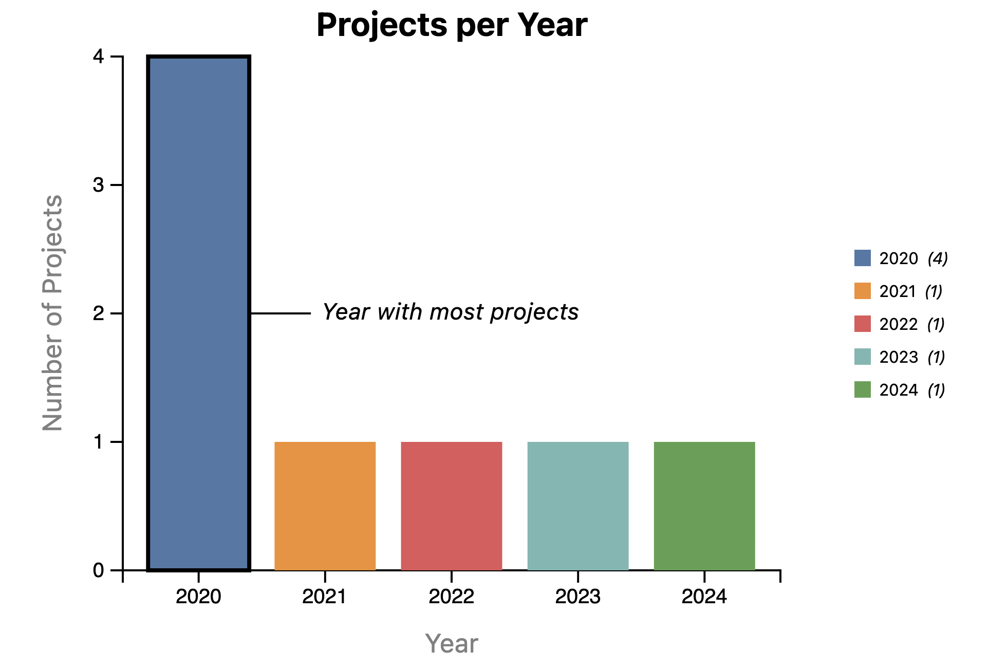
Depending on your project data, the annotation may still overlap with other bars or run outside the chart area. If this happens, adjust the margin.right value in your Bar.svelte script block to give more space, or change the +30 and +35 offset values in the <line> and <text> elements to move the annotation further from the bar.
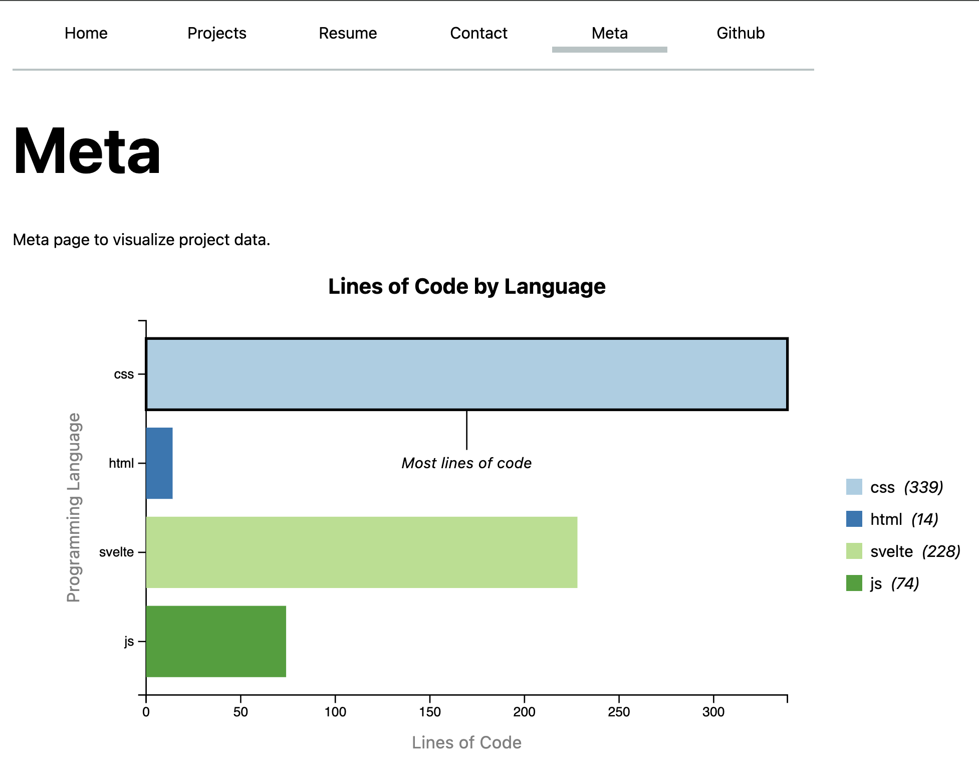
Step 4: Independent exercise — Lines of code by language
You now have all the tools you need to build a bar chart from scratch. In this step you will apply everything your learnt from Steps 1-3.
Your goal is to display a horizontal bar chart on your Meta page (src/routes/meta/+page.svelte) showing the number of lines of code per programming language in your codebase, using the loc.csv file you generated in Step 0.2.
Step 4.1: Load the data
The data lives in loc.csv, which you already have in your static folder. This time we will load it with d3.csv() instead of d3.json(). d3.csv() works exactly like d3.json() with one important difference: every value in a CSV file is read as a string by default, including numbers. To fix this, pass a row conversion function as a second argument.
We also need to import base from SvelteKit’s $app/paths module. When deployed to GitHub Pages, your site lives at a URL like https://username.github.io/repo-name/ — using /loc.csv directly would look for the file at the root of the domain and fail. base gives us the correct path prefix automatically, and is empty during local development so nothing changes there.
import { base } from '$app/paths';
import { onMount } from 'svelte';
import * as d3 from 'd3';

let locData = [];

onMount(async () => {
    locData = await d3.csv(`${base}/loc.csv`, row => ({
        ...row,
        line: Number(row.line),
        length: Number(row.length),
        depth: Number(row.depth)
    }));
});
Check your browser console to verify the data loaded correctly. The type field contains the programming language for each row (e.g. "css", "js", "svelte", "html"). This is the field you will group by.
The ...row spread operator copies all fields from the row as-is, and then we override only the numeric fields. Any field you do not explicitly convert will remain a string — which is fine for type, file, and other categorical fields.
Step 4.2: Wrangle and visualize
Using the patterns from Steps 1–3, build a horizontal bar chart that shows the total lines of code per language. Display it on your Meta page.
A few guidelines:
- Use
d3.rollups()to grouplocDatabytypeand count the rows per group usingv => v.length— each row represents one line of code, so counting rows gives you lines per language - Create a new component
src/lib/BarHorizontal.svelte— think carefully about how the scales, rect attributes, and axis positions change compared to the verticalBar.sveltefrom Step 2 - Make
dataa prop so the component is reusable - Add title and axes to your bar chart
- Include a legend using the same pattern as Step 2.6
- Add an annotation highlighting the language with the most lines of code
- Pass the wrangled data to
<BarHorizontal>from the Meta page
For a horizontal bar chart, xScale maps the quantitative value to horizontal pixels (d3.scaleLinear) and yScale maps the categories to vertical positions (d3.scaleBand). The <rect> attributes change accordingly — refer back to the scale explanations in Step 2.3 if you get stuck.
The expected result should look something like this:
Step 4.3: Generating loc.csv on GitHub
You may notice that after deploying to GitHub Pages, the bar chart on your Meta page is empty or broken. This happens because loc.csv is excluded from your committed files via .gitignore — so while it exists on your local machine, GitHub has no idea it exists.
To fix this, we need to tell GitHub to generate the file automatically as part of the deployment process. Open your .github/workflows/deploy.yml file and add the following new step between the “Install dependencies” step and the “build” step:
      - name: Generate loc.csv
        run: npx elocuent -d static,src -o static/loc.csv
If you’re on Windows, put static,src in quotation marks: "static,src"
Commit and push the updated workflow file. GitHub will now generate loc.csv fresh on every deployment, and your Meta page bar chart should appear correctly on the live site.