Assignment 3: Visualization Critique & Redesign
In the previous assignment, you created a large number of visualizations but likely stuck with the default design choices the software package (e.g., Tableau) made. In this assignment, you will instead focus much more intently on design choices by critiquing a well-known visualization, and developing a redesign first through a series of sketches, and then through a final, polished version. By the end of this assignment, you should be able to justify the contribution of every element of a visualization.
Due: Wednesday 2/25, 11:59 pm ET
Request Slack days →
Submit on Canvas →
Table of contents
Why does design matter? Case studies and research have shown that seemingly-minor design choices (e.g., the color palette that is used or switching from color to position encodings) can have a large impact on the accuracy and kinds of inferences readers make with charts. While many modern visualization tools strive to create perceptually effective charts by default, producing an effectively designed visualization still requires careful thought about the target audience, the intended takeaway or message you wish to communicate, and any domain-specific or cultural communication norms.
So, how do we become better designers? One way is to expose ourselves to lots of different (well- and poorly-designed) examples, and analyzing their strengths and weaknesses—a practice called “critique” or “crits” in many design fields. Colloquially, “critique” suggests being negative; in design work, however, we use “critique” to mean a more generative process: a serious discussion of how to improve a piece of work, pushing it to be the best version it could be. And, as pathbreaking visualization designers Fernanda Viégas and Martin Wattenberg describe, visualization is a unique kind of design discipline because our critiques can extend beyond qualitative descriptions: we can concretely redesign a visualization to explore the impact of alternate design choices.
The Original Visualization
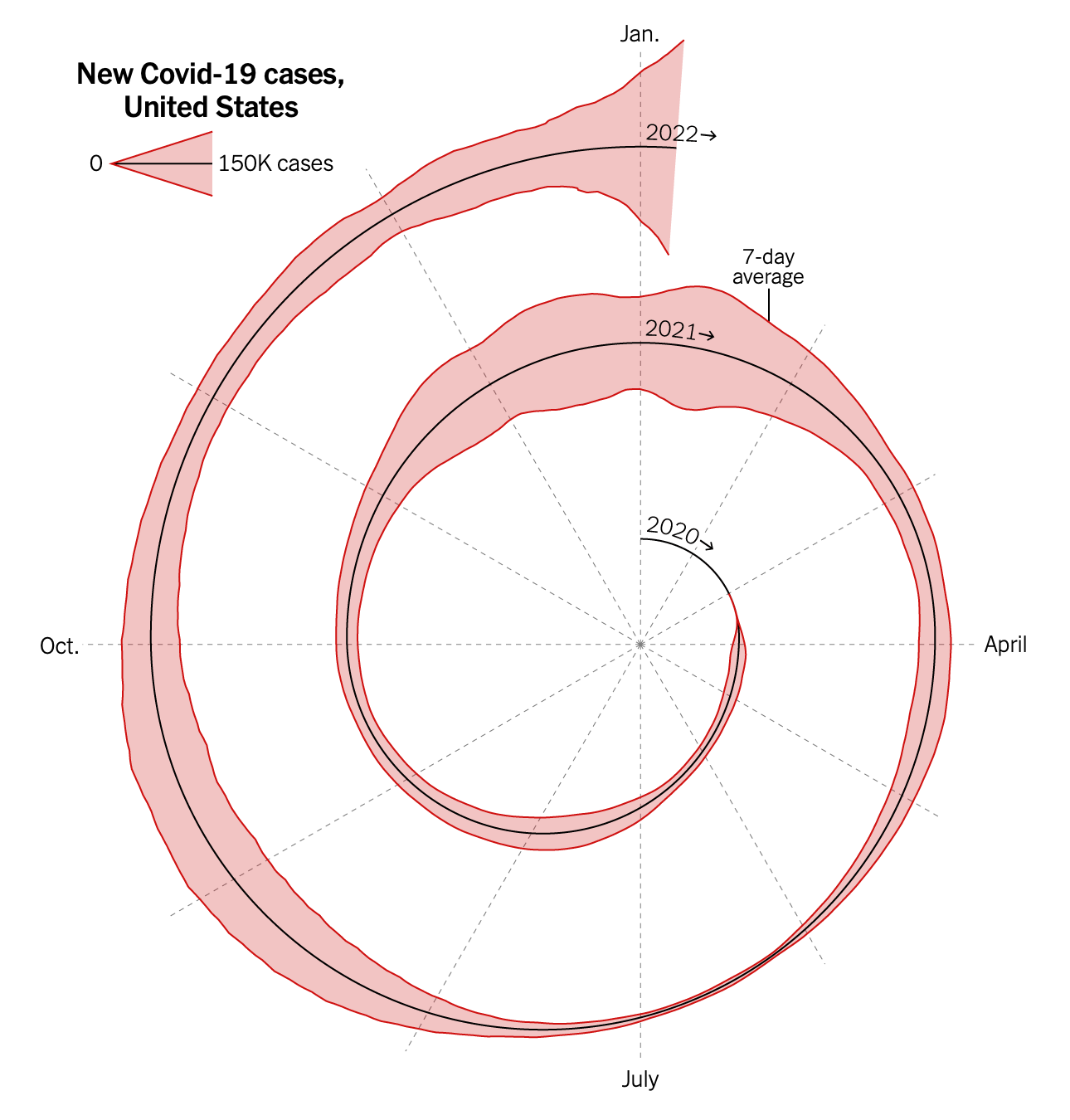
At the peak of the Omicron variant of the COVID-19 pandemic, the New York Times published an opinion article by Dr. Jeffrey Shaman, an infectious disease modeler and epidemiologist at Columbia University whose team built one of the first models of COVID-19. The article lead with the following, widely-discussed data visualization:
Your Tasks
-
Read the visualization to understand what it is seeking to depict. Bullet point a few insights about the data that you’re able to decipher (e.g., peaks and troughs, trends or patterns, etc.).
-
Critique the visualization design. Remember, the goal of a critique isn’t to be negative but rather to describe what is working in addition to how you think the design could be improved. As a result, think about what the visualization does well before getting into how it might be improved (and try not to nitpick!). To help, consider the following prompts (and we encourage you to read the original opinion article to more rigorously grapple with the context the visualization was published within):
- Are expressive and effective visual encodings used?
- How well do they reveal the most important features or trends of the underlying data?
- Is important data easily seen, or is it unnecessarily “hidden”?
- Is the target audience likely to understand the visualization?
- Are the takeaway message(s) for the intended audience clear and crisp?
- Are elements appropriately titled or labeled?
- Is there appropriate spacing, layout, legible type, and other forms of design styling?
- Is it clear where/how to begin reading the design?
Your critique should be 1–2 paragraphs long.
-
Sketch 3 visualizations (with pen and paper!) to explore diverse ways that you can address the issues that you raise in your critique. Think about not only minor tweaks (e.g., color, font, etc.) but larger-scale changes as well (e.g., different visual forms). As with the sketching you did in A1, don’t forget to include titles, axis labels or legends as needed.
For each sketch, bullet point your rationale for your design decisions. What was your motivation behind generating this sketch? What were you hoping it would communicate? What worked well and what didn’t? What would you like to explore in the next sketch?
-
Design a fourth visualization. This visualization is your final design for this assignment: it should be your best attempt to clearly communicate the data and takeaway message to the intended audience by making judicious use of both visual design and narrative techniques described in class (i.e., appropriate visual encoding choices, effective use of space, highlighting, annotation, etc.). As a result, it should not be a sketch but rather, you should use a visualization tool (or combination of tools) such as Tableau, Datawrapper, Flourish, Microsoft Excel, Google Sheets, Adobe Illustrator, PowerPoint/Keynote, or Paint.
We strongly recommend iterating on or synthesizing across the ideas you explored in your sketches. But you may also start from scratch and/or draw on inspiration from other sources. In the latter case, your write up must justify why you opted to start fresh.
Dataset: COVID_US_cases.csv
Source: Google Covid-19 Open DataThis dataset contains a few more attributes than the original visualization to give you a larger design space to explore for your final design.
While you must use the dataset given, you are free to transform the data as necessary. Such transforms may include (but are not limited to) log transformations, computing percentages or averages, grouping elements into new categories, subsetting the data to focus on a particular aspect, or removing unnecessary variables or records. You are also free to incorporate external data as you see fit.
Your submission should consist of a single chart. This means that visualizations that concatenate together many different charts (e.g., a dashboard) are out of scope. However, small multiple displays (i.e., using the same chart but horizontally or vertically faceting across a nominal or categorical data field) are acceptable.
Your chart image should be interpretable without consulting your writeup. Do not forget to include a title, axis labels or legends as needed!
-
Include a 2-paragraph final writeup that:
-
Provides a rigorous rationale for your design decisions. As different visualization designs can emphasize different aspects of a dataset, your writeup should document what aspects of the data you are attempting to most effectively communicate. In short, what message are you trying to convey?
Document the visual encodings you used and why they are appropriate for the data and your specific message. These decisions include the choice of visualization (mark) type, size, color, scale, and other visual elements, as well as the use of sorting or other data transformations. How do these decisions facilitate effective communication? Just as important, also note which aspects of the data might be obscured or down-played due to your visualization design.
-
Reflects on how your final design does or does not address the critiques you surfaced in Step 2. Did the process of “critique by redesign” help you identify some of the challenges of communicating this data, and perhaps some design tensions or tradeoffs (i.e., that you weren’t able to address all the critiques you had initially levied?).
-
Submission Details
Your final submission should take the form of an HTML webpage that consists of your sketches, final visualization, and associated write-ups. To help you put this page together, we’re providing a basic HTML template for you to fill in. You will need to edit the HTML page to add your captions and correctly link your images (for simplicity, we recommend exporting image files to the same local directory as your HTML file).
Please deploy your HTML report to a publicly accessible URL. We recommend GitHub Pages (as described in Lab 1, Part 2) but you are welcome to use any platform of your choice. If you are participating in the labs, your A3 submission can be part of your portfolio (e.g., a subdirectory). Once deployed, please double check that your web page is appearing and rendering correctly at the publicly-accessible URL (e.g. that there are no broken images or links).
Finally, submit this URL on Canvas by the due date: Wednesday 2/25, 11:59 pm ET. You may use up to 3 slack days to extend this deadline (provided you fill out the request form before the deadline).
Grading
The assignment score is out of a maximum of 15 points. Submissions that squarely meet the requirements (i.e., the “Satisfactory” column in the rubric below) will receive a score of 12/15 (80%). We will use the following rubric to grade your assignment. We will determine scores by judging the diversity and creativity of your sketches, the soundness of your ultimate design, and the quality and crispness write-ups. We will also look for consideration of the audience, message, and intended task.
Doing well in this assignment does not require you to be artistic. Rather, high-scoring submissions will demonstrate careful and thorough attention to design detail and robust rationale for design choices.
| Component | Excellent | Satisfactory | Poor |
|---|---|---|---|
| Critique (15%) | Thoughtful critique offers actionable prompts for future design exploration that demonstrate an understanding of the constraints and/or tradeoffs of the original visualization and its publication context. | A well-written critique offers concrete suggestions of design improvements, but the critique could more deeply consider aspects of the visualization context (e.g., publication medium, intended audience, etc.). | Critique is high-level or relatively shallow, and doesn’t offer many concrete directions for design improvements. |
| Sketches (10%) | Sketches explore a diverse range of designs that go well-beyond standard chart types. | Sketches cover a good range of design choices. They exhibit some exploration beyond standard chart types, but could have pushed further in terms of alternate mark types, visual channels, or annotation. | Sketches cover a relatively narrow portion of the design space, largely retreading the standard chart types. |
| Final Design: Mark, Encoding, and Data Transforms (30%) | Visual design and data transformation have been used effectively to produce an insightful visualization with a clear takeaway message. | Visual encoding and data transformation choices are largely expressive and effective, but some issues hinder accuracy or comprehension. | Inexpressive or ineffective mark, encoding, or data transformation choices have produced a distracting or potentially misleading visualization. |
| Final Design: Titles, Labels, and Annotations (25%) | Titles, labels, and annotations helpfully describe and contextualize the depicted data. | Necessary titles and labels are present, but they could provide more context. | Several titles or labels are missing, or do not provide human-understandable information. |
| Sketches & Final Design: Design Rationale and Reflection (20%) | Well crafted write-ups provide reasoned justification for all design choices with a thoughtful reflection on the impact of phase one sketches. | Most design decisions are described, but rationale or impact of phase one sketches could be explained at a greater level of detail. | Missing or incomplete. Several design choices or impacts of phase one sketches are left unexplained. |
| Creativity and Originality (+5%) | You exceeded the parameters of the assignment, with original insights or a particularly engaging design. | You met all the parameters of the assignment. | – |