Project Pitch
Project pitches kick off the Final Project phase of this class! You will conduct additional EDA around your subtheme and, based on the results, you will sketch out a series of wireframes to help you plan and outline your final project (including helping you organize and divide work between your team members). You’ll pitch your analysis results and wireframes to the class to get feedback from your peers, the staff, and experts on housing policy.
Due: Mon, 3/16, 1:00pm ET
Submit on the Google Sheet →
In-Class Presentations on Mon 3/16 and Wed 3/18.
Table of contents
Over the remainder of the semester, you will work in teams of approximately 4 people to build an interactive narrative visualization that addresses a question on one of the subthemes about housing affordability in Greater Boston. Teams may pursue a final project topic that is not one of the six subthemes, with the caveats that 1) it still needs to relate to housing affordability in Greater Boston and 2) you need to get instructor approval.
The interactive narrative visualization you make—how it is structured and designed—will be entirely up to you and your teammates. For instance, you might follow a strongly author-guided narrative (e.g., a scrolly or stepper slideshow), be fully reader-driven (e.g., an interactive data dashboard), or lie somewhere in-between (i.e., the “martini glass” structure).
The final project will unfold over a sequence of milestones to give you plenty of opportunities to get feedback on your progress from the teaching staff as well as your peers. Pitch Day is the first milestone, and is designed to help you get feedback on your project idea, allowing teaching staff to help provide feedback on potential data, scoping, and research questions. The more effort you put into the presentation, the more you will get out of the result.
Remember, this is not your final project presentation—so your ideas don’t need to be fully polished! Rather, think of pitch day as a great moment to experiment with ideas you might like to focus on for your final project. You will have plenty of time over the rest of this semester to change and develop it.
Your Tasks
-
For your chosen subtheme, conduct data exploration & analysis to first, identify a question you would like to explore as part of your final project; and, then, second systematically delve into the dataset(s) so as to thoroughly address this question. What aspects of the data reveal the most interesting discoveries or stories? Do not feel obligated to try to convey everything about the data: focus on a compelling subset.
Conduct sufficient exploration and analysis such that, at the end of this task, you have a clear idea of what the takeaway insights from your final project be for your target audience, and how you will use the data to support your arguments. Moreover, you should have this data ready for use in building out your final project including cleaning, shaping, and transforming it as necessary.
Since A2, we have released additional data for the subthemes as well as collated links to current policies under debate related to the subtheme. These datasets are available in a new Google Drive folder. Please tell us if you don’t see a dataset listed on the subtheme pages.
-
Wireframe your final project. Think of wireframes as visual outlines: they should communicate the overall narrative structure, visual layout, and interactive flow of your project by providing a step-by-step walkthrough of its main features (for this reason, wireframes are sometimes known as storyboards).
What is the arc of your narrative, and what are the main story beats? How many different visualizations will you have, and how do they correspond to the narrative beats? How will the visualizations and narrative pieces be laid out, and how will users navigate between them?
Then go one step deeper and consider the specific design and capabilities of the visualizations—for example, what kinds of interactive or animation techniques might you use to make things more engaging, and what visualizations remain static? What narrative structure or genre will you be following? How will you use highlights, annotations, or other narrative features intended to draw attention to particular items of interest and provide additional context?
We encourage you to do this walk-through from the perspective of your target audience. For instance, what device will they use (mobile or website)? What should the takeaway insights or messages be for them, and how is that conveyed at each step?
You are free to use any tool you’d like to construct the wireframes. We recommend hand-drawn sketches (akin to those you drew for A1 and A3) but, in the past, students have also used Figma. Use the tool that is easiest for your team to collaborate, and focus on conveying the high-level ideas, structure, and flow of your project. You could also consider combining tools (e.g., hand-drawn sketches of the visualizations assembled into a Figma wireframe).
-
Conduct a visual design study. Whereas the wireframes focus on structure, layout, and flow, a visual design study instead helps you establish the “look and feel” of your final project–namely, what fonts and colors will you use, and how do they also help communicate the takeaway message(s) to your intended audience?
Look through a diverse range of visual media (including photographs, screenshots, magazines, newsprint, graphic novels, etc.) and assemble two slides of inspiration focusing on typography and color respectively. On each slide, collage together examples that you find particularly inspiring, and then use the margins to extract or annotate particular design choices you might be interested in exploring (e.g., specific color palettes and font families, or characteristics that you find interesting such as serifs, tall/short x-heights, etc.). We provide an example of a slide focusing on color in the advice section at the bottom of this page.
-
Put together a 5-minute pitch presentation. The goal of these presentations will be to provide you with feedback to improve your projects—we will be inviting outside critiques (including from MAPC staff) to offer their suggestions for your projects. Your pitch should cover the following content:
-
On your title slide, include the names of all members of your team, include the subtheme you have chosen, and crisply state the question you are interested in exploring in the final project.
-
(~1 min) Your motivation for addressing this question. For instance, consider showing highlighted screenshots/clippings from the background readings (or other news articles you have found). Or, if your motivation stems from your experiences or stories you’ve heard from friends and family, consider how you can communicate this through slides.
-
(~1 min) Who is your audience, and what is the purpose or goal of the narrative visualization you hope to construct? For instance, are you trying to help policymakers identify particular issues that need to be addressed? Or, are you hoping to communicate to the general public to raise their awareness about an issue? Or, are you trying to make a case to a specific subgroup, e.g. suburban homeowners?
It is essential that you have a clear audience for your data visualization as it will help you determine how to frame and communicate the data. For instance, if your audience is more knowledgeable about the topic, perhaps you’re able to dive into the specifics more directly. On the other hand, if you’re speaking to a more general audience, perhaps you need to convey more background first. If your audience may be skeptical of your narrative, you may have to work to dispel some common myths they might hold (e.g. “building housing for families with schoolage children will be a drain on town resources”).
-
(~1 min) Summarize the main results from your data analysis (e.g., via screenshots) and describe what the key takeaway message(s) for your target audience will be.
Include your fuller set of results (as well as their captions) as hidden/skipped slides at the end of your presentation such that the course staff can grade them and give you additional feedback.
-
(~2 mins) Walk us through your wireframes and visual design study. We encourage you to do so by simulating your target audience—i.e., how are they meant to experience things? What do they see first? What must they then do to get to the next view? And so forth.
-
You are welcome to either pre-record your presentation, or deliver your presentation live.
An important portion of your grade will be devoted to the quality of your presentation. Thus, we strongly encourage you to practice your pitch a couple of times to make sure you are able to deliver you material clearly, smoothly, and within the alloted 5 minutes. This is especially important if you choose to deliver your presentation live—we will cut you off after 5 minutes to help us stay on schedule.
We will be announcing presentation order a week ahead of time and, given the size of the class, we are likely to be split between a few different rooms. If you have any scheduling conflicts or obligations with lecture on Mon 3/16 or Wed 3/18 that we should take into account when planning presentation orders, please let the course staff know as soon as possible.
Grading
This milestone is worth 30 points. Pitches that squarely meet the criteria (i.e., the “Satisfactory” column in the rubric below) will receive a score of 24/30 (80%). We will use the following rubric to grade your assignment. We will determine scores by judging how well you define and motivate the question you’re interested in addressing in your final project, the richness of results of your data analysis, the quality of your wireframes and design study, and finally the clarity of your presentation.
| Component | Excellent | Satisfactory | Needs Improvement |
|---|---|---|---|
| Research Question & Motivation (15%) | Your data analysis has yielded a compelling question (i.e., one without a straightforward or intuitive answer, and thus ideal to unpack over a data story). You went above and beyond in finding extra materials to help motivate the question, including via additional background research that richly illustrates the impact/implications on housing affordability. | A reasonably interesting question is posed, and is relatively well-grounded in the materials provided. Your submission begins to demonstrate an understanding of why this issue is important and worth addressing. Further analysis or background research would help to nuance the question and unpack its impact/implications. | You can lose points for any of the following: (a) the question is difficult to understand, vague, or posed too broadly to be addressable in a final project; (b) conversely, the question may be too narrowly posed, or offer too straightforward or intuitive an answer/explanation such that it would be difficult to produce a compelling data story; (c) motivation or cited evidence is missing, communicated poorly, or is mismatched to the question |
| Audience & Purpose (15%) | You have clearly defined a specific audience, and tailored the narrative to them by providing an appropriate amount of context to engage with. The narrative has a crisp purpose, and it concludes with a clear call to action or key takeaway message which may include addressing counterarguments with multiple perspectives on the same topic, or directing the audience to appropriate and relevant supplemental resources. | The audience you seek to address is defined, and the narrative is mostly framed with them in mind. However, the narrative occasionally becomes unfocused which can make it difficult to identify what the takeaway message for the audience is. | You can lose points for any of the following (a) if you audience or purpose is not specific (e.g., “everyone” is too broad a definition and will not help inform your design process) (b) if there is a mismatch between the question/problem you seek to address and your choice of audience/purpose (c) the narrative beats do not feel particularly tuned to the audience (e.g., several generic steps in the story) |
| Data Analysis Results (25%) | A deep and thorough analytical treatment of your subtheme and research question has yielded a rich and insightful set of results that leave practically no stone unturned. This thoroughness may emerge from a variety of ways including but not limited to: (a) interrogating the data from multiple different angles; (b) advanced data transformation; (c) synthesizing across multiple datasets or integrating external datasets. (Note: your wireframed narrative is still crisp; analysis thoroughness is demonstrated through supplementary result slides in your presentation). | Sufficient analysis has been conducted to yield results that point to a potentially compelling set of insights. However, following some analytic threads down a few additional steps of depth would have yielded a richness and texture to the details (e.g., uncovering some nuance, surprise, or just lending a sense of “completeness” to the emerging story). | The analysis process appears to have been conducted in a relatively ad hoc or piecemeal fashion that has yielded relatively shallow results. Several missed opportunities to ask follow-up questions or follow a thread in more detail. Incorrect analysis may have been conducted in parts. |
| Wireframes (25%) | The wireframes richly depict the narrative structure and flow of your final project. It is easy to imagine how your intended audience will experience your work, and the impact it will have on them. The wireframes make clear what the major pieces of analysis, design, and implementation work your final project will encompass. | Your wireframes do a good job of describing your final project. But, there are occasional missing details that make it difficult to robustly understand how your intended audience will experience your final project. These missing details also somewhat hinder your ability to plan out the rest of your final project timeline. | Your wireframes are very rough, making it difficult to understand your final project’s narrative structure, or how your intended audience will experience them. They are not especially helpful in planning design and implementation details, or dividing labor between team members. |
| Visual Design Study (5%) | The design study explores a diverse range of visual media and representation strategies. Typographic and color inspiration are well-chosen for the intended audience and help to reinforce the tone, information, and takeaway message that needs to be communicated. | The design study offers some nice inspiration for your project’s look and feel, but could have drawn from a more diverse range of sources. It is a little difficult to see how certain design choices connect to your intended audience or narrative purpose. | The design study is missing or incomplete (e.g., only focuses on color or typography, or draws from a very limited pool). Specific inspiration is not identified or is poorly communicated. |
| In-Class Presentation (15%) | Your presentation is crisp, perhaps even exciting! Narration is clear, flows smoothly, and is easy for the audience to follow. Slides are well-constructed with a balance of visual and textual information. Your presentation fits within the alloted 5 minutes. | The presentation is clear, and we understand the goals of your project. However, some presentation issues around the format, narration, or slide design hinder easy comprehension. Your presentation fits within the alloted 5 minutes. | Your presentation is difficult to follow and/or doesn’t hold together. You may have gone over the time limit. Narration rambles and/or is difficult to follow. Slides are text-heavy, making poor or inadequate use of images or visual media. Or, conversely, you have visual-only slides without any text to help explain what the audience is seeing. Few to no members of the team showed up for the presentation. |
Helpful Resources
Wireframing and Storyboarding Tutorials
- How to Create your first Wireframe
- The Ultimate Guide to Wireframe Design
- Storyboard Your Project
- Structures of Stories
Example Visualization Design Processes
- Nadieh Bremer (Homelessness)
- Pedro Cruz (Immigration to the US)
- Lynn Cyerny (Visualizing Fiction)
- Eric Fisher (Mapping Billions of Dots)
- Ian Webster (Mapping the Cosmos)
- Hannah Fairfield (The Power of the Reveal)
- Kim Albrecht (Untangling Tennis)
Example Wireframes & Design Studies
- Migration Motivations, Decisions, and Trade-Offs by Grace Huang, Lyla Kiratiwudhikul, Nerine Uyanik
- Risks to the Urban by Jie Fan, Peiqi Chen, and Zhaofeng Wu
-
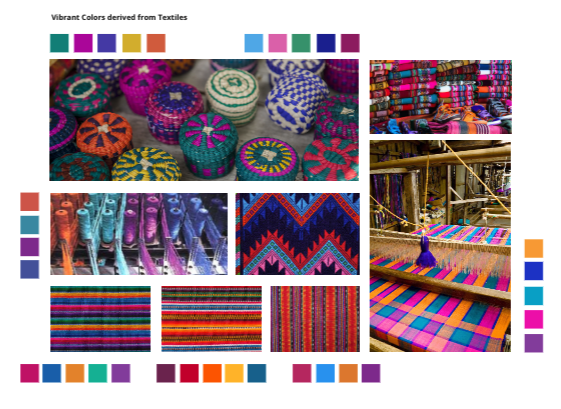
Example Color Study:
Example Final Projects
To help inspire you (and to help you gauge scope), we have curated the following projects from past iterations of the class which demonstrate high quality work along one or more dimensions including telling compelling narratives, grounded in rich data analysis, and through well-designed interactive visualizations:
- Marginal or Meaningful? by Simone Peter, Riccardo Fiorista, Amelia Baum, Ravi Tejwani
- A Homebuyer’s Guide to the Investment Landscape in Boston by Jenny Huang, Shelley Choi, Kimia Hamidieh, Julia Chae
- Speculation | Renovation by Inge Donovan, Rachel Blowes, Jenna Schnitzler, Adi Kupershmidt
- Transfer Fee and the American Dream by Yung-Sung Chuang, Yun-Sheng Chang, Ria-Yunqian Guan, VN Chen
- Transit Deserts by Erin Mitchell, Kelton Aldridge, Nisha Nkya, Hilary Zen
- Foreclosures in Boston by Wenhan Xue, Hannah Chiou, Ashima Kamra, Manasa Kudumu
- 404 Housing Not Found by Hyun Kim, Elisa Xia, Mingyang Sun, Jiao Zhao
Remember, we have intentionally designed the final project to unfold over a sequence of milestones. These milestones are setup to guide your process in a step-by-step way, and to help you stay on track rather than having work pile up at the end of the semester. Each milestone will also serve as an opportunity to get feedback about your final project from the course staff (and your peers!).