Lab 10: Accessibility
In this lab, we will:
- Learn how to make visualizations accessible to screen readers and keyboard users
- Improve interactivity and focus styles for SVG elements
- Use ARIA roles, labels, and properties effectively
- Practice adding descriptive text and summaries to support diverse users
Table of contents
- Check-off
- Lab 10 Rubric
- What will we make?
- Step 0: Complete Lab 6 and 7 if you haven’t already done so
- Step 0.1: Install and Try a Screen Reader
- Step 1: Making Elements Keyboard Focusable
- Step 2: Writing Alt Text for Images and Visualizations
- Step 2.1: Adding Static Alt Text to the Bar Chart
- Step 2.2: Generating Dynamic Alt Descriptions for the Bar Chart
- Step 2.3: Adding Live Region Updates to the Bar Chart
- Step 2.4: Including a Tabular Representation for Increased Accessibility
- Step 2.5: Adding a Button to Toggle between a Tabular and Bar Chart Representation of the Data
- Step 3: Making the Bar Chart Visually Accessible
Check-off
To receive a lab checkoff, please submit your work asynchronously by filling out this form. TAs will review your lab and post your grade. If you do not pass, you will be able to fix any issues and resubmit or receive help in an office hour until the deadline.
Lab 10 Rubric
To successfully complete this lab check-off, ensure your work meets all of the following requirements:
General
- Your implementation of this lab is a project accessible from your portfolio webpage.
- You tested your visualizations using a screen reader (VoiceOver or NVDA) and made necessary fixes.
Bar Chart
- Bars are keyboard focusable
- Bars use appropriate ARIA attributes
- Your
<svg>element includes a descriptive<title>and<desc> - You implemented live region to announce the currently selected bar
- Your bar chart uses an accessible color palette and includes focus-visible styling.
- Your bar chart includes a tabular representation
- Your projects page includes a button to toggle between the bar chart and table
Scatterplot (Optional)
- Each datapoint is keyboard focusable
- Each dot includes an accessible label
- The tooltip uses
role = "tooltip"and is activated on hover and focus.
Slides
Please find the slides here.
What will we make?
In this lab, we will be building on the interactive visualizations you created in Labs 6 and 7, and transforming them into visually and non-visually accessible experiences. You’ll:
- Fix common accessibility issues flagged by Svelte (like focusable SVG elements)
- Make charts navigable by keyboard users
- Add screen reader-friendly titles, descriptions, and live region updates
- Improve visual accessibility by choosing color-blind accessible color palettes
By the end of this lab, your bar chart and scatterplot will be easier to use for everyone — regardless of how they interact with the web.
Step 0: Complete Lab 6 and 7 if you haven’t already done so
In this lab we will be building off of your work in Lab 6 and Lab 7. If you have not completed them, you should do that now.
Step 0.1: Install and Try a Screen Reader
The first step is to experience how blind or low-vision users interact with web content using a screen reader. This will help you understand the importance of making your visualizations and websites accessible.
Windows users can either use:
- Narrator: built-in and easy to start
- NVDA: a free, open-source screen reader used widely in the accessibility community
Mac users can use:
- VoiceOver(Mac): built into all macOS systems
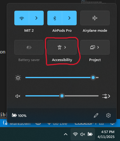
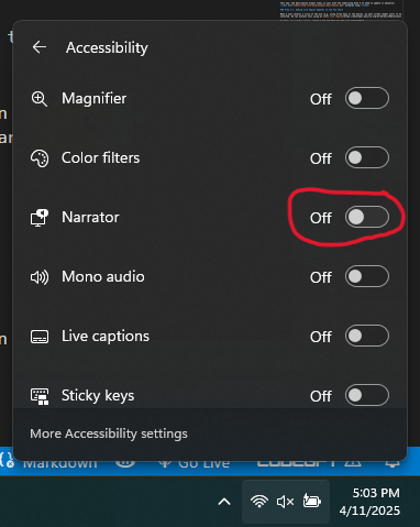
To turn on Narrator (Windows):
- Go to the bottom-right of your taskbar
- Click on Accessibility Settings
- Toggle Narrator to On
To turn on VoiceOver(Mac) you can follow these steps:
- Apple menu
- System Settings
- then click Accessibility in the sidebar (you may need to scroll down).
- Click VoiceOver, then turn VoiceOver on or off
(And don’t forget to turn up your audio!)
Screen readers translate the contents of a page into speech output. They rely on semantic HTML and ARIA labels to understand page structure. You can navigate web pages using:
- Tab: jump between interactive elements (like buttons, links, form fields)
- Arrow keys: move through content line-by-line or item-by-item
- H / Shift + H: navigate by heading (e.g., in VoiceOver and NVDA)
- Insert + F7 (NVDA): open an element list (headings, links, landmarks)
- Control + Option + U (VoiceOver): open the rotor to explore page structure
Please feel free to refer to this Voice Over Cheat Sheet for Mac users and this Narrator Cheat Sheet for Windows users.
Most screen readers have keyboard shortcuts to quickly jump to:
- Headings
- Landmarks (like navigation or main content)
- Links
- Form controls
Screen readers announce what kind of element you’re on (e.g., “Heading level 1: Accessibility Lab”), and whether it’s clickable, selected, or editable. This makes semantic structure critical—using proper headings (<h1>, <h2>), labels (aria-label, aria-labelledby), and focusable elements is key for accessibility.
Step 1: Making Elements Keyboard Focusable
Step 1.1: Making the Bar Chart Keyboard Focusable
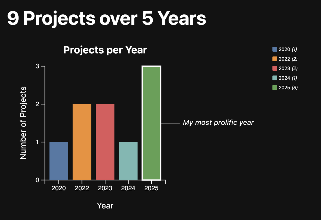
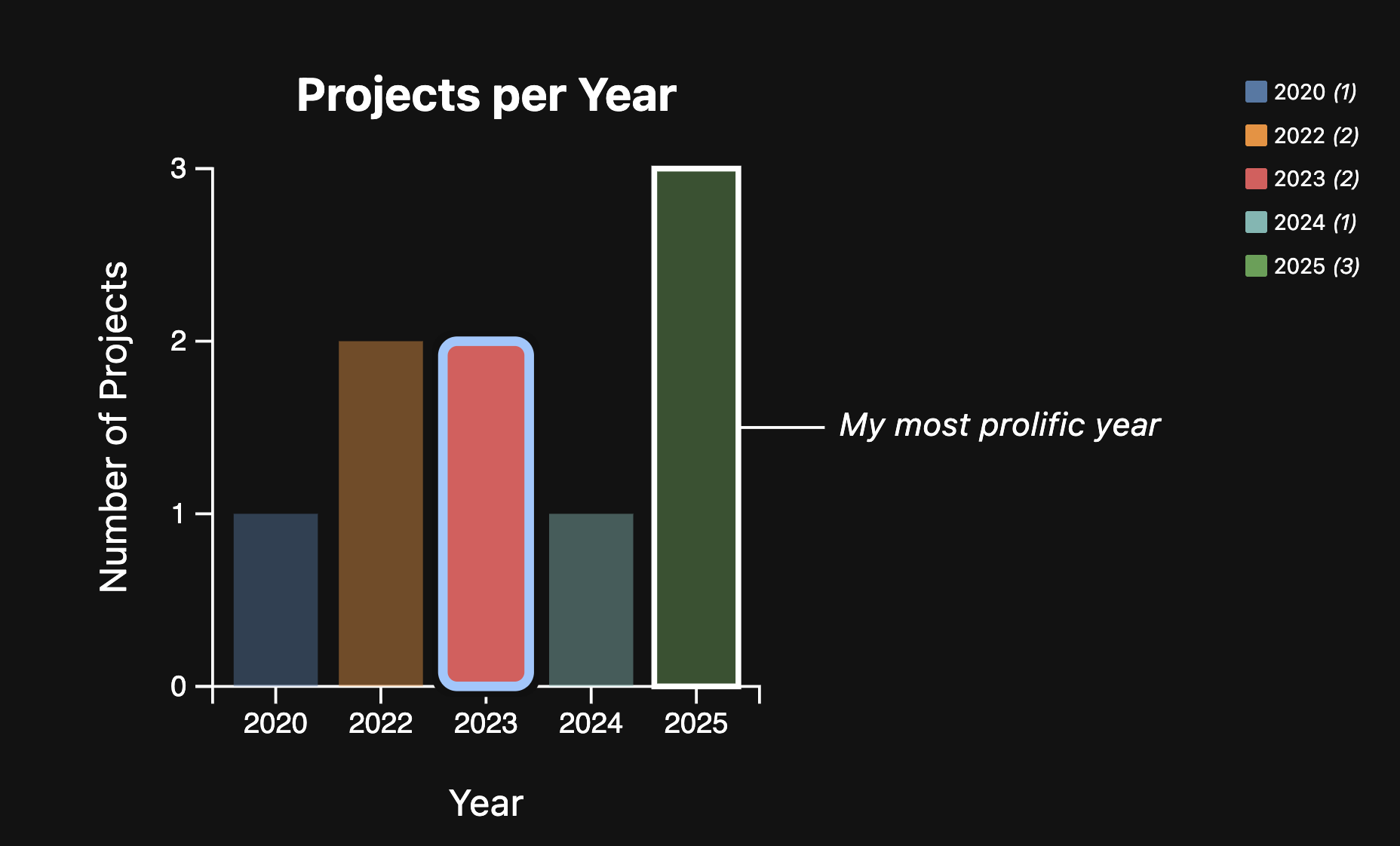
Remember the bar chart you made in Lab 6 to filter your projects by year - it should looks something like this:
Let’s first make bars visually selectable on click, so interaction is clearer for mouse users, and then notice the accessibility warning that appears.
In src/lib/Bar.svelte, add a selected index state in your <script>:
let selectedIndex = -1;
Then update each <rect> so a click selects it by dimming the other bars while keeping the selected bar at full intensity:
{#each data as d, index}
  <rect
    x={xScale(d.label)}
    y={yScale(d.value)}
    width={xScale.bandwidth()}
    height={innerHeight - yScale(d.value)}
    fill={colorScale(d.label)}
    opacity={selectedIndex === -1 || selectedIndex === index ? 1 : 0.45}
    on:click={() => selectedIndex = index}
  />
{/each}
In our src/lib/Bar.svelte, we had a yellow squiggly line indicating an Accessibility warning. These built-in warnings are great reminders from Svelte to think about how accessible our applications are when we make them. In this section of the lab we will learn to address warnings like these.
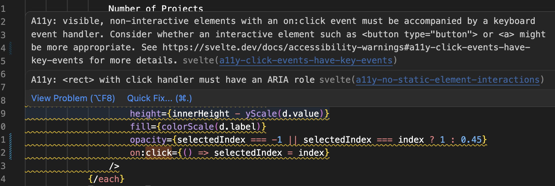
It’s important to understand why these warnings are there. The rect elements are not focusable by default, so they cannot be interacted with using the keyboard. This means that as it currently stands, people who cannot use a mouse or other pointing device cannot select a bar. Even users who can use a mouse, often find keyboard interactions more convenient (e.g. imagine filling out a form by clicking on each field with the mouse instead of pressing Tab!).
So how do we fix this? The first step is making it possible to interact with these bars with the keyboard at all. Right now, you cannot even select a bar by pressing the Tab key on your keyboard, because they are not focusable.
We can fix this by adding a few attributes to the <rect> elements:
- Make it focusable, by adding
tabindex="0" - Expose it as a button to assistive technology, by adding
role="button" - Adding a label via
aria-label
We’re not done yet. All that these do is to make sure users of assistive technology can actually interact with the bar. However, because it’s not a native button or link, the click event will not be triggered when the user focuses on the bar with the keyboard and presses Enter or Space. Instead, we need to enable that, via a separate event listener (keyup is a good candidate).
To avoid duplicating code, let’s move the code that selects a bar into a separate function:
function toggleBar(index, event) {
	selectedIndex = index;
}
Then replace on:click={e => selectedIndex = index} with on:click={e => toggleBar(index, e)}. Now add a keyboard event listener: on:keyup={e => toggleBar(index, e)}.
In the toggleBar function, we can wrap the code that selects the bar with a conditional that checks that either event.key doesn’t exist, or if it does, that it is Enter:
function toggleBar(index, event) {
	if (!event.key || event.key === "Enter") {
		selectedIndex = index;
	}
}
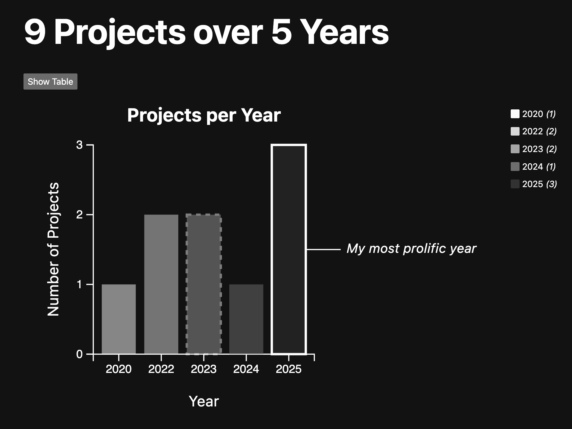
If you try the keyboard interaction (first use Tab to move focus to the bars, then press Enter to select each one) you will notice that it works, but the default focus ring can be confusing. In our chart, we already outline the bar with the most projects, so a generic browser outline can make it harder to tell what is focused vs. what is annotated:
We can hide that with outline: none:
rect {
	transition: 300ms;
	outline: none;
}
However, now keyboard users have no way to know which bar they have currently focused, which is a terrible user experience. Never, ever remove the browser’s default focus styles without providing alternative focus styles. To make focus clearer, we can use a dotted outline for the focused bar, and still dim non-focused bars:
svg:hover rect:not(:hover), .container:focus-within rect:not(:focus-visible) { opacity: 50%; }
rect:focus-visible {
  stroke: white;
  stroke-width: 2px;
  stroke-dasharray: 4;
}
If you try out the keyboard interaction now, you will notice that we are getting a visible indication of focus. Yay! 🎉
As you start applying ARIA attributes like aria-label, aria-labelledby, and aria-describedby, you might find yourself wondering—what’s the difference between them, and when should you use each?
These attributes help screen readers understand and communicate what elements are, how they relate to other elements, and any additional descriptions users should hear. But the names and use cases can be a bit confusing at first.
To help clarify, here’s a quick reference guide to when and why you’d use each one:
| Attribute | What it does | When to use it |
|---|---|---|
aria-label | Gives the element an explicit label. | Use when there’s no visible label (e.g. icon-only buttons or SVG elements). |
aria-labelledby | Uses the ID of another element to label this element. | Use when there’s a visible label (e.g. heading or label nearby). |
aria-describedby | Provides a longer description (via an element ID). | Use when you want to offer supplementary info, like tooltips or hints. |
Think of aria-label as “what is this?”, aria-labelledby as “what text on the page already explains this?”, and aria-describedby as “what extra info helps explain it?”
Step 1.2: Making the Scatterplot Keyboard Focusable (Optional)
Similarly to how we fixed the accessibility of the bar chart, now, let’s fix the accessibility of the scatterplot we made in Lab 7. As you may recall, when we added information in step 3.1 to the tooltip, we also had a yellow squiggly line indicating an Accesibility warning. Take a look at your file src/routes/meta/+page.svelte - you should see something like this: 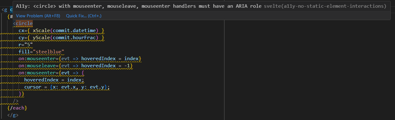
To fix the accessibility issues, we should also add:
tabindex="0"to the dots to make them focusablearia-describedby="commit-tooltip"to the dots to link them to the tooltip for assistive technologyrole="tooltip"to the tooltip to indicate its purpose to assistive technologyaria-haspopup="true"to the dots to indicate that they have a tooltipon:focusandon:blurevent listeners (that also calldotInteraction())
Step 2: Writing Alt Text for Images and Visualizations
Screen readers can’t automatically interpret the meaning of visual elements like SVG charts or images. Without additional context, users who rely on assistive technologies may miss key information. In this section, we’ll learn how to make our bar chart accessible by adding meaningful descriptions that screen readers can detect and announce.
Writing good alt text helps convey what the image is and why it matters. For data visualizations, this means focusing on the key trends, outliers, or takeaways.
Here are some quick rules of thumb:
- ✅ Summarize the takeaway, not every bar or point (unless that’s the point).
- ✅ Use clear and concise language.
- 🚫 Avoid phrases like “Image of…” or “Graph of…” — screen readers already announce the element type.
- 🚫 Don’t just repeat the caption — expand it.
Examples:
- ❌ “Bar chart of housing prices.”
-
✅ “Bar chart showing housing prices have doubled from 2020 to 2023.”
- ❌ “Line graph showing temperatures.”
- ✅ “Line graph showing steady temperature rise over the last decade, peaking in 2023.”
Here are some additional resources on writing alt text from the Web Accessibility Initiative and this Medium Article on Mastering Alt Text
Step 2.1: Adding Static Alt Text to the Bar Chart
Try turning on your screen reader — NVDA on Windows or VoiceOver on macOS (don’t forget to turn up your audio!). Navigate to your local site and hover or tab to your project bar chart.
👉 You’ll notice something surprising: the chart is completely silent. Screen readers skip over it as if it doesn’t exist.
Let’s fix that.
Open src/lib/Bar.svelte, and locate your <svg> element. It should look like this:
<svg viewBox="-50 -50 100 100">
  <!-- your code for the bars -->
</svg>
We’ll make it accessible by adding:
role="img"– tells screen readers this is an informative visual.<title>and<desc>– provide a name and summary for the chart.aria-labelledby– links the<title>and<desc>to the SVG so screen readers read them aloud.
Here’s what your updated <svg> should look like:
<svg
  viewBox="-50 -50 100 100"
  role="img"
  aria-labelledby="bar-title bar-desc">
  <title id="bar-title">Projects by Year</title>
  <desc id="bar-desc">A bar chart showing the number of projects per year. Most projects are in 2024 and 2025.</desc>
  <!-- your code for the bars -->
</svg>
Now try testing with a screen reader again. You should hear the title and description of the chart read out loud. 🎉
Step 2.2: Generating Dynamic Alt Descriptions for the Bar Chart
Our current alt text is hardcoded — but what happens if the data changes? For example, if you add more projects in 2026, the description will no longer be accurate.
Let’s make the chart description dynamic, so it always reflects the current dataset.
In the <script> section of src/lib/Bar.svelte, add a computed variable like this:
$: description = `A bar chart showing project counts by year. ${data.map(d => `${d.label}: ${d.value} projects`).join(', ')}.`;
and after the <title> but before each bar, add this line:
<desc id="bar-desc">{description}</desc>
Now your screen reader will say something like:
“A bar chart showing project counts by year. 2025: 4 projects, 2024: 8 projects.”
This way, the description always stays in sync with the underlying data — no need to update it manually!
Step 2.3: Adding Live Region Updates to the Bar Chart
When a user selects a bar (e.g. using keyboard or the mouse), we want screen reader users to hear which year and how many projects were selected. We can achieve this using an ARIA live region.
In your src/lib/Bar.svelte create a new variable for the live announcement. In your <script> block, add:
let liveText = "";
This will store the text that we want the screen reader to announce.
Next, update your toggleBar function to dynamically announce the selected bar:
function toggleBar(index, event) {
	if (!event.key || event.key === "Enter") {
		selectedIndex = index;
		const d = data[index];
		liveText = `${d.label}: ${d.value} projects selected.`;
	}
}
(Ensure liveText is defined above the updated function)
Lastly, we can add the live region element to in the component’s HTML (e.g. after the <svg>, but before the </div>), ideally where it won’t disrupt layout:
<p aria-live="polite" class="sr-only">{liveText}</p>
And in your <style>, define a visually hidden class:
.sr-only {
  position: absolute;
  left: -9999px;
  width: 1px;
  height: 1px;
  overflow: hidden;
}
This ensures the text is read out loud but remains invisible to sighted users.
Finally, with NVDA or VoiceOver on, try selecting a bar using Tab + Enter. You should now hear something like:
“2025: 3 projects selected.”
🎉 Success!
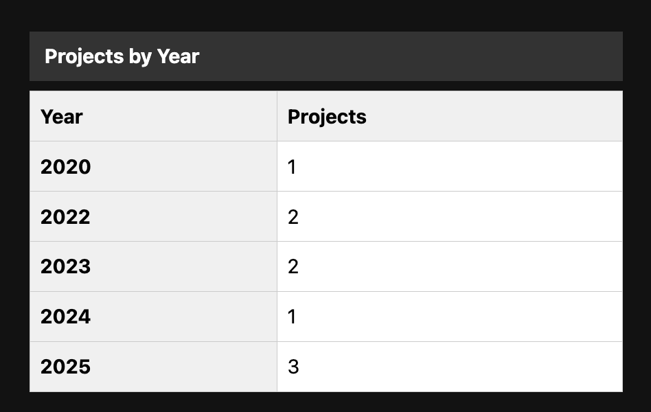
Step 2.4: Including a Tabular Representation for Increased Accessibility
To increase the accessibility of charts, it is also a good practice to include the tabular data. This allows users who are accessing the information with a screenreader to have a way to navigate through the information without missing out on anything.
In your src/lib/Bar.svelte add the following <table> right after the <div class="container">:
<table aria-label="Table showing project counts by year" class="data-table">
    <caption>Projects by Year</caption>
    <thead>
        <tr>
          <th id="year-header" scope="col">Year</th>
          <th id="projects-header" scope="col">Projects</th>
        </tr>
      </thead>
    <tbody>
        {#each data as d, i}
          <tr>
            <th id="row-{i}" scope="row">{d.label}</th>
            <td aria-labelledby="row-{i} projects-header">{d.value}</td>
          </tr>
        {/each}
      </tbody>
  </table>
What’s going on here?
<caption>gives the table a visible title (great for all users).aria-label="..."describes the purpose of the table to screen readers.scope="col"andscope="row"mark which headers apply to each column and row.aria-labelledby="..."helps screen readers read full context, like: “2020, Projects, 15” instead of just “15”.
Add this CSS either in your <style> block:
.data-table {
  margin-top: 1rem;
  margin-bottom: 1rem;
  border-collapse: collapse;
  width: 100%;
  max-width: 30em;
}

.data-table caption {
  font-weight: bold;
  margin-bottom: 0.5em;
  text-align: left;
}

.data-table th,
.data-table td {
  border: 1px solid #ccc;
  padding: 0.5em;
  text-align: left;
}

.data-table th {
  background-color: #f0f0f0;
}
Your page should now include a table similar to this:
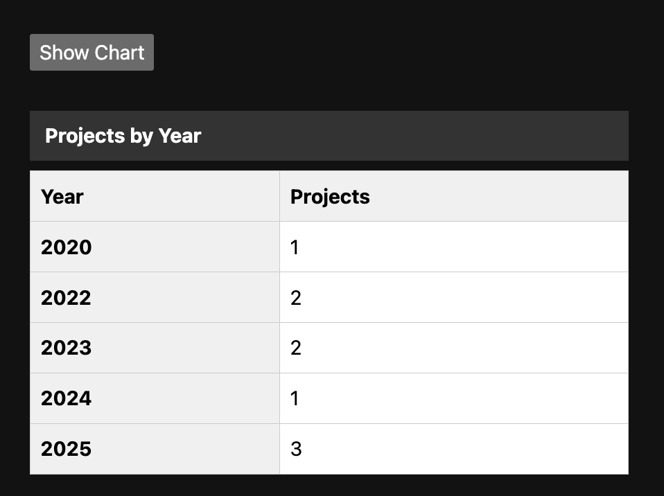
Step 2.5: Adding a Button to Toggle between a Tabular and Bar Chart Representation of the Data
At this point, we have both a bar chart and a tabular representation of the same data. Displaying data in a table is great for accessibility, but we may want to provide the option to view only one format at a time.
Let’s add an accessible toggle button that switches between the bar chart and the table.
In your <script> section, add the following:
    let showChart = true;

    function toggleView() {
        showChart = !showChart;
        liveText = showChart ? "Bar chart view shown." : "Table view shown.";
    }
Above <div class="container">, add the button
<button
  on:click={toggleView}
  aria-pressed={!showChart}
  aria-label="Toggle between bar chart and table view"
  class="toggle-button">
    {showChart ? 'Show Table' : 'Show Chart'}
</button>
You should now see a button above your bar chart. Next, let’s add the functionality.
Wrap the bar chart + legend in {#if showChart} and the table in the {:else} block:
{#if showChart}
  <div class="container">
    <!-- your code for the bar chart and legend -->
  </div>
{:else}
  <table>
    <!-- your code for the table -->
  </table>
{/if}
At this point, you should be able to toggle between the bar chart and table.
Step 3: Making the Bar Chart Visually Accessible
Now, we’ve made the bar chart more accessible to screen readers. However, our chart is still not working that well from a visual accessibility point of view. We want to make the bar chart accessible for people with low vision, color vision deficiencies or other visual impairments.
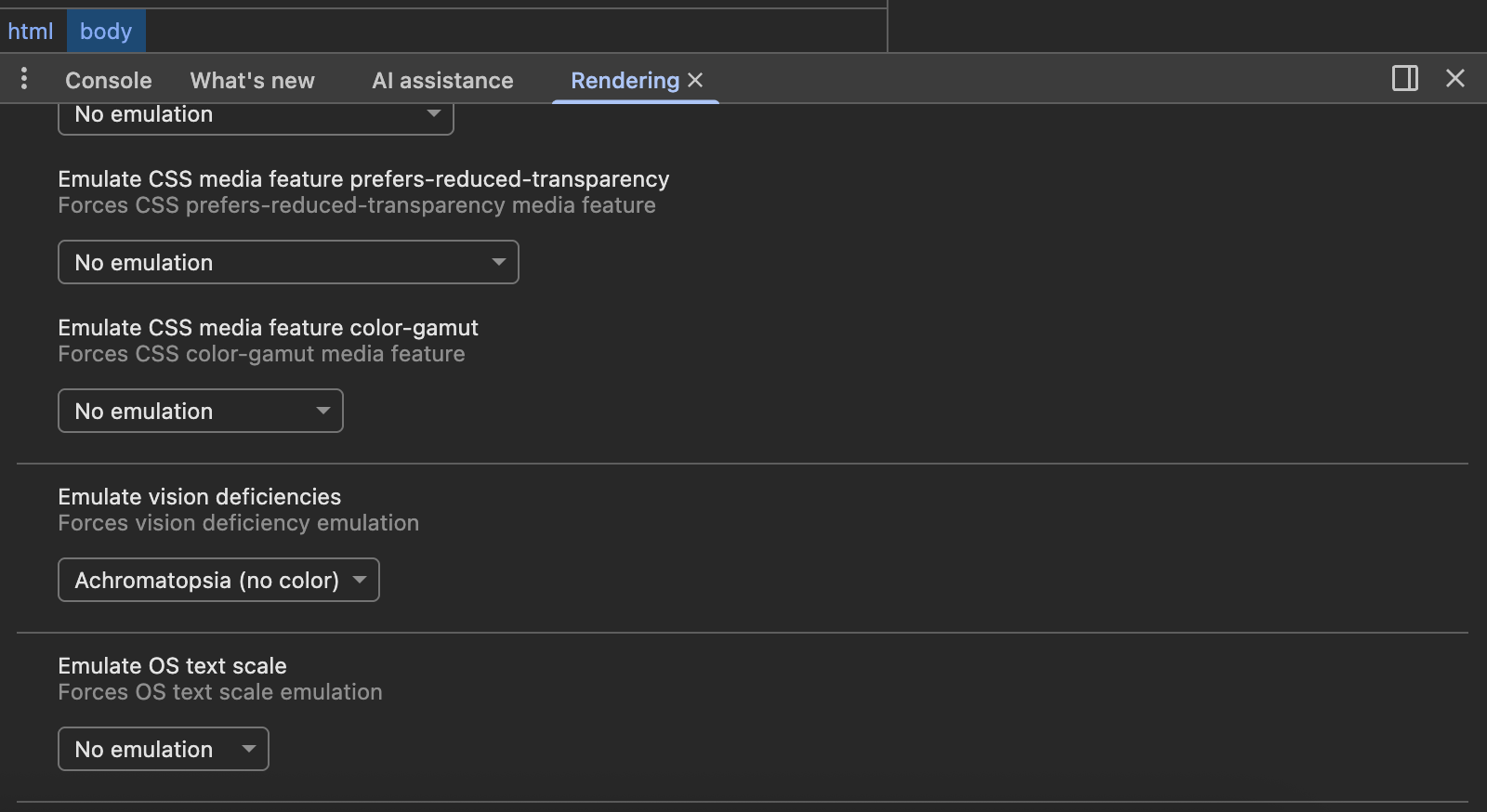
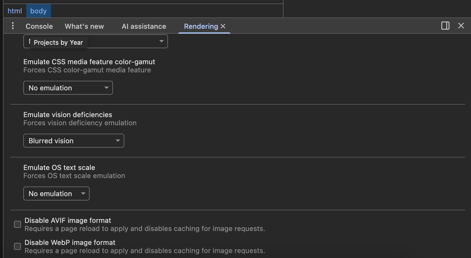
You can simulate vision deficiencies in using DevTools to see how users who experience color blindness or blurred vision might see your sight. Follow the steps in the video below by Addy Osmani to preview your projects page under different conditions:
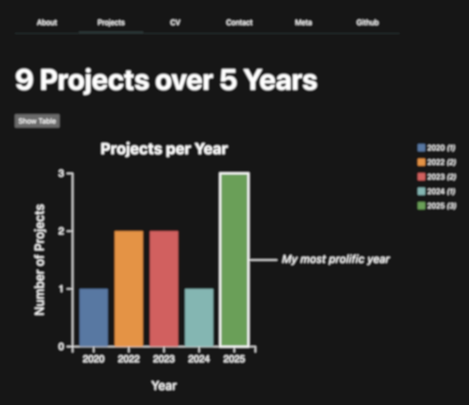
For example, a user with Achromatopsia, whom has difficulty perceiving any color except for shades of grey would see our page as the following: 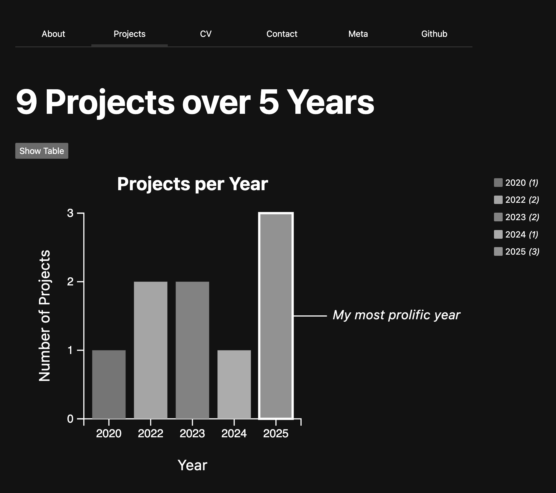
A user with blurred vision might see something like the following:
Step 3.1: Ensuring sufficient color contrast
For starters, let’s use a color palette with good contrast and color-blind safe. Instead of using D3’s default colors, we can pick a color-blind safe palette, using tools like Colorbrewer and Accessible Palette Builder.
Replace let colorScale = d3.scaleOrdinal(d3.schemeTableau10); with:
$: colorScale = d3.scaleOrdinal()
    .domain(data.map(d => d.label))
    .range(d3.quantize(d3.interpolateBlues, data.length));
If you preview your website now, you’ll see that there isn’t much contrast between the background of the site and the bars. Let’s add visible outlines around our bars to make the distinction more clear.
Inside your <rect> element, add this line:
stroke="black"
and in your <style> section make sure each bar keeps that visible border:
rect {
    stroke: black;
    stroke-width: 1;
}
Now users with Achromatopsia would see colors which have higher contrast: 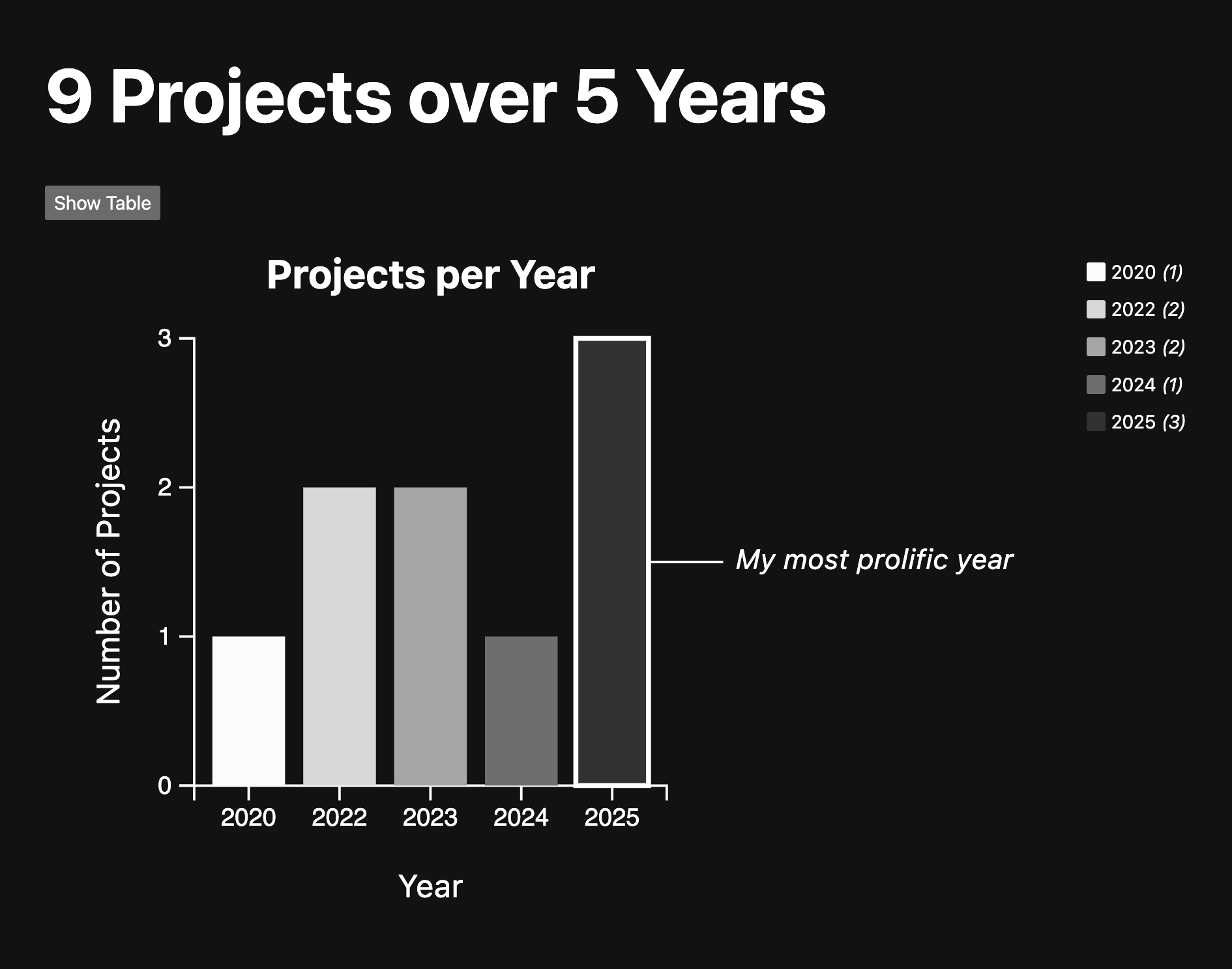
Step 3.2: Use hover and focus styles that reinforce interaction
Your CSS already fades out non-selected bars when one is hovered or focused, which is great!
To make keyboard focus clearer, ensure the selected or focused bar is highlighted in a visible way.
In your <style> section:
rect:focus-visible {
  stroke: white;
  stroke-width: 2px;
  stroke-dasharray: 4; /* Adjust the dash length as needed */
  }
This gives a visible outline to users navigating via keyboard.
You have now completed Lab 10. Nice work! 🎉