Lab 8: D3 III (Advanced Interaction Techniques)
In this lab, we will learn:
- How to add brushing as a mode of interactivity on D3 visualizations
- How SVG lines work, and how to use
d3.lineto generate SVG lines- How to build custom interaction behavior
Table of contents
Check-off
To receive a lab checkoff, please submit your work asynchronously by filling out this form. TAs will review your lab and post your grade. If you do not pass, you will be able to fix any issues and resubmit or receive help in an office hour until the deadline.
Lab 8 Rubric
To successfully complete this lab check-off, ensure your work meets all of the following requirements:
General
- Same functionality from Labs 4-7.
- Succesfully deployed to GitHub Pages.
- When executing the Svelte development server locally, there are no warnings
Scatterplot
- Brushing is implemented, and selects all commits within its bounds
- Tooltips are still visible
- The brushing region cannot extend past the axes
- The bar chart gets filtered based on both brushed and clicked commits.
Line Chart
- The line chart shows edited lines of code over time, with points and interpolations between the points
- The line chart has a title, axes, and axis labels
- On hover, the title changes, and all days of the week that correspond to the hover are highlighted, with appropriate text annotations
- When the mouse leaves the line chart, the highlight gets reset
Slides (or lack thereof)
Just like the previous lab, there are no slides for this lab! Since the topic was covered in the first D3 lecture it can be helpful for you to review the material from it.
Step 1: Brushing
In Step 4.1 of Lab 7, we enabled clicking various commits and thus selecting them, allowing us to adapt other components (such as Bar) to the selection. As discussed in the A Tour through the Interaction Zoo lecture, brushing can be an effective interaction technique for selecting multiple data points in a visualization.
Once points are selected, we can further explore the dataset by displaying more data.
Step 1.1: Setting up the brush
Exactly because brushing is so fundamental to interactive charts, D3 provides a module called d3-brush to facilitate just that.
To use it, we need a reference to our <svg> element, so we use bind:this. More specifically, create a variable svg in your <script> and use bind:this={svg} in the top <svg> component (the one where we have also defined the viewBox).
We then create the brush through a reactive component like this:
$: d3.select(svg).call(d3.brush());
Try it! You should already be able to drag a rectangle around the chart, even though it doesn’t do anything yet.
Step 1.2: Getting our tooltips back
Did you notice that now that we can brush, our tooltips disappeared and that we can’t select any data points? 😱 What happened?!
If you inspect the chart, you will find the culprit:
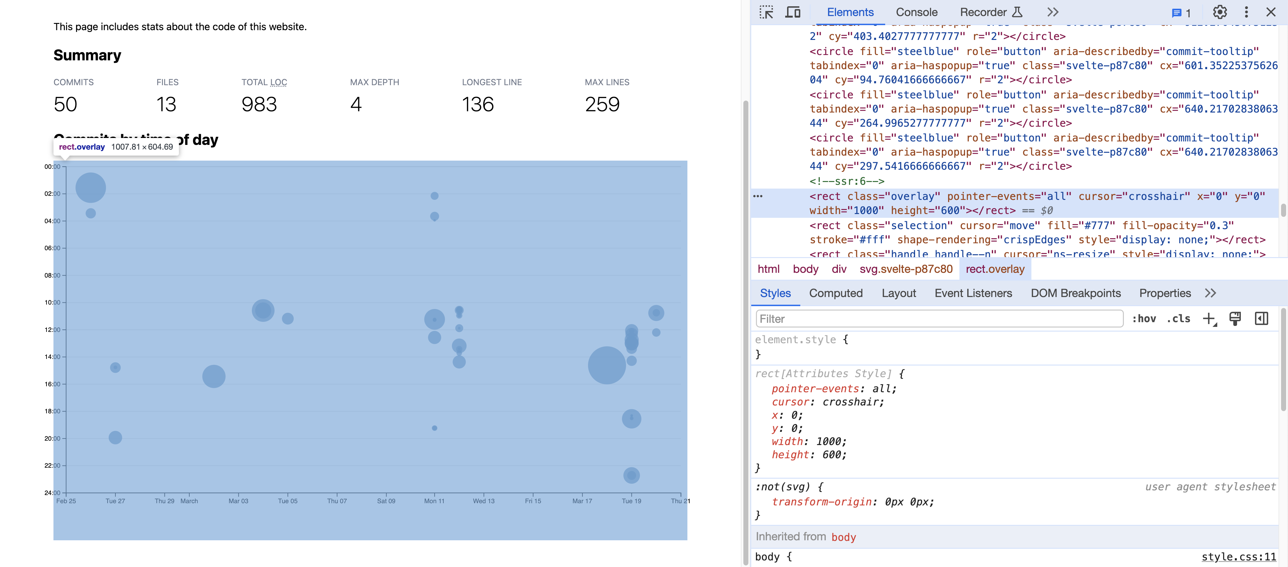
So what is happening here? To make the brush work, D3 adds a rectangle overlay over the entire chart that catches all mouse events. Because of this, our circles never get hovered, and thus our tooltips never show and no selection can take place.
Since SVG elements are painted in source order, to fix this we need the overlay to come before the dots in the DOM tree. D3 provides a selection.raise() method that moves one or more elements to the end of their parent, maintaining their relative order.
Therefore, to move the overlay to be before the dots, we will “raise” the dots and everything that comes after the overlay.
First, let’s convert the single-line reactive statement to a reactive block:
$: {
	d3.select(svg).call(d3.brush());
}
Then, inside the reactive block, let’s change the extent of the brush to prevent the brush from extending over the axes:
d3.select(svg).call(d3.brush())
    .extent([[usableArea.left, usableArea.top], [usableArea.right, usableArea.bottom]]);
After the brush is created, we raise the dots and everything after the overlay:
d3.select(svg).selectAll(".dots, .overlay ~ *").raise();
That’s a funny looking selector, isn’t it? The ~ is the CSS subsequent sibling combinator and it selects elements that come after the selector that precedes it (and share the same parent).
Try it: you should now see that the tooltips are back, the brush still works, and it’s limited to an area within the axes!
Step 1.3: Styling the selection rectangle (optional)
The overlay is not the only element added by d3.brush(). For example, there is a <rect class="selection> element that is used to depict the brush selection. This means you can use CSS to style it!
Just make sure to use the Svelte-specific :global() pseudo-class around .selection otherwise Svelte will drop the whole rule, as it thinks it’s unused CSS.
Here’s what I did, but feel free to experiment with your own styles:
@keyframes marching-ants {
	to {
		stroke-dashoffset: -8; /* 5 + 3 */
	}
}

svg :global(.selection) {
	fill-opacity: 10%;
	stroke: black;
	stroke-opacity: 70%;
	stroke-dasharray: 5 3;
	animation: marching-ants 2s linear infinite;
}
Step 1.4: Making the brush actually select dots
So far we can draw a nicely animated selection box, but it neither does anything, nor does it look like it does anything.
The first step is to actually figure out what the user has selected, both in terms of visual shapes (dots) so we can style them as selected, as well as in terms of data (commits) so we can allow the user to use brushing instead of clicking on every single commit to select them.
d3.brush() returns a brush object, which actually fires events when the brush is moved. We can use .on() to listen to these events and do something when they happen.
Let’s start by simply logging them to the console. Let’s define a function called brushed() that takes an event object as an argument and logs it to the console:
function brushed (evt) {
	console.log(evt);
}
Then, we use .on() to call this function when the brush is moved:
d3.select(svg).call(d3.brush()
    .extent([[usableArea.left, usableArea.top], [usableArea.right, usableArea.bottom]])
    .on("start brush end", brushed));
This line can replace your existing d3.select(svg).call(d3.brush()) code.
Open your browser console (if it’s not already open) and try brushing again. You should see a flurry of events logged to the console, a bit like this:
Try exploring these objects by clicking on the ▸ icon next to them.
You may notice that the selection property of the event object is an array of two points. These points represent the top-left and bottom-right corners of the brush rectangle. This array is the key to understanding what the user has selected.
Let’s create a new reactive variable that stores this selection array. I called it brushSelection. Then, inside the brushed() function, we can remove the console.log statement and set brushSelection to evt.selection like so:
$: brushSelection = null;

function brushed (evt) {
	brushSelection = evt.selection;
}
Now, thinking back to what we’ve done with the manual selection of the various commits, we can piggyback off the clickedCommits array that we have instantiated and make commit selection possible through both clicking and brushing! Thanks to the work we have done before, we get the selected view of the circles, i.e. the difference in color, for free!
function isCommitBrushed (commit) {
	if (!brushSelection) {
		return false;
	}
	// TODO return true if commit is within brushSelection
	// and false if not
}
The core idea for the logic is to use our existing xScale and yScale scales to map the commit data to X and Y coordinates, and then check if these coordinates are within the brush selection bounds.
Another way to do it is to use the D3 scale.invert() to map the selection bounds to data, and then compare data values, which can be faster if you have a lot of data, since you only need to convert the bounds once.
Can you figure out how to do it?
Show solution
There are many ways to implement this logic, but here’s one:
let min = {x: brushSelection[0][0], y: brushSelection[0][1]};
let max = {x: brushSelection[1][0], y: brushSelection[1][1]};
let x = xScale(commit.date);
let y = yScale(commit.hourFrac);
return x >= min.x && x <= max.x && y >= min.y && y <= max.y;
We can make use of this function and get an array of brushedCommits by adding:
$: brushedCommits = brushSelection ? commits.filter(isCommitBrushed) : [];
This will allow us to filter all the commits by the ones the brush encompasses and return an empty list, if none are in fact selected.
Now, we know if and what commits are click-selected (through clickedCommits) and which ones are brushed (through brushedCommits). Since we want to enable selection through both jointly, how can we combine these two? Why not simply merge the two arrays, making sure that every commit is present just once? Here we make use again of our spread operator and do the following:
$: selectedCommits = Array.from(new Set([...clickedCommits, ...brushedCommits]));
Last but not least, we replace the clickedCommits with selectedCommits where we want to consider both, the brushed and selected circles. That should be the following:
<script>
	// Omitting all the other code for clarity

	$: selectedLines = (clickedCommits.length > 0 ? clickedCommits : commits).flatMap(d => d.lines);
</script>

<circle
	class:selected={ clickedCommits.includes(commit) }
	<!-- Your other elements ... -->
/>
Changed to:
<script>
	// Omitting all the other code for clarity

	$: selectedLines = (selectedCommits.length > 0 ? selectedCommits : commits).flatMap(d => d.lines);
</script>

<circle
	class:selected={ selectedCommits.includes(commit) }
	<!-- Your other elements ... -->
/>
Don’t forget to change your bar chart title based on selectedCommits, as opposed to clickedCommits!
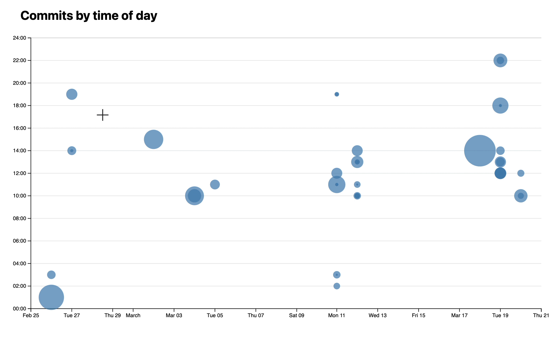
If everything comes together nicely, it should look somewhat similar to this:
Step 1.5: Showing count of selected commits
Lastly, you might find it a good idea to inform your user of the number of commits they have selected in total. That’s a quick one! Just add the length of the selectedCommits variable to your dynamically titled bar chart:
`Lines of Code: ${selectedCommits.length} Selected Commits`
If it works, it should look a bit like this:
Step 2: Commit Line Chart
We will be building a line chart which effectively projects our commit scatter plot onto the x axis, and accumulates all edits to our repository for each day.
Here’s a preview of what steps will go into building this line chart:
- Wrangle the output of the
elocuentscript into a data structure with a count of lines edited for each day - Draw this data as a line over time
- Add axes, labels, and a title
- Highlight days of the week by hovering over the chart
- Add annotations
Step 2.1: Data Wrangling: Lines edited by date
We’re going to wrangle our data in the script of the routes/meta/+page.svelte, and pass in the wrangled data into a LineChart component.
So, begin by defining our LinesbyDate
let linesByDate = [];
Set up a reactive block statement with $: {}, and write code for the following steps:
- Get the count of edits for each date in
locData- You may want to use
d3.rollups(), and used3.timeDay.floor()to group the edits by the date on which they happened - Afterwards, you may want to add
.map(([date, count]) => ({ date, count }), to convert the output ofd3.rollups(an array of arrays) into an array of named objects, so you can callrolled.dateandrolled.countas needed
- You may want to use
- Get an array of all days covered by the data
- You may find using
d3.extent()on yourrolledvariable helpful to get your minimum and maximum date d3.timeDays(minDate, d3.timeDay.offset(maxDate, 1))returns every date betweenminDateandmaxDate, inclusive
- You may find using
- Build
linesByDateby filling all undefined dates with 0 counts- Consider using a structure like
allDays.map(date => ({date, count: ...}))to iterate over all days inallDays .find()allows you to find an element in an array that matches a certain condition. If no element exists,.find()returnsundefined- You may find the optional chaining operator
?and the nullish coalescing operator??useful
- Consider using a structure like
Check your answers here!
$: {
	// 1. Get the count for each date in the data
	const rolled = d3.rollups(
		locData,
		v => v.length,
		d => d3.timeDay.floor(d.datetime)
	).map(([date, count]) => ({ date, count }));

	// 2. Get an array of all days covered by the data
	const [minDate, maxDate] = d3.extent(rolled, d => d.date);
	const allDays = d3.timeDays(minDate, d3.timeDay.offset(maxDate, 1));

	// 3. Build linesByDate by filling all undefined dates with 0 counts
	linesByDate = allDays.map(date => ({
		date,
		count: rolled.find(d => d.date.getTime() === date.getTime())?.count ?? 0
	}));
}
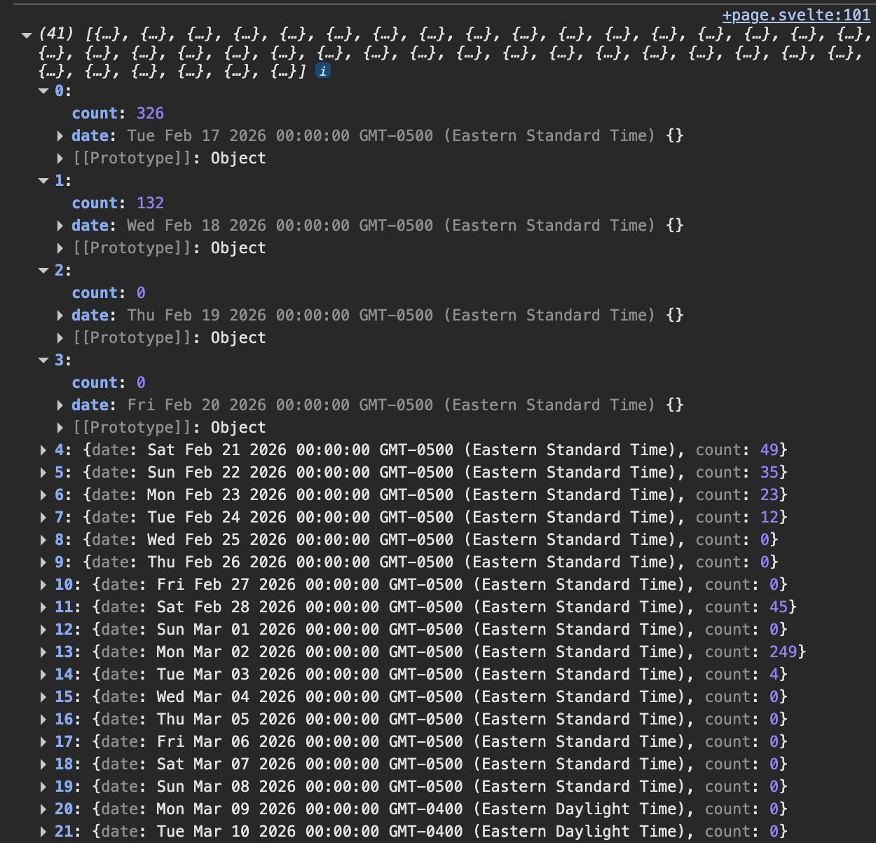
If you add a console.log(linesByDate), you should see an array of objects like this, though your array size and exact counts might be different from mine:
Step 2.2: Creating a LineChart component
Now that we have our line chart data, it’s time to create the component and pass the data into the component.
Create a new LineChart.svelte component where you created your other components, import * as d3 from 'd3'; at the top of a <script> section, and then export let data = [];, to allow the data property to be populated
Then, you can import your LineChart component into your meta page, and add a <LineChart data={linesByDate} /> element at the bottom of your meta page HTML.
Step 2.3: d3.line and <path> svg elements
Sound familiar? It should! Let’s begin with our base SVG element:
As you did in Step 2.2 of Lab 6 and Step 1.4 of Lab 7, define an svg viewbox with width 1000 and height 300, and appropriate overflow styling to prevent the SVG from growing too large and to avoid clipping shapes.
Check your answer here!
First, let’s define a width and height for our coordinate space in our <script> block (just below your imports, outside any function or reactive block):
let width = 1000, height = 300;
Then, in the HTML we add an <svg> element to hold our line chart, and a suitable heading (e.g. “Lines Edited by Day” in a <h3> element):
<h3>Lines Edited by Day</h3>
<svg viewBox="0 0 {width} {height}">
	<!-- line chart will go here -->
</svg>
Add the following to the <style> element:
<style>
	svg {
		overflow: visible;
	}
</style>
Just like in Lab 7, we need an X Scale for the dates, and a Y Scale for the count of edited lines.
The X Scale will be a time scale that maps the d3.extent of dates in your line chart’s data to the area between usableArea.left and usableArea.right.
The Y Scale will be a linear scale that maps from a domain of 0 and d3.max of data to area between usableArea.bottom and usableArea.top. scale.nice() can give us nicer tick marks.
Check your answers here!
$: xScale = d3.scaleTime()
	.domain(d3.extent(data, d => d.date))
	.range([usableArea.left, usableArea.right]);

$: yScale = d3.scaleLinear()
	.domain([0, d3.max(data, d => d.count)])
	.range([usableArea.bottom, usableArea.top])
	.nice();
In SVG, a line is defined with a <path> element, which has a d attribute. This d attribute is just a string, written in a mini language of commands that tells the browser how to draw a path.
For example, "M 100,0 L 200,200 L 0,200 Z" represents a triangle. We don’t need to worry about what our d string actually looks like for our purposes – just how to generate it with d3. If you’re curious, this website is a fun explanatory tool.
We define a line in d3 with d3.line(), which creates a generator function. The function can take in data and spit out a path string. To define it, we need to tell the generator function which part of our data to read to get the x values (in pixels) of the line, and which part of our data to read to get the y values (in pixels) of the line. Add this after your xScale and yScale variables:
$: line = d3.line()
	.x(d => xScale(d.date))
	.y(d => yScale(d.count));
Then, if you add the following <path> element to your <svg>:
<path
	d={line(data)}
	fill="none"
	stroke="steelblue"
	stroke-width="2"
/>
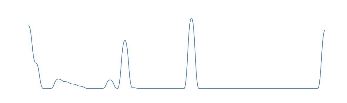
You should get something like this!
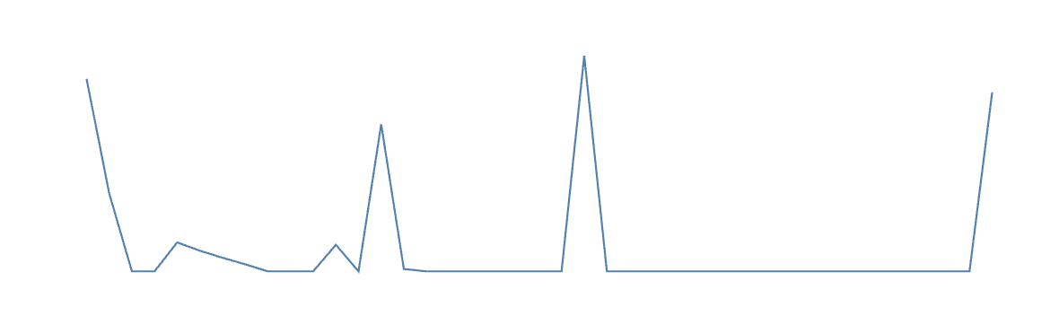
If your line rarely drops down to 0, you might just be a very busy programmer, but the more likely culprit is incorrectly filling your data with 0’s on the dates that were not defined in locData. Consider double checking that part of your code.
I’m not a big fan of the spike aesthetic, so I also applied .curve(d3.curveBumpX) to the line. There are other valid options, like .curve(d3.curveStep) for a step-wise look, but feel free to use this site as a resource for choosing point interpolation methods.
This is how the curveBumpX looks:
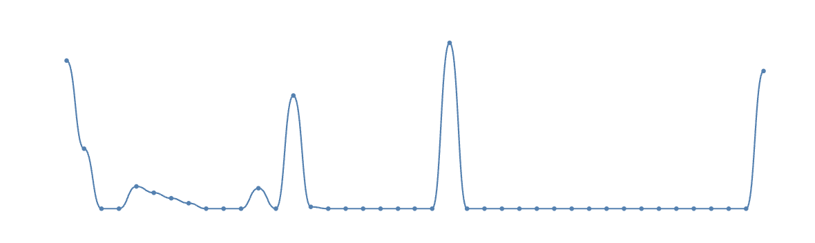
Let’s also make it clear which parts of the line are data points, and which are interpolations.
After your <path> element, add <circle>s for each data point in your chart
<!-- dots at each data point -->
{#each data as d}
	<circle
		cx={xScale(d.date)}
		cy={yScale(d.count)}
		r="3"
		fill="steelblue"
	/>
{/each}
At this point, your line chart should look something like this:
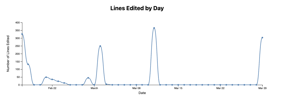
Step 2.4: Axes, labels, and title
Every chart needs axes, labels, and a title. Time to add them!
The title is easy – just add an <h3> in your HTML before your <svg> with an appropriate title, like “Lines Edited by Day”. You can style your title however you’d like – I gave mine text-align: center.
Just like in Step 1.5 in Lab 7, define a margin, usableArea, xAxis, yAxis, bind the axes to <g> elements, and d3.select() below our xAxis and yAxis definitions to select these elements and apply the axes to them via d3-axis functions. The only difference between the scatter plot axes and the line chart axes is that, in the line chart, you don’t need to format your ticks in a special way.
Add your x and y axis labels just after the axes in your <svg>
 <!-- x-axis label -->
<text
	x={usableArea.left + (usableArea.right - usableArea.left) / 2}
	y={height - 5}
	text-anchor="middle"
	class="axis-label">
	Date
</text>

<!-- y-axis label -->
<text
	x={-(usableArea.top + (usableArea.bottom - usableArea.top) / 2)}
	y={10}
	text-anchor="middle"
	transform="rotate(-90)"
	class="axis-label">
	Number of Lines Edited
</text>
Style your .axis-labels. I gave mine font-size: 0.8em and fill: currentColor to behave well in dark mode.
At this point, your line chart should look something like this:
Step 3: Day of Week Highlighting
So far, we have a basic line chart. It doesn’t give you many more insights into your commit patterns that you couldn’t also glean from your scatter plot.
But, using a bit of your own domain knowledge about your coding habits (and when these labs are due), you might expect that you make more edits to your repo on certain days of the week.
A line chart offers us an opportunity to make this seasonality readily apparent. If you could highlight all Mondays, or all Thursdays, you might notice that some days of the week tend to house busier coding sessions.
Let’s build this interaction into our line chart!
First, a plan of attack:
- Define a variable to store the hovered day of the week
- Define invisible interaction regions that know which day of the week they cover
- Draw the interaction regions on the
<svg>and trigger changes in the hovered day of the week - Draw the visible highlight regions on the
<svg>which react to the currently hovered day of the week - Add annotations
Step 3.1: Building interaction regions
First, in your <script> define hoveredDay
let hoveredDay = null; // e.g. "Monday"
We initialize hoveredDay as null, because we want to define a state for the chart where no day is highlighted.
Our regions will need to be updated as new commit data comes in, so we cannot hard code them into our <svg>. Instead, we’ll dynamically build our regions, and use svelte templating to build them into the <svg>.
We define the regions as follows:
$: dayRegions = (() => {
	// if there's no data, there are no regions!
	if (data.length === 0) return [];
	return data.map((d, i, arr) => {
		// get the previous date, if it exists
		const prev = arr[i - 1];
		// get the next date, if it exists
		const next = arr[i + 1];
		// define the left side of the region, which might be the edge of the axis if this is the first date
		const left = prev ? new Date((d.date.getTime() + prev.date.getTime()) / 2) : d.date;
		// define the right side of the region, which might be the edge of the axis if this is the last date
		const right = next ? new Date((d.date.getTime() + next.date.getTime()) / 2) : d.date;

		return {
			date: d.date,
			weekday: d.date.toLocaleString("en", { weekday: "long" }), // e.g. "Monday"
			x: xScale(left),
			width: xScale(right) - xScale(left),
		};
	});
})();
Notice the use of arrow functions, ternary operators, and array.map()
Each region knows its own date, its day of the week, the x pixel value of its beginning, and its width.
Step 3.2: Reactive hoveredDay
Now, let’s build these interaction regions, and use the on:mouseenter event to trigger a change in hoveredDay:
<!-- invisible hover regions -->
{#each dayRegions as region}
	<rect
		x={region.x}
		y={usableArea.top}
		width={region.width}
		height={usableArea.bottom - usableArea.top}
		fill="transparent"
		on:mouseenter={() => hoveredDay = region.weekday}
	/>
{/each}
You may notice that you have a yellow squiggly here indicating an Accessibility warning. These built-in warnings are great reminders from Svelte to think about how accessible our applications are when we make them. We will come back to address warnings like these in Lab 10!
If you want to see which hoveredDay is active, add this debugging line to your <script>. As you mouse over your chart, you should see a flurry of console logs telling you which day of the week is active (Don’t forget to delete it when you’re done!)
$: console.log(hoveredDay);
You might notice that when you leave the <svg>, the hoveredDay stays stuck on the last day of the week you hovered.
You can fix that by using the on:mouseleave event and adding this line to the opening tag of your <svg>:
on:mouseleave={() => hoveredDay = null}
This line, too, will trigger an Accessibility warning. We will come back to address warnings like these in Lab 10!
Now, when you leave the <svg>, hoveredDay should get set to null.
Step 3.3: Building highlight bands
Lets make these days of the week pop! These rectangles are going to have the exact same shape, and be put into the same place as the invisible interaction regions – the only difference is that they only exist {#if} their weekday property matches the current hoveredDay, and they have a different fill color and opacity (I used fill="var(--color-accent)" and opacity="0.2" for my highlighted regions)
Give it a shot! Your highlighted regions should look very similar to your interaction regions, but use svelte templating to only display them if they match the hoveredDay.
Step 3.4: Adding annotations
Almost done! Let’s make it more obvious which day of the week we are highlighting, and emphasize the y values of the highlighted regions.
First, change your title <h3> to reflect which day of the week is being highlighted, saying something like "Lines Edited on <day of week>"
Next, let’s create a local constant inside our svelte templating code right before we describe each <circle>
{@const isHighlighted = d.date.toLocaleString("en", { weekday: "long" }) === hoveredDay}
This is not something you have encountered before in svelte! A local constant is just like a variable you would define in python or javascript, which you can use to avoid copy-pasting the same expressions in multiple places
Now, we can change the styling of our dots based on whether or not they are highlighted. Change the r and fill properties of your <circle>s to slightly increase their size and be colored with your accent color if they are highlighted.
Finally, right after your circles, add some text to the top of each highlighted region representing the count of lines edited in that region:
{#if isHighlighted}
	<text
		x={xScale(d.date)}
		y={usableArea.top + 15}
		text-anchor="middle"
		font-size="12"
		fill="var(--color-accent)"
	>
		{Math.round(d.count)}
	</text>
{/if}
Whew! Pat yourself on the back, because now you have a complete line chart of your repo editing habits with on-hover interactivity!