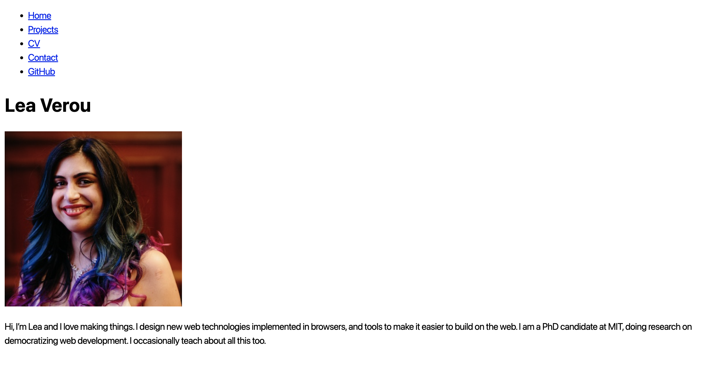
Lab 2: Styling with CSS
In this lab, we will learn:
- What are the core concepts of CSS?
- How can we use CSS selectors to target the elements we want to style?
- What is the difference between absolute and relative units?
- How to use CSS to customize deisgn aspects such as fonts, colors, or layout?
- What happens when there are conflicting CSS declarations about the same element?
Table of contents
Check-off
Asynchronous lab checkoff is no longer one-and-done. To receive a lab checkoff, please submit your work asynchronously by filling out this form. TAs will review your lab and post your grade. If you do not pass, you will be able to fix any issues and resubmit or receive help in an office hour until the deadline.
Lab 2 Rubric
To successfully complete this lab check-off, ensure your work meets all of the following requirements:
Body Layout
- Content width adjusts properly to smaller viewport sizes.
- Content remains centered.
- Content does not touch the edges of the viewport.
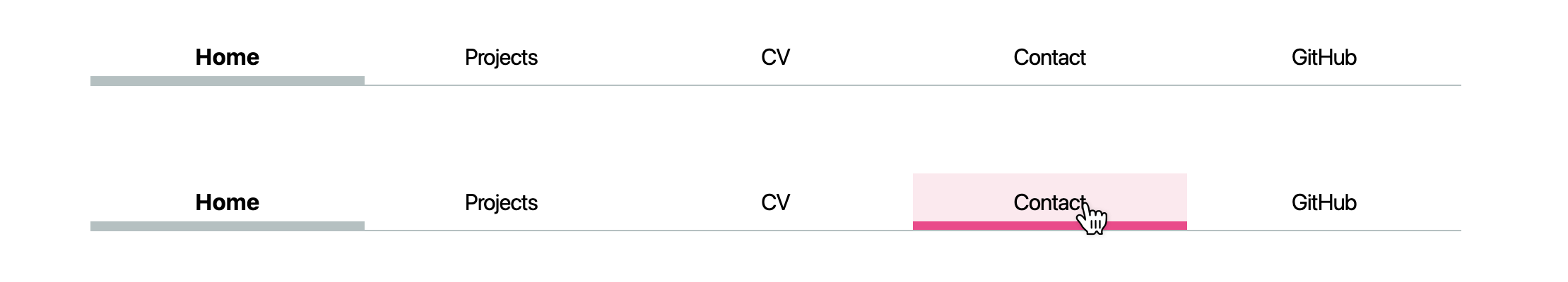
Navigation Bar Styling
- The current page is highlighted in the navigation bar with:
- A distinct color.
- A thicker underline or border.
- When hovering over other sections:
- The color changes.
- The underline or border thickness changes.
Contact Form
- There is a grid-based layout:
- Email subject and message fields are in one column.
- Corresponding input boxes are aligned next to them in another column.
- Proper spacing between form controls.
- Send button functions correctly and generates a URL to send an email.
Projects Page
- Contains dummy content for population.
- Adjusts dynamically to viewport size.
- Images do not become excessively wide.
- There is a grid-based layout for project display.
- Projects are aligned horizontally.
- Different heading levels (e.g.,
<h1>vs.<h2>) have distinguishable sizes.
Resume (Free-Form)
- Applied some CSS styling to the resume.
Prerequisites
This lab assumes you have already completed Lab 1, as we will use this as a starting point.
You do not need to create a new repository for Lab 2, simply work on the same repository you created for Lab 1.
Slides
Playgrounds:
If you are a first-time coder, you are welcome to use this Skeleton that we created to help you go through Lab 2. To use this, replace the <style.css> file in your Lab 1 with this Skeleton file, and name it <style.css>. You can also check these video tutorials that will help you with the first steps.
At the end of this lab, you should have a webpage that follows this example as a reference. While your design doesn’t need to be identical, it should maintain a similar structure and styling.
Step 1: Prevent content from getting too wide
In lab 1, we created a simple homepage with minimal styling (only setting the font family, and line-height).
It looked a bit like this:
In this lab we are going to edit the appearence of our website. For that purpose, we will be editing the <style.css> file in our repository.
First, let’s stop the content from getting so wide, by applying a max-width to <body>. Why not simply a width? So that the content continues to adapt to smaller viewport sizes. We will specify that max-width in em, rem, or ch units, so that it scales with the font size. Experiment with the browser dev tools to find a good value for max-width. I used 100ch:

Now let’s center that content. We can do that by using the special value auto for the left and right margin. We can set both of these to the same value by using the margin-inline shorthand property.
This already looks better!
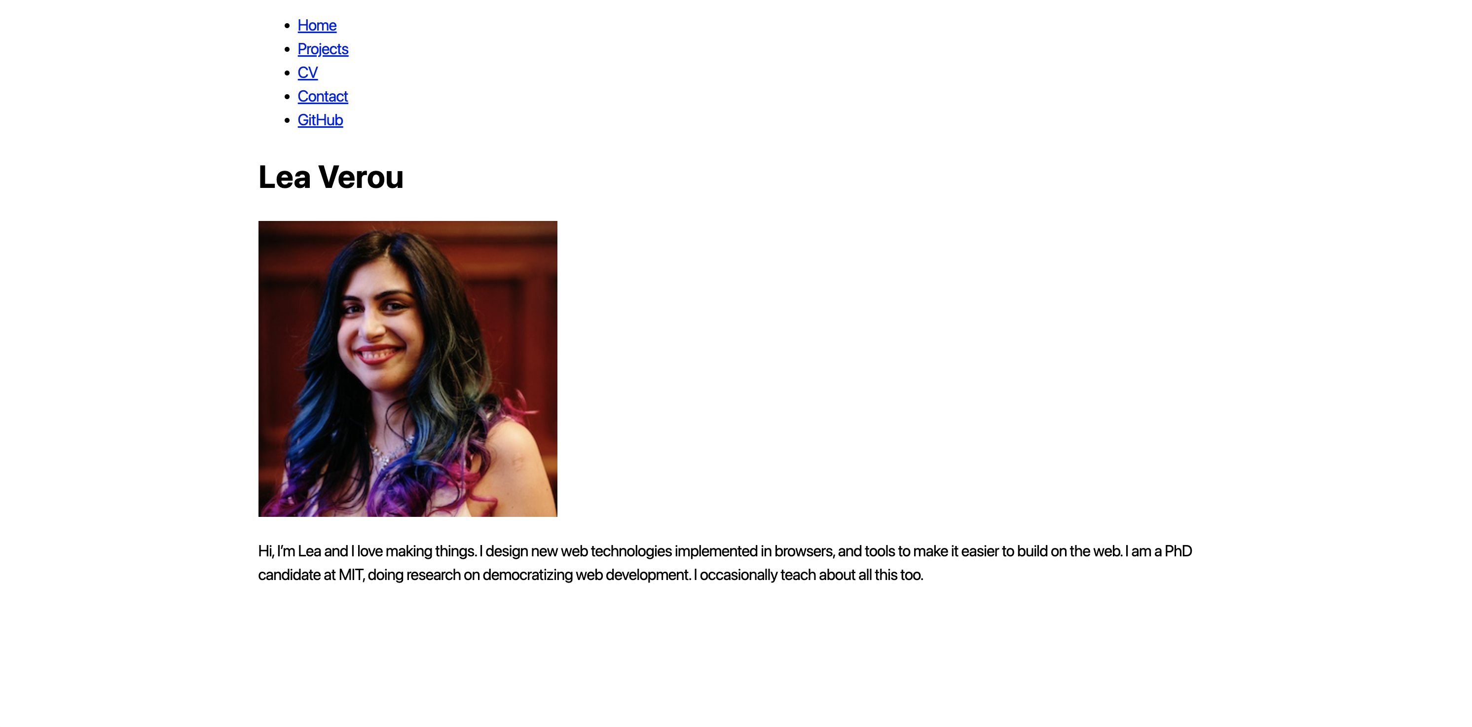
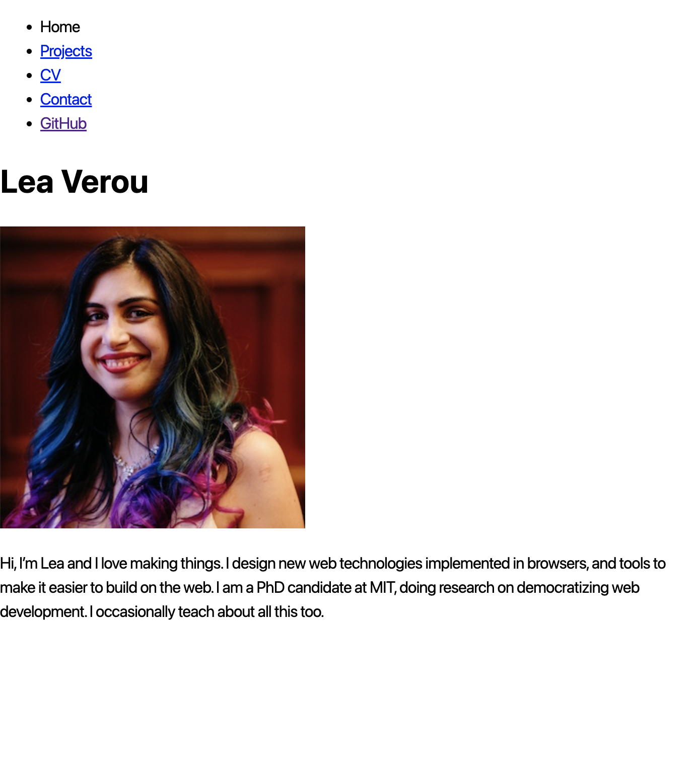
But try resizing your window to be smaller than that max-width we set.
Yikes! Our content is now touching the edges of the viewport, which makes it hard to read. One way to fix that is to add some padding to the content.
What would be another way to solve it? We can specify a lower bound for our margin by using the
max()function, but we need to specify the margin explicitly, not using theautokeyword:margin-inline: max(1em, (100% - 100ch) / 2);
Step 2: Styling the navigation bar
Our navigation bar looks more like a list than a navigation bar. Let’s fix that!
Step 2.1: Getting <ul> and <li> out of the way
If you have used a <ul> element within your <nav>, you can tell the browser to ignore that <ul> and its <li> children for stylng by applying display: contents to them both, which prevents them from having any styling of their own.
Step 2.2: Using Flexbox to lay out the navigation
Now we don’t have weird list bullets, but our navigation is all scrunched up:

Flexbox to the rescue!
Before you proceed, wrap the menu item for the current page in a <a> as well, as that will simplify things. Give it a class="current" attribute, which will allow us to style it differently.
Let’s apply display: flex to the <nav> to enable Flexible box layout (Flexbox).
You will not notice any immediate difference, but we can now use Flexbox to control the layout of the children of <nav>.
Apply flex: 1 to each of the <a> elements (via a suitable CSS rule) to make them take up the same amount of space 1.
Useful links for Flexbox:
- MDN: Basic concepts of flexbox
- MDN: Flexbox tutorial
- CSS Tricks: A Complete Guide to Flexbox
- Flexbox Froggy
- Flexbox Defense
- Flexbox Zombies
Step 2.3: Adding some style
This is starting to look like an actual navigation bar!
Now let’s give it some style.
- Remove the underline from the links by setting
text-decoration: none. - Remove the gory default link color by setting
color: inheritto make links use the same text color as their parent element. - Center the text in its box by setting
text-align: center - Let’s give each link some spacing by adding some
padding(we recommend0.5em) - Apply some
margin-bottomto the whole<nav>to separate it from the content below.
Apply a bottom border to the <nav> to visually separate it from the content. Give it a border-bottom-width of 1px, a border-bottom-style of solid, and a border-bottom-color of oklch(80% 3% 200)border-bottom shorthand property to specify all of these at once. Feel free to play with these values, but we recommend keeping it subtle.
Now let’s style the current page link. Give it a thick bottom border (we recomend a border width of 0.4em), and either the same cool gray as the navigation bar border, or a lighter version. To counter the increase in height that the border adds, apply a reduced padding-bottom to that link.

Step 2.4: Accent color and hover styles
Define an accent color for your website, and store it in an --color-accent custom property. Add this custom property in the <style.css> file by setting it on the <:root> selector so that it is available to the entire document. I used oklch(65% 50% 0)accent-color: var(--color-accent) on <html> or <body> so that all elements that use the accent color can inherit it.
Now let’s use this accent color to style hovered navigation links (a:hover). Apply the same border-bottom as you did for the current page link, but with var(--color-accent) as the color.
Wanna go further? Apply background-color: oklch(from var(--color-accent) 95% 5% h) that is a light color with the same hue as our accent color!
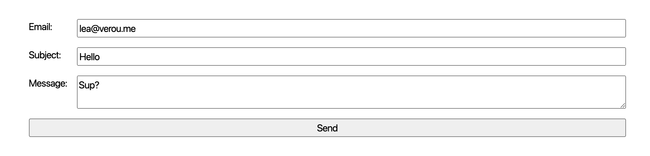
Step 3: Contact form layout
In the previous lab, we created a simple contact form. It worked, but it was not very usable, since there is no alignment, nor clear proximity to distinguish what input fields the labels belong to:
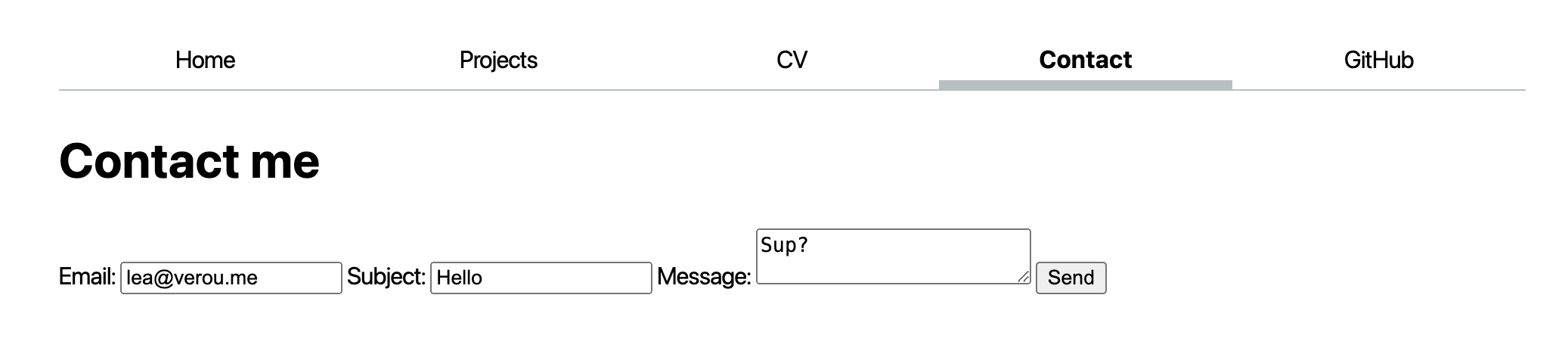
Let’s use CSS to improve this.
Step 3.1: Integrate typography
Inspect the form controls (<input>, <textarea>, <button>) and search for font-family in both the Styles and Computed tabs. What do you observe?
All we need to make these use the same font as the rest of the page is font: inherit:
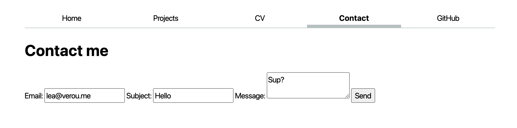
Step 3.2: Top-down layout
The easiest way for that is to lay it out top-to-bottom, with each text field occuping the whole width of the form, and its label is above it.
This is exactly what the optional Contact form styling step did in the previous lab. The gist was:
- Apply
display: blockto the form controls and labels to make them behave like block elements (such as<p>), i.e. insert line breaks before and after - Apply
width: 100%to the form controls to make them take up the whole width of their container (in other elementsdisplay: blockdoes this too, but form controls are special) - Apply
box-sizing: border-boxto the form controls to make their width of 100% include their padding and border - Apply
margin-blockto the labels to add spacing before and after them
Step 3.3: Grid layout
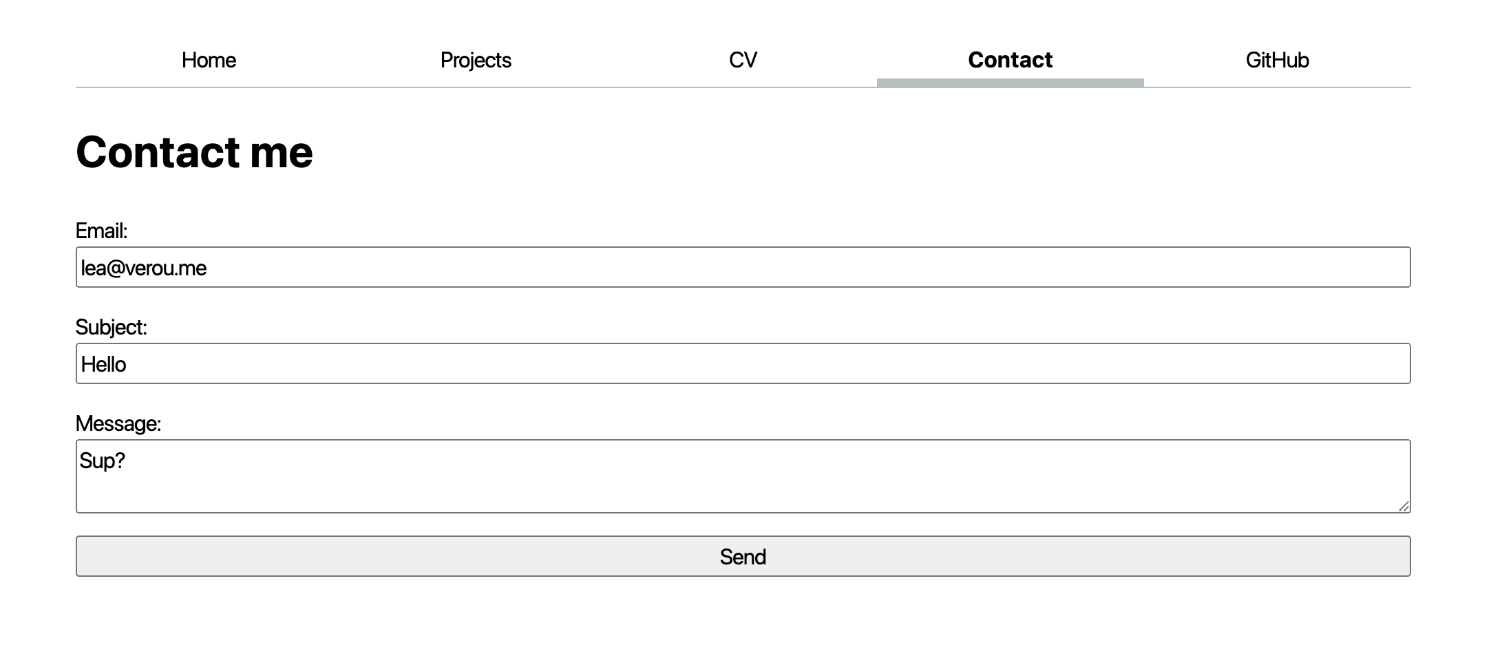
Our form now looks much better, and it’s crystal clear which label belongs to which input field. However, it is exceedingly wide and looks a bit weird. The primitive layout method we used works, but is not very flexible. How could we make it so that the labels are on the left, and the input fields are on the right, and they are all aligned? No, you do *not* use a <table> for that! Repeat after me: tables are for tabular data, not for layout!
The answer is CSS Grid: the crème de la crème of CSS layout methods. It may take some time to fully grok, but it is well worth it.
The core idea of CSS Grid is that we define a grid container (the element with display:grid), and then place its children in the grid (or descendants, through subgrid or display: contents).
First, remove the CSS you applied in the previous step, since we will not need it. Everything starts by applying display: grid to the form.
Note that you immediately see a change in the layout: Once you enable grid layout, the grid container’s children are automatically placed on a grid with one column and as many rows as needed to fit all of them. This is called the automatic grid placement algorithm, and it saves you a lot of time: you only need to define the actual constraints, and the browser will take care of the rest.
E.g. in this case, all we need to define is columns, via grid-template-columns: auto 1fr. auto means that the column will be as wide as its content, and 1fr means that the column will take up the remaining space (similar to flex: 1).
If we preview our changes at this point, the result can be quite surprising, but inspecting the <form> element in the browser dev tools will reveal what is happening:
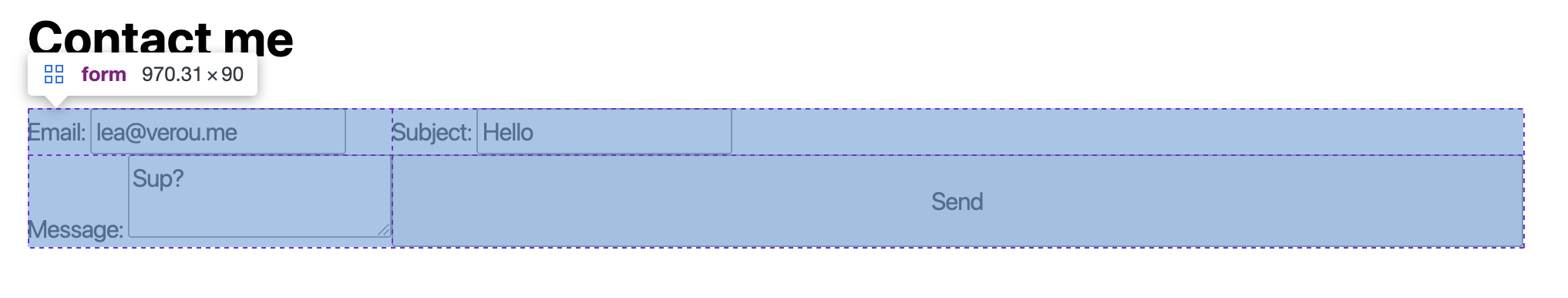
As often happens, the computer is doing exactly what we told it and not what we wanted 😀. It is placing the child elements of <form> on the grid we defined, one by one, in the order they appear in the HTML.
But we wanted each <label> to occupy two columns: one for its text, and one for the input field! Fear not, for we can do this.
The quick and dirty way would be to apply display: contents to the <label> elements, so that stop creating boxes of their own, and their children are placed directly in the grid. But the proper way to do it is to use subgrid. The core idea is that we make the labels grid containers themselves (display: grid), but their grid is a subset of the form grid (grid-template-columns: subgrid). The last piece of the puzzle, is that we need to make the labels (and the submit button while we’re at it) to span a whole row. We can use that by grid-column: 1 / -1; which means that the element will start at the first column and end at the last (-1) column.
At this point, your form should look about right. The last remaining touch is to add gap: 1em; to the form to add some spacing between the form controls.
Useful links for Grid Layout:
Step 4: Style your projects page
Soon, you will be populating your projects page with your assignments from this class. You can start by adding some dummy content and styling it.
Step 4.1: Add some dummy content
We will use Emmet to generate some dummy content.
Copy the following abbreviation:
.projects>article*12>h2>lorem4^img[src="https://vis-society.github.io/labs/2/images/empty.svg"]+p>lorem
Paste it in your projects/index.html file under the <h1> element (i.e. after its closing tag </h1>), and expand it with Emmet (delete and re-add the last character, then hit Tab). If it all worked well, you should have 12 articles, each with a heading, an image, and a paragraph of lorem ipsum text. <!–
Step 4.2: Stop images from getting too wide
Because the dummy image is an SVG file with no intrinsic size, it is stretching to fill the whole width of its container. It’s generally a good practice to restrict images from getting too wide by applying max-width: 100% to them. You don’t need to only apply this on images within .projects, you can apply it to all images. –>
Step 4.2: Applying a responsive grid
We will use Grid Layout to lay out the projects in a grid, but with a twist: rather than a fixed number of columns, we will use a flexible number of columns that adapt to the width of the page.
- First, apply
display: gridto.projectsto make it a grid container. - Then, use
repeat(auto-fill, minmax(15em, 1fr))forgrid-template-columnsto make the grid have as many columns as can fit in the container, each with a minimum width of15emand a maximum width of1fr(i.e. the remaining space). - Add
gap: 1emto create a bit of spacing between the projects.
When you try it, resize your window to see the grid adapt to the width of the page!
Step 4.3: Horizontal alignment with subgrid
The grid layout is looking good, but the content is not aligned. Some headings take up two lines, and the images are not aligned across columns.
Use subgrid on the <article> elements to make their contents align across columns. Tips:
- In this case, we will set
grid-template-rowstosubgrid, notgrid-template-columns. - We want to declare that each
<article>should span 3 rows without having to specify the starting row. We can do that by usinggrid-row: span 3;. - You will likely want to set
margin: 0on the<h2>to avoid excessive spacing.
Step 4.4: Finishing touches
Note that we don’t have a clear information hierarchy. The default <h1> size is very close to the default <h2> size, violating the design principle of contrast. Make it significantly larger (e.g. 400% the body text). This is not specific to the projects page, but it’s the only one that currently has <h2> elements.
While we’re at it we can also add some good defaults for all headings (h1, h2, h3, h4, h5, h6), by applying line-height: 1.1 (we typically want their leading to be smaller than body text) and text-wrap: balance to prevent uneven lines.
Step 5: Style your CV
Now that you got your feet wet with CSS, experiment with it in a more freeform way by styling your CV/resume page!
Always remember to commit and push your changes to GitHub after you make them and preview the published website as well!
CSS resources
Videos
-
That is not exactly what
flexdoes. It specifies how any remaining space is distributed, after elements have taken up their normal width. This means that you could end up with elements of uneven width if there is little remaining space or one is much wider than the others. ↩