Lab 7: D3 II (Intro to Interaction)
In this lab, we will learn:
- How to draw a scatter plot using D3
- How to show tooltips on hover as a way to provide more information about the data
- How to compute summary statistics about our data in a structured a way
- How to select data to filter calculated statistics
Table of contents
- Lab 7: D3 II (Intro to Interaction)
Check-off
To receive a lab checkoff, please submit your work asynchronously by filling out this form. TAs will review your lab and post your grade. If you do not pass, you will be able to fix any issues and resubmit or receive help in an office hour until the deadline.
Lab 7 Rubric
To successfully complete this lab check-off, ensure your work meets all of the following requirements:
General
- Same functionality from Labs 4-6.
- Succesfully deployed to GitHub Pages.
Scatterplot
- Commits show as separate data points
- Axes are aligned and visible
- Horizontal grid lines are visible but don’t interfere with the actual plot (opacity &/ color adapted)
Tooltip
- On
mouseenterandmouseleave, the tooltip shows and hides accordingly - The circles of the data points are scaled using the
d3.scaleSqrtscale - The color of the circles changes when hovered
- The circles of the data points are painted largest to smallest such that, with overlapping data points, the smallest ones are on top and can be interacted with.
Click Selection
- All commits are clickable and thus selectable
- The circles change color upon click and remaing colored as long as they are selected
Bar Chart
- Bar chart component renders on meta page
- Selecting commits changes the data underlying the chart and thus also the chart
- Colors and positions of the Bar chart remain unchanged no matter which commits are selected
- When no commits are selected, the language statistics of all are shown
- Bar chart title correctly reflects whether the language breakdown is show for selected commits or for the entire website
- Annotation does not cover other chart elements
- Horizontal axis shows only whole numbers (no decimals)
- Bar chart is sized such that it fits into standard viewport sizes at the same time as the scatterplot above
Slides (or lack thereof)
Just like the previous lab, there are no slides for this lab! Since the topic was covered in last Monday’s lecture, it can be helpful for you to review the material from it.
Step 0: Regenerate the code count loc.csv
As we did in Lab 6, run this command to regenerate the CSV of lines of code:
npx elocuent -d static,src -o static/loc.csv
If you’re on Windows, put static,src in quotation marks: "static,src"
Step 1: Visualizing time and day of commits in a scatterplot
Step 1.1: Typecasting commit dates and times
In Step 4.1 of Lab 6, we loaded the data from loc.csv into the variable locData in the routes/meta/+page.svelte file. Our code looked something like this:
onMount(async () => {
    locData = await d3.csv(`${base}/loc.csv`, row => ({
        ...row,
        line: Number(row.line),
        length: Number(row.length),
        depth: Number(row.depth)
    }));
	//...
Let’s review the structure of this data by adding a console.log(locData) right after the statement (within onMount) that sets the variable. Now, check your console. We place this inside onMount to ensure that the statement is triggered once the data is loaded.
You should be seeing something like this (I’ve expanded the first row):
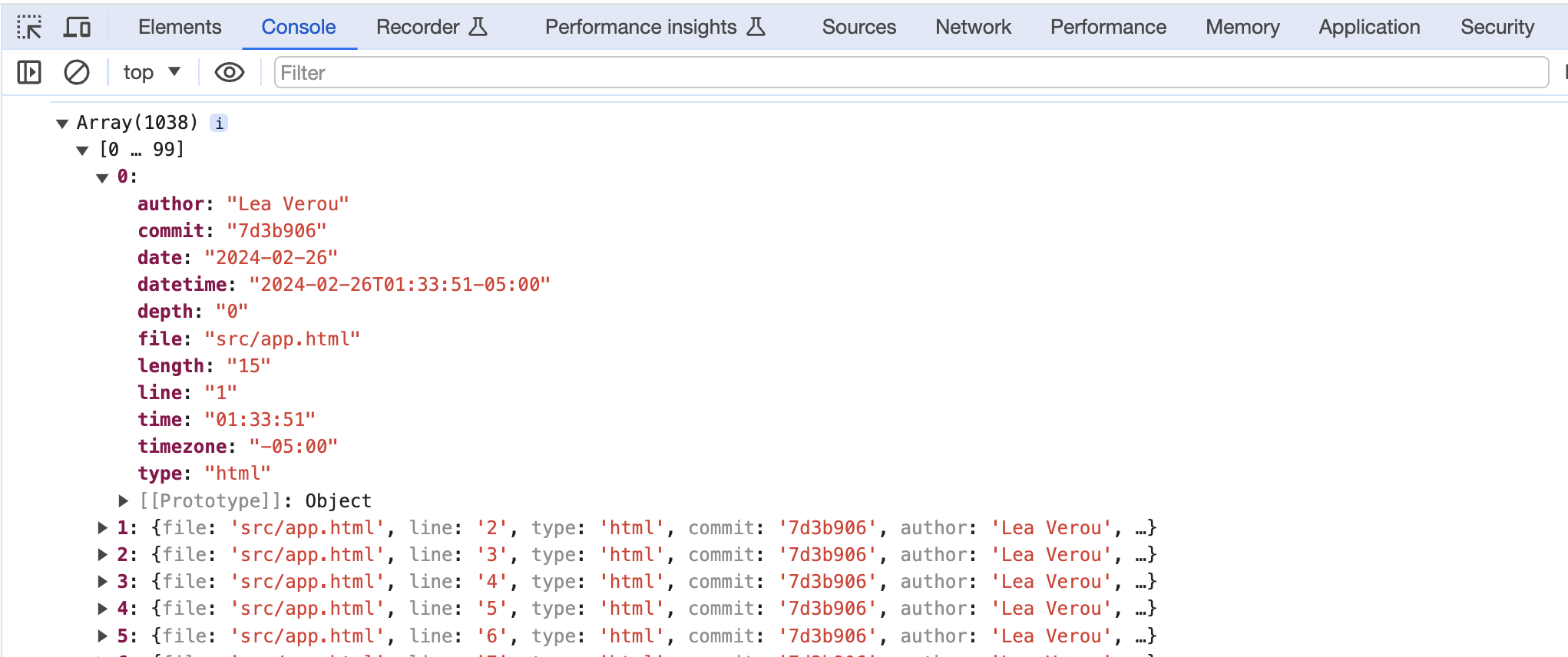
Note that everything while you converted the line numbers, lengths, and depths from strings to numbers using Number(), the dates and times are still strings. That can be quite a footgun when handling data.
Number() is an exampe of a row conversion function. We can adapt our data fetching to use similar conversions to convert the dates and times of commits to Date objects like so:
locData = await d3.csv(`${base}/loc.csv`, row => ({
	...row,
	line: Number(row.line),
	depth: Number(row.depth),
	length: Number(row.length),
	date: new Date(row.date + "T00:00" + row.timezone),
	datetime: new Date(row.datetime)
}));
It should now look like this:
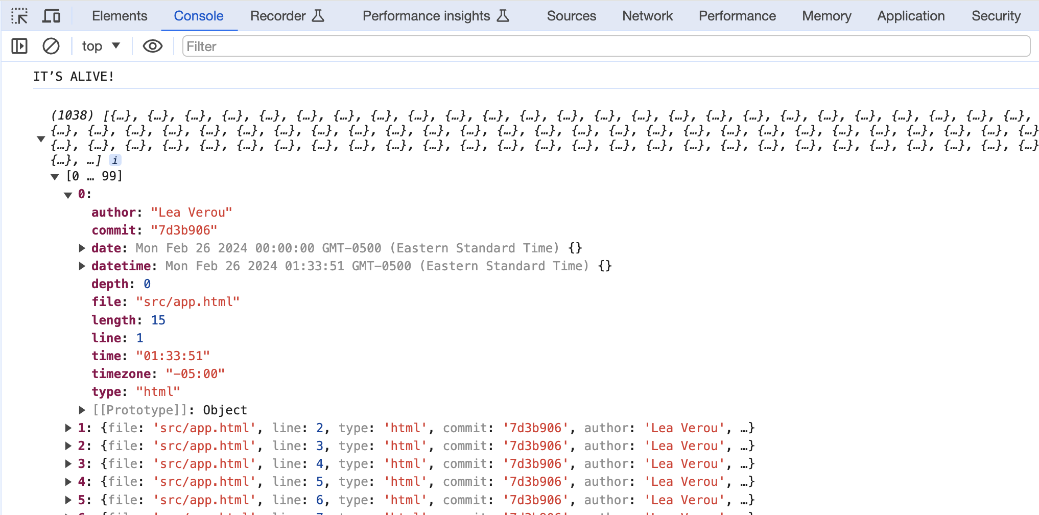
Don’t forget to delete the console.log line now that we’re done — we don’t want to clutter our console with debug info!
Step 1.2: Computing commit data
Notice that while this data includes information about each commit1 (that still has an effect on the codebase), it’s not in a format we can easily access, but mixed in with the data about each line (this is called denormalized data).
Let’s extract this data about commits in a separate object for easy access. We will compute this inside onMount after reading the CSV file.
First, define a commits variable outside onMount:
let commits = [];
Then, inside onMount, we will use the d3.groups() method to group the data by the commit property.
commits = d3.groups(locData, d => d.commit);
This will give us an array where each element is an array with two values:
- The first value is the unique commit identifier
- The second value is an array of objects for lines that have been modified by that commit.
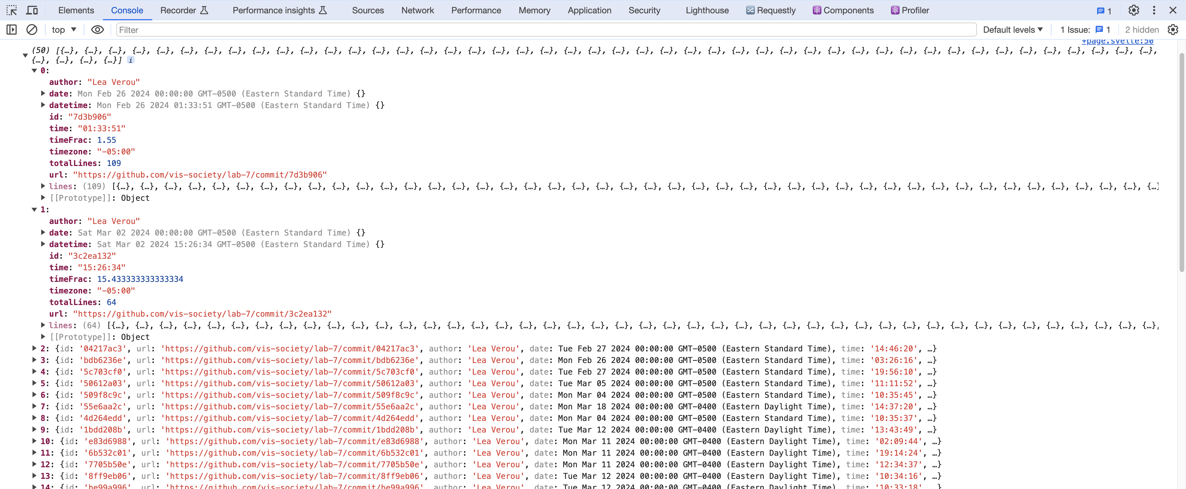
Check it out by adding console.log(commits) after setting it.
To transform this into an array of objects about each commit, with a lines property that contains the number of lines that were modified by that commit:
commits = d3.groups(locData, d => d.commit).map(([commit, lines]) => {
	let first = lines[0];
	let {author, date, time, timezone, datetime} = first;
	let ret = {
		id: commit,
		url: "https://github.com/vis-society/lab-7/commit/" + commit,
		author, date, time, timezone, datetime,
		hourFrac: datetime.getHours() + datetime.getMinutes() / 60,
		totalLines: lines.length,
		lines: lines
	};

	return ret;
});
It should look something like this:
Step 1.3: Displaying the stats (Optional)
Let’s get our feet wet with this data by displaying two more stats. Use a <dl> list that reuses the same formatting as in the GitHub profile stats on your homepage.
Avoid copy-pasting the CSS. You can either create a class and define the styling for dl.stats and its children in your style.css file, or create a Stats Svelte component that wraps it (I went with the former for simplicity, but the “proper” way is the latter).
Replace the paragraph we added previously and replace it with the following, such that data.length is now the first stat we display:
<dl class="stats">
	<dt>Total <abbr title="Lines of code">LOC</abbr></dt>
	<dd>{locData.length}</dd>
</dl>
You can display the total number of commits as the second statistic.
What other aggregate stats can you calculate about the whole codebase? Here are a few ideas (pick 1 from the list below, or come up with your own that you then show us during the lab check-off):
- Number of files in the codebase
- Maximum file length (in lines)
- Longest file
- Average file length (in lines)
- Average line length (in characters)
- Longest line length
- Longest line
- Maximum depth
- Deepest line
- Average depth
- Average file depth
- Time of day (morning, afternoon, evening, night) that most work is done
- Day of the week that most work is done

You will find the d3-array module very helpful for these kinds of computations, and especially:
Following is some advice on how to calculate these stats depending on their category.
Other stats that you can (but don't have to) consider :)
Aggregates over the whole dataset
The following code is meant to be living in your <script> section of your +page.svelte file. You want to compute them, when data is computed (i.e. when it has a length superior to 0) and then call the respective data fields in the HTML portion of your file.
These measures compute an aggregate (e.g. sum, mean, min, max) over a property across the whole dataset.
Examples:
- Average line length
- Longest line
- Maximum depth
- Average depth
These variables involve using one of the data summarization methods over the whole dataset, mapping to the property you want to summarize, and then applying the method. For example, to calculate the maximum depth, you’d use d3.max(data, d => d.depth). To calculate the average depth, you’d use d3.mean(data, d => d.depth).
Number of distinct values
These compute the number of distinct values of a property across the whole dataset.
Examples:
- Number of files
- Number of authors
- Number of days worked on site
To calculate these, you’d use d3.group() / d3.groups() to group the data by the property you want to count the distinct values of, and then use result.size / result.length respectively to get the number of groups.
For example, the number of files would be d3.group(data, d => d.file).size, (or d3.groups(data, d => d.file).length).
Grouped aggregates
These are very interesting stats, but also the most involved of the bunch. These compute an aggregate within a group, and then a different aggregate across all groups.
Examples:
- Average file length (in lines)
- Average file depth (average of max depth per file)
First, we use d3.rollup() / d3.rollups() to compute the aggregate within each group. If it seems familiar, it’s because we used it in the previous lab to calculate projects per year. For example, to calculate the average file length, we’d use d3.rollups() to callculate lengths for all files via
$: fileLengths = d3.rollups(data, v => d3.max(v, v => v.line), d => d.file);
Then, to find the average of those, we’d use d3.mean() on the result:
$: averageFileLength = d3.mean(fileLengths, d => d[1]);
Note that those reactive statements (defined by $), are placed outside of onMount. They are supposed to update dynamically whenever the variable it depends on changes. If we would place it inside, it would only update once (when the component is first mounted).
Min/max value
These involve finding not the min/max of a property itself, but another property of the row with the min/max value. This can apply both to the whole dataset and to groups.
Examples:
- Longest file
- Longest line
- Deepest line
- Time of day (morning, afternoon, evening, night) that most work is done
- Day of the week that most work is done
For example, let’s try to calculate the time of day that the most work is done. We’d use date.toLocaleString() to get the time of day and use that as the grouping value:
$: workByPeriod = d3.rollups(data, v => v.length, d => d.datetime.toLocaleString("en", {dayPeriod: "short"}))
Then, to find the period with the most work, we’d use d3.greatest() instead of d3.max() to get the entire element, then access the name of the period with .[0]:
$: maxPeriod = d3.greatest(workByPeriod, (d) => d[1])?.[0];
Step 1.4: Drawing the dots
Now let’s visualize our edits in a scatterplot with the time of day as the Y axis and the date as the X axis.
As you did in Step 2.2 of Lab 6, define an svg viewbox with specified width and height variables, and appropriate overflow styling to prevent the SVG from growing too large and to avoid clipping shapes.
Check your answer here!
First, let’s define a width and height for our coordinate space in our <script> block (just below your imports, outside any function such as onMount):
let width = 1000, height = 600;
Then, in the HTML above the horizontal bar chart we add an <svg> element to hold our scatter plot, and a suitable heading (e.g. “Commits by time of day” in a <h3> element):
<svg viewBox="0 0 {width} {height}">
	<!-- scatterplot will go here -->
</svg>
Add the following to the <style> element:
<style>
	svg {
		overflow: visible;
	}
</style>
Now, as shown in the Web-based visualization lecture, specifically when we discussed the x- and y-scales, we need to create scales to map our data to the coordinate space using the d3-scale module. We already practiced using scales in Step 2.3 of Lab 6.
We will need to create two scales: a Y scale for the times of day, and an X scale for the dates.
The Y scale (yScale variable) is a standard linear scale that maps the hour of day (0 to 24) to the Y axis (0 to height).
But for the X scale (xScale variable), there’s a few things to unpack:
- Instead of a linear scale, which is meant for any type of quantitative data, We use a time scale which handles dates and times automagically. It works with JS
Dateobjects, which we already have in thedatetimeproperty of each commit. - We can use
d3.extent()to find the minimum and maximum date in our data in one fell swoop instead of computing it separately viad3.min()andd3.max(). - We can use
scale.nice()to extend the domain to the nearest “nice” values (e.g. multiples of 5, 10, 15, etc. for numbers, or round dates to the nearest day, month, year, etc. for dates).
Define both scales as reactive variables ($:) in the <script> element based on the linked resources. To avoid finding a dot which is outside the x-axis range, which occurs if you have a commit which is at some time after 00:00 of the current date, we need to create two variables holding the minimum (starting) and maximum (latest + 1 day) date. To this end, we’ll use d3’s max and min functionalities and add one day to the maxDate. This allows us to create the correct xScale extent.
Check your answers here!
// Thanks to Nathanael Jenkins for flagging this to us!
$: [minDate, maxDate] = d3.extent(commits.map(d => d.date));
$: maxDatePlusOne = new Date(maxDate);
$: maxDatePlusOne.setDate(maxDatePlusOne.getDate() + 1);

$: xScale = d3.scaleTime()
              .domain([minDate, maxDatePlusOne])
              .range([0, width])
              .nice();

$: yScale = d3.scaleLinear()
              .domain([24, 0])
              .range([height, 0]);
Once we have both scales, we can draw the scatter plot by drawing circles with the appropriate coordinates inside our <svg> element. Note that we already define an index count here to be able to use it later for the tooltip in Step 3.
<g class="dots">
{#each commits as commit, index }
	<circle
		cx={ xScale(commit.datetime) }
		cy={ yScale(commit.hourFrac) }
		r="5"
		fill="steelblue"
	/>
{/each}
</g>
The group (<g>) element is not necessary, but it helps keep the SVG structure a bit more organized once we start adding other visual elements.
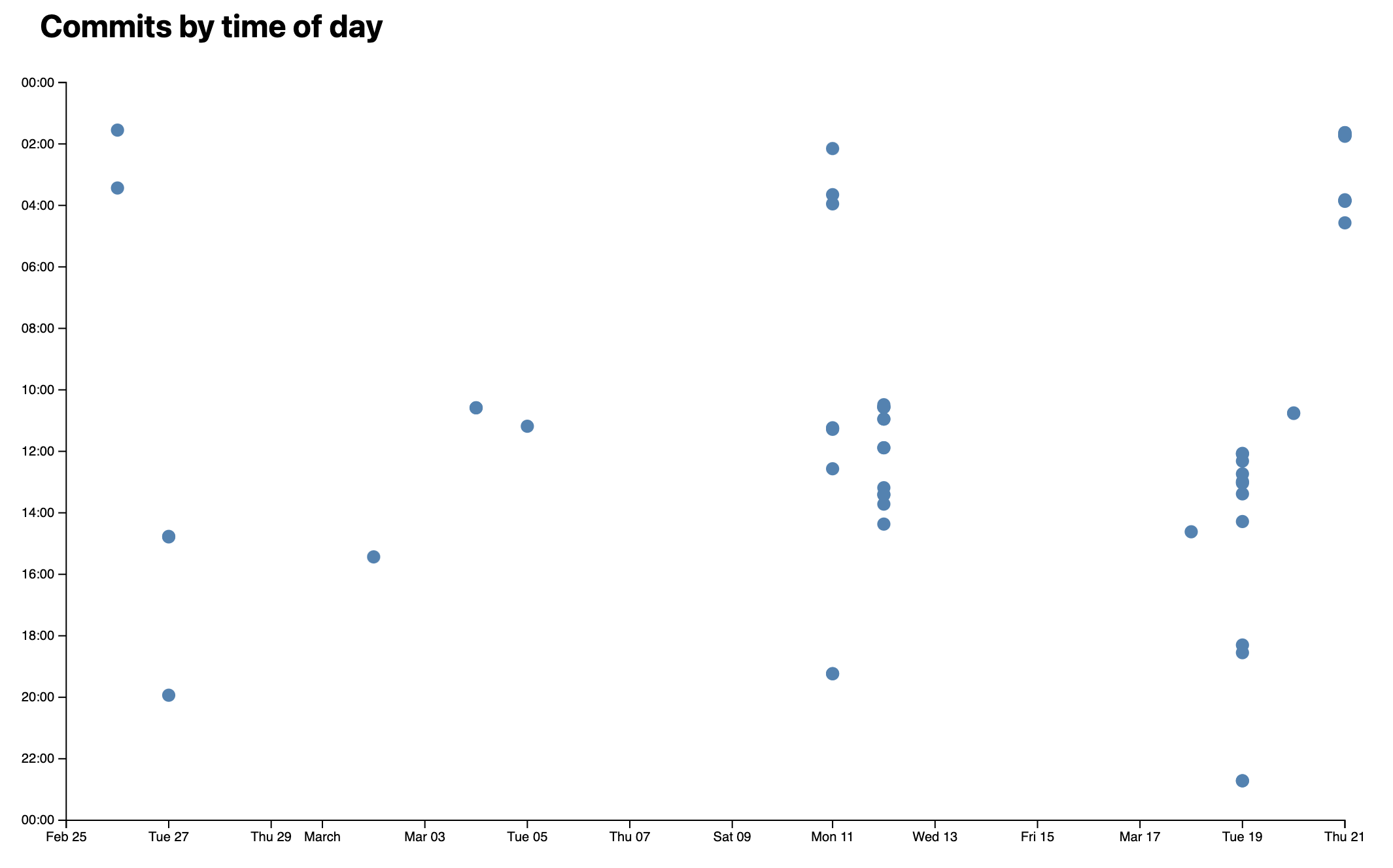
If we preview at this point, we’ll get something like this:
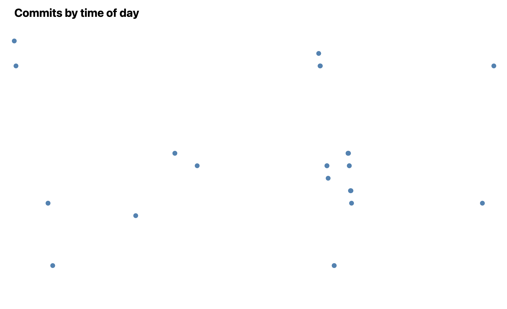
That was a bit anti-climactic! We did all this work and all we got was a bunch of dots?
Indeed, without axes, a scatterplot does not even look like a chart. Let’s add them!
Step 1.5: Adding axes
As shown in lecture, the first step to add axes is to create space for them. Define a margin object as you did in Step 2.3 of Lab 6.
Now we would need to adjust our scales to account for these margins by changing:
- The range of the X scale from
[0, width]to[margin.left, width - margin.right] - The range of the Y scale from
[height, 0]to[height - margin.bottom, margin.top]
However, for readability and convenience, you can also define a usableArea variable to hold these bounds, since we’ll later need them for other things too:
let usableArea = {
	top: margin.top,
	right: width - margin.right,
	bottom: height - margin.bottom,
	left: margin.left
};
usableArea.width = usableArea.right - usableArea.left;
usableArea.height = usableArea.bottom - usableArea.top;
Now the ranges become much more readable. Update the arguments of .range in xScale and yScale accordingly.
[usableArea.left, usableArea.right]for the X scale[usableArea.bottom, usableArea.top]for the Y scale
Now, walk through the steps of adding axes. We’ve already done this in Step 2.4 of Lab 6; consult this for a walkthrough if you need help. Try using your new usableArea variable rather than the margin computations.
Check your answers here!
First, we create xAxis and yAxis variables in our JS to hold our axes:
let xAxis, yAxis;
and <g> elements within our <svg> that we bind to them:
<g transform="translate(0, {usableArea.bottom})" bind:this={xAxis} />
<g transform="translate({usableArea.left}, 0)" bind:this={yAxis} />
Make sure these elements come before your dots, since SVG paints elements in the order they appear in the document, and you want your dots to be painted over anything else.
Then we use d3.select() below our xAxis and yAxis definitions to select these elements and apply the axes to them via d3-axis functions:
$: {
	d3.select(xAxis).call(d3.axisBottom(xScale));
	d3.select(yAxis).call(d3.axisLeft(yScale));
}
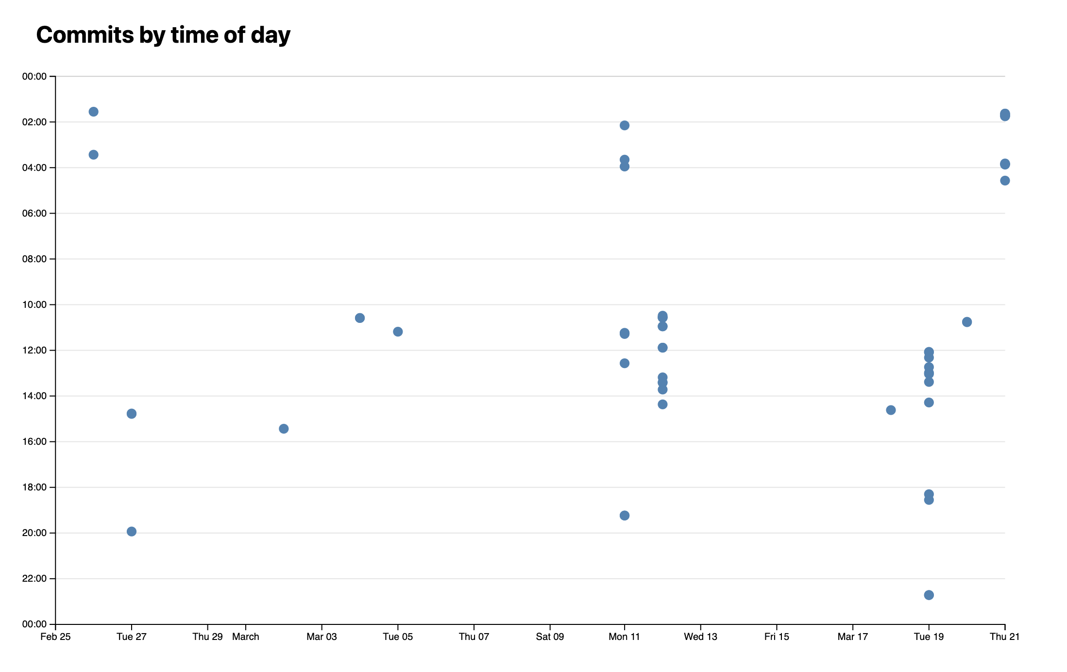
If we view our scatterplot now, we’ll see something like this:

Much better, right?
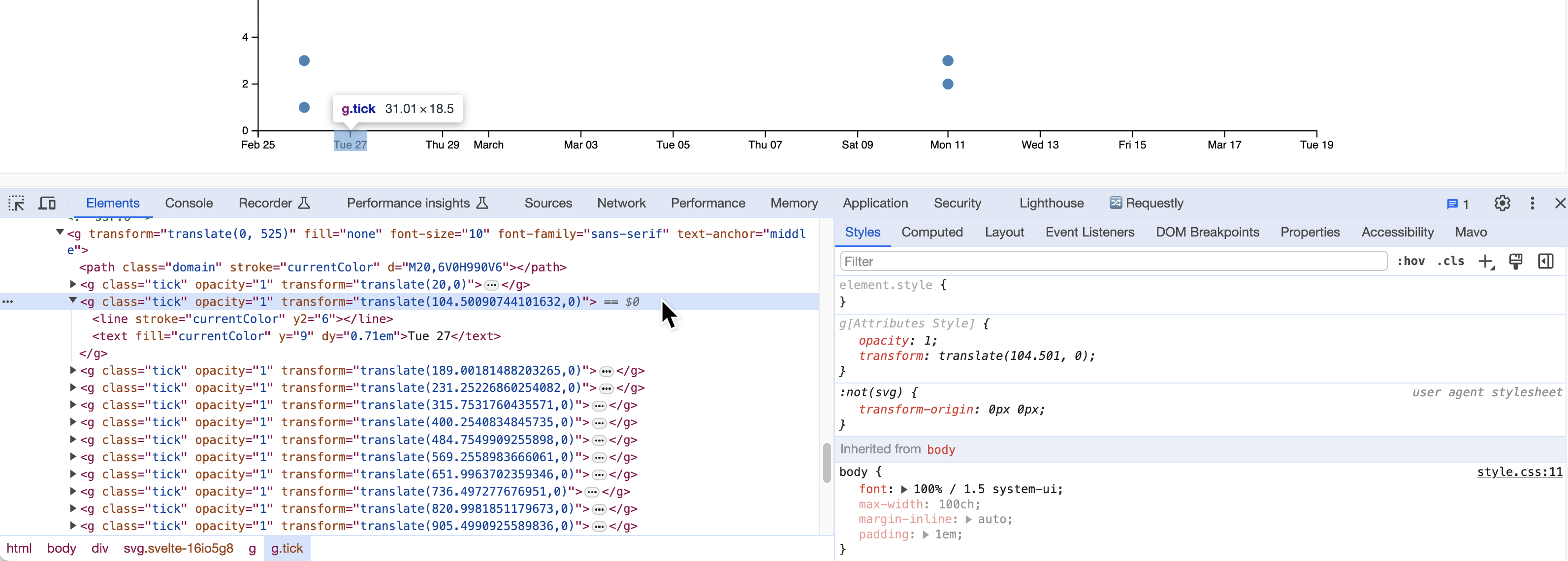
But how does it work? Right click one of the points in the axes and select “Inspect Element”. You will notice that the ticks are actually <g> elements with <text> elements inside them. So D3 has auto-magically generated these elements and added them to our visualization.
The only thing that remains is to actually format the Y axis to look like actual times. We can do that using the axis.tickFormat() method:
d3.select(yAxis).call(d3.axisLeft(yScale).tickFormat(d => String(d % 24).padStart(2, "0") + ":00"));
What is this function actually doing? Let’s break it down:
d % 24uses the remainder operator (%) to get0instead of24for midnight (we could have doned === 24? 0 : dinstead)String(d % 24)converts the number to a stringstring.padStart()formats it as a two digit number- Finally, we append
":00"to it to make it look like a time.
D3 provides a host of date/time formatting helpers in the d3-time-format module, however for this case, simple string manipulation is actually easier.
The result looks like this:
Step 1.6: Adding horizontal grid lines
Axes already improved our plot tenfold (it now looks like an actual scatterplot for one!) but it’s still hard to see what X and Y values each dot corresponds to.
Let’s add grid lines to make it easier to read the plot at a glance.
When adding grid lines, there are a few tradeoffs to consider. You want to make them prominent enough to assist in reading the chart, but not so prominent that they add clutter and distract from the data itself. Err on the side of fewer, fainter grid lines rather than dense and darker ones.
We will only create horizontal grid lines for simplicity, but you can easily add vertical ones too if you want (but be extra mindful of visual clutter).
Conceptually, there is no D3 primitive specifically for grid lines. Grid lines are basically just axes with no labels and freakishly long ticks. 😁
So we add grid lines in a very similar way to how we added axes: We create a JS variable to hold the axis (I called it yAxisGridlines), and use a reactive statement that starts off identical to the one for our yScale. First, we will use axis.tickFormat() again, but this time to remove the text. Then, we use the axis.tickSize() method with a tick size of -usableArea.width to make the lines extend across the whole chart (the - is to flip them). Place this definition together with the ones for the x- and y-Axis in the same reactive statement.
$: {
	d3.select(yAxisGridlines).call(
		d3.axisLeft(yScale)
		  .tickFormat("")
		  .tickSize(-usableArea.width)
	);
}
We also need to create a <g> element to hold the grid lines. Let’s give it a class of gridlines so we can style it later:
<g class="gridlines" transform="translate({usableArea.left}, 0)" bind:this={yAxisGridlines} />
Make sure that your <g> element for the grid lines comes before the <g> element for the Y axis, as you want the grid lines to be painted under the axis, not over it.
If we look now, we already have grid lines, but they look a bit too prominent.
Let’s add some CSS to fix this:
.gridlines {
	stroke-opacity: .2;
}
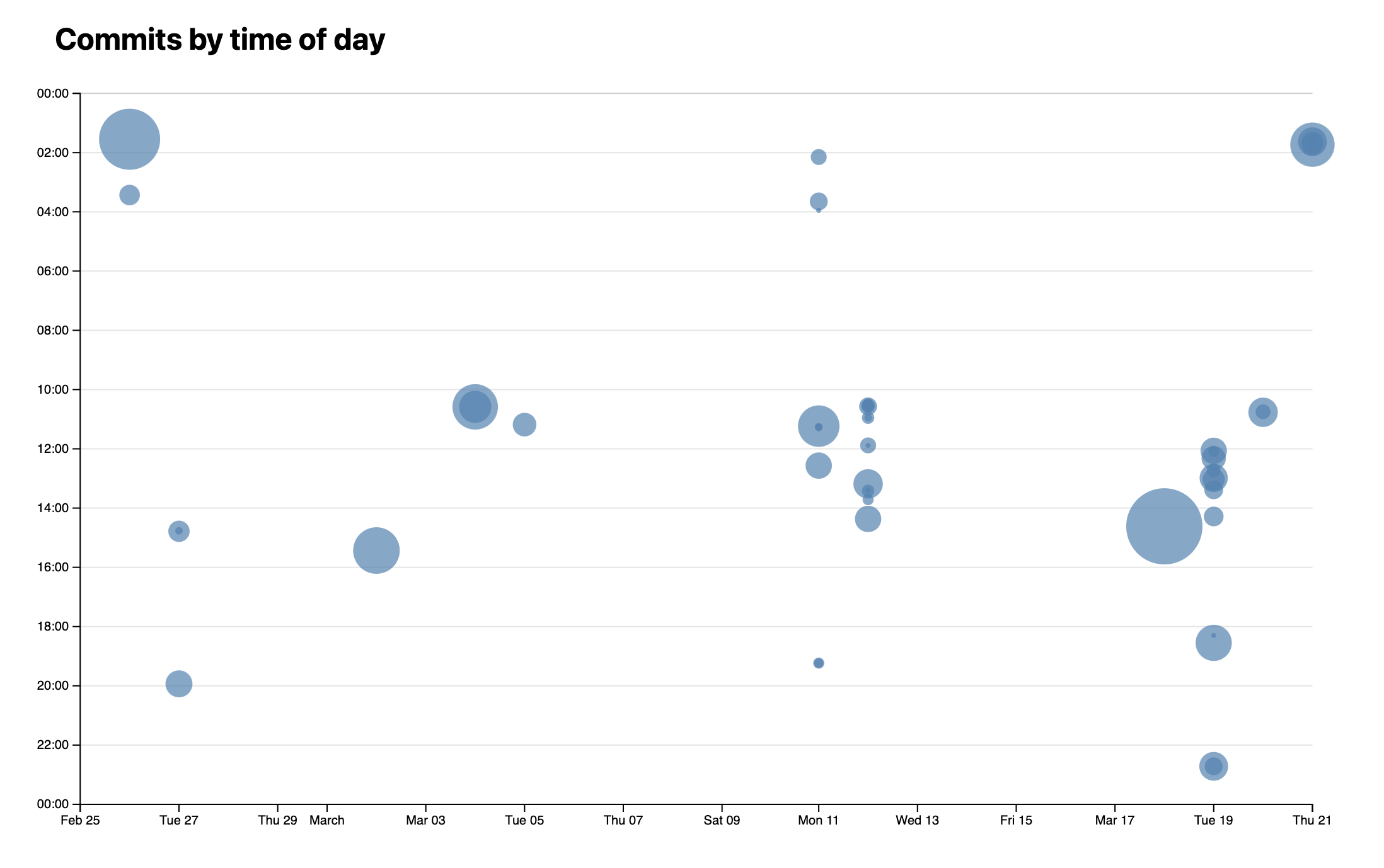
Here the comparison before and after:

Do not use .gridlines line, .gridlines .tick line or any other descendant selector to style the lines: Svelte thinks it’s unused CSS and removes it!
Coloring each line based on the time of day, with bluer colors for night times and orangish ones for daytime? 😁
Step 2: Communicating lines edited via the size of the dots
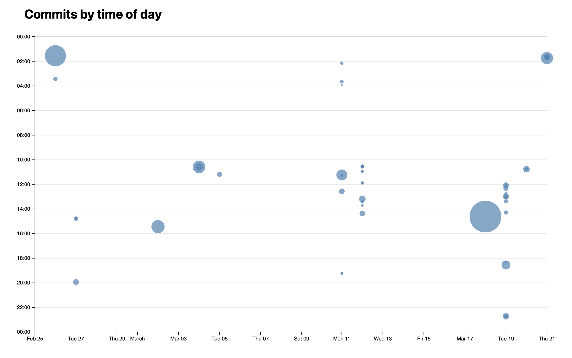
Note that the tiniest of edits are currently represented by the same size of dot as the largest of edits. It is common to use the size of the dots to communicate a third variable, in this case the number of lines each commit edited.
Step 2.1: Calculating our scale
We will need to define a new scale to map the number of lines edited to the radius of the dots. This means we need to:
- Decide on the minimum and maximum radii we want to allow. Here, we can edit the circle
rattribute and play around with different radii to decide. I settled on5and30. - Calculate the range of values for number of lines edited by a single commit. For this one, we can refer to Step 1.4 and use
d3.extent()to find the minimum and maximum value in one go. Then define a new linear scale (I called itrScale) usingd3.scaleLinear()mapping the domain of the number of lines edited to the range of radii we decided on.
Now, in our HTML, instead of a hardcoded r="5", set the circle radius to r={ rScale(commit.totalLines) }.
If everything went well, you should now see that the dots are now different sizes depending on the number of lines of each!
As one last tweak, apply fill-opacity to the dots to make them more transparent, since the larger they are, the more likely they are to overlap.
Step 2.2: Area, not radius
If you cross-check your circle sizes with your array of commits, you might notice that the size of the dots is not very good at communicating the number of lines edited. This is because the area of a circle is proportional to the square of its radius (A = πr²), so a commit with double the edits appears four times as large!
To fix this, we will use a different type of scale: a square root scale. A square root scale is a type of power scale that uses the square root of the input domain value to calculate the output range value. Thankfully, the API is very similar to the linear scale we used before, so all we need to do to fix the issue is to just change the function name.
Step 3: Adding a tooltip
Even with the gridlines and expressive sizing, it’s still hard to see what each dot corresponds to. Let’s add a tooltip that shows information about the commit when you hover over a dot.
Step 3.1: Highlighting hovered point
While there are some differences, SVG elements are still DOM elements. This means they can be styled with regular CSS, although the available properties are not all the same.
Let’s start by adding a hover effect to the commit dots. What about fading out all other commit dots when one dot is hovered? We can target the <circle> to change color when it is hovered and add a timer for easy transition with this code inside our <style> section:
circle {
	//...
	transition: 200ms;
	&:hover {
		fill:darkgreen;
	}
}
This gives us something like this:
You may notice that when dots are overlapping, it’s sometimes harder to hover over the smaller ones, if they happen to be painted underneath the larger one.
One way to fix this is to sort commits in descending order of totalLines, which will ensure the smaller dots are painted last. To do that, we can use the d3.sort() method. This would go in your onMount() callback:
commits = d3.sort(commits, d => -d.totalLines);
Why the minus? Because d3.sort() sorts in ascending order by default, and we want descending order, and that’s shorter than writing a custom comparator function.
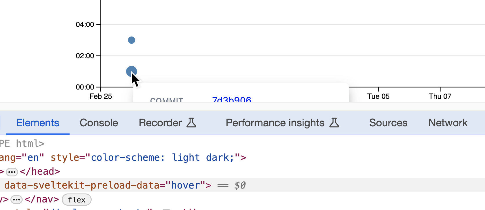
Step 3.2: Tooltip info in a static element
First, we’ll render the data in an HTML element, and once we’re sure everything works well, we’ll make it look like a tooltip.
We will use a hoveredIndex variable to hold the index of the hovered commit, and a hoveredCommit variable that is reactively updated every time a commit is hovered and holds the data we want to display in the tooltip:
let hoveredIndex = -1;
$: hoveredCommit = commits[hoveredIndex] ?? hoveredCommit ?? {};
Then, in our SVG, we add mouseenter and mouseleave event listeners on each circle element:
<circle
	on:mouseenter={evt => hoveredIndex = index}
	on:mouseleave={evt => hoveredIndex = -1}
	<!-- Your other elements ... -->
/>
You may notice that you have a yellow squiggly here indicating an Accessibility warning. These built-in warnings are great reminders from Svelte to think about how accessible our applications are when we make them. We will come back to address warnings like these in Lab 10!
Now add an element to display data about the hovered commit:
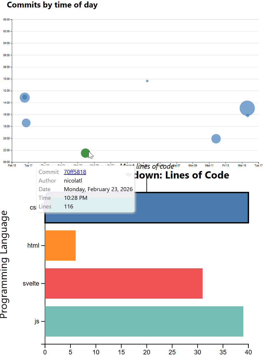
<dl class="info tooltip">
	<dt>Commit</dt>
	<dd><a href="{ hoveredCommit.url }" target="_blank">{ hoveredCommit.id }</a></dd>

	<dt>Date</dt>
	<dd>{ hoveredCommit.datetime?.toLocaleString("en", {dateStyle: "full"}) }</dd>

	<!-- Add: Time, author, lines edited -->
</dl>
In the CSS, we add two rules:
dl.infowith grid layout so that the<dt>s are on the 1st column and the<dd>s on the 2nd, remove their default margins, and apply some styling to make the labels less prominent than the values..tooltipwithposition: fixedto it andtop: 1em;andleft: 1em;to place it at the top left of the viewport so we can see it regardless of scroll status.
Why not just add everything on a single CSS rule? Because this way we can reuse the .info class for other <dl>s that are not tooltips and the .tooltip class for other tooltips that are not <dl>s.
What’s the difference between fixed and absolute positioning? position: fixed positions the element relative to the viewport, while position: absolute positions it relative to the nearest positioned ancestor (or the root element if there is none). The position offsets are specified via top, right, bottom, and left properties (or their shorthand, inset) In practice, it means that position: fixed elements stay in the same place even when you scroll, while position: absolute elements scroll with the rest of the page.
Overall, at the end of this step, we should have something like this:
Step 3.3: Making it look like a tooltip
Seeing this info is already useful, but it’s not really a tooltip yet. There are three components to making our <dl> an actual tooltip:
- Styling it like a tooltip (e.g. giving it a shadow that makes it look raised from the page)
- Making it only appear when we are hovering over a dot (Step 3.4)
- Positioning it near the mouse cursor (Step 3.5)
FYI, these steps can be done in any order since they are basically independent tasks.
In terms of styling, you should definitely give it a background-color as otherwise the text will be hard to read. You can either go for a solid color (e.g. white) or a semi-transparent color (e.g. oklch(100% 0% 0 / 80%)) that will show some of the chart behind it.
A few other useful CSS properties are:
box-shadowfor shadows. Avoid overly prominent shadows: you are trying to make it look elevated, not to decorate it. The shadow should not be distracting, but just enough to make it look like it’s floating above the page. Generally, the larger the blur radius and the more transparent the color, the more raised the element will look. Experiment with different values to see what looks best for your design.border-radiusfor rounded cornersbackdrop-filterto blur what’s underneath (frosted glass effect). This is only relevant if you have a semi-transparent background color.
You would also probably want to add some spacing between its content and the edges of the tooltip, i.e. padding.

Step 3.4: Making only appear when we are hovering over a dot
Currently, our tooltip appears even when it has no content, which is quite jarring. It also appears when we are not hovering over any dot, and just shows the previous content. That’s not too bad when it’s fixed at the top left of the viewport, but can you picture how annoying this would be if it was an actual tooltip that just won’t take a hint and go away?
We could wrap the whole tooltip with an {#if hoveredIndex > -1 }...{/if} block and it would work. However, that’s not very flexible. It makes it hard to use transition effects when the tooltip disappears (because it’s gone immediately), make it disappear with a delay to allow users to interact with it, or not disappear at all if users are actively interacting with it (hovering it or focusing elements within it).
Instead, we will use the HTML hidden attribute:
<dl class="info tooltip" hidden={hoveredIndex === -1}>
and add some CSS to hide the element by fading it out:
dl.info {
	/* ... other styles ... */
	transition-duration: 500ms;
	transition-property: opacity, visibility;

	&[hidden]:not(:hover, :focus-within) {
		opacity: 0;
		visibility: hidden;
	}
}
It should now behave like this:
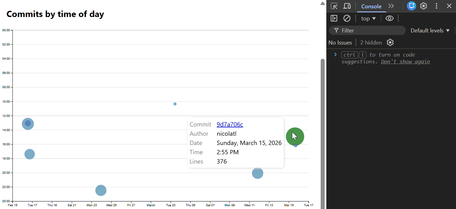
Step 3.5: Positioning the tooltip near the mouse cursor
Now, the final piece of the puzzle to make this element into an actual tooltip!
Our tooltip is currently positioned at the top left corner of the viewport (actually 1em from the top and 1em from the left) in a hardcoded way, via the top and left properties. To position it near the mouse cursor instead, we need to set these properties dynamically based on the mouse position.
Thankfully, the event object on mouse events has several properties that give us the mouse position relative to different things. To get the mouse position relative to the viewport, we can use the x and y properties of the event object.
We will declare a new variable in our JS and use it to store the last recorded mouse position:
let cursor = {x: 0, y: 0};
Then, we will update it in our mouseenter event listener:
<circle
	on:mouseenter={evt => {
		hoveredIndex = index;
		cursor = {x: evt.x, y: evt.y};
	}}
	<!-- Other attributes/directives that you already have in this element -->
/>
Print it out in your HTML via {JSON.stringify(cursor, null, "\t")} and move the mouse around to make sure it works!
As with all these debug statements, don’t forget to remove it once you verify it works.
Now let’s use these to set top and left on the tooltip:
<dl class="info tooltip" hidden={hoveredIndex === -1} style="top: {cursor.y}px; left: {cursor.x}px">
This is the result:
While we directly set top and left for simplicity, we usually want to avoid setting CSS properties directly. It’s more flexible to set custom properties that we then use in our CSS. For example, assume you wanted to subtly move the shadow as the mouse pointer moves to create more sense of depth (parallax). If we had custom properties with the mouse coordinates, we could just use them in other properties too, whereas here we’d have to set the box-shadow with inline styles too.
Step 3.6: Bulletproof positioning
Our naïve approach to positioning the tooltip near the mouse cursor by setting the top and left CSS properties works well if the tooltip is small and the mouse is near the center of the viewport. However, if the tooltip is near the edges of the viewport, it falls apart.
Try it yourself: dock the dev tools at the bottom of the window and make them tall enough that you can scroll the page. Now hover over a dot near the bottom of the page. Can you see the tooltip?
Solving this on our own is actually an incredibly complicated problem in the general case. Thankfully, there are many wonderful packages that solve it for us. We will use Floating UI here.
First, we install it via npm:
npm install @floating-ui/dom
Then, we import the three functions we will need from it:
import {
	computePosition,
	autoPlacement,
	offset,
} from '@floating-ui/dom';
Just like D3, Floating UI is not Svelte-specific and works with DOM elements. Therefore, just like we did for the axes in Step 4.2, we will use bind:this to bind a variable to the tooltip element:
let commitTooltip;
<!-- Other attributes omitted for brevity -->
<dl class="info tooltip" bind:this={commitTooltip}>
Then, we will use computePosition() to compute the position of the tooltip based on the mouse position and the size of the tooltip. This function returns a Promise that resolves to an object with properties like x and y that we can use in our CSS instead of cursor. Therefore, let’s create a new variable to hold the position of the tooltip that we will update in our mouseenter event listener:
let tooltipPosition = {x: 0, y: 0};
Since the code of this event listener is growing way beyond a single line expression, it’s time to move it to a function.
We’ll try something different this time: instead of creating separate functions for each event, we will invoke the same function for all events, and read evt.type to determine what to do. For this, create a new dotInteraction() function in your JS that takes the index of the dot and the event object as arguments:
function dotInteraction (index, evt) {
	if (evt.type === "mouseenter") {
		// dot hovered
	}
	else if (evt.type === "mouseleave") {
		// dot unhovered
	}
}
Move your existing event listener code, i.e. the code we have added to the circle element in the svg to handle on:mouseenter and on:mouseleave to the dotInteraction() function. We can now update the event listeners in circle to just call the dotInteraction function instead:
<circle
	on:mouseenter={evt => dotInteraction(index, evt)}
	on:mouseleave={evt => dotInteraction(index, evt)}
	<!-- Other attributes/directives that you already have in this element -->
/>
Back to the dotInteraction() function, we can use evt.target to get the dot that was hovered over:
let hoveredDot = evt.target;
Now, in the block that handles the mouseenter events, we will use computePosition() to compute the position of the tooltip based on the position of the dot. To do so, let’s first mark the function as async, which allows us to wait for async code to realize. This is helpful because computePosition() returns such a Promise that resolves to the position of the tooltip.
This is how your function should look like now:
async function dotInteraction (index, evt) {
	let hoveredDot = evt.target;
	if (evt.type === "mouseenter") {
		hoveredIndex = index;
		cursor = {x: evt.x, y: evt.y};
		tooltipPosition = await computePosition(hoveredDot, commitTooltip, {
			strategy: "fixed", // because we use position: fixed
			middleware: [
				offset(5), // spacing from tooltip to dot
				autoPlacement() // see https://floating-ui.com/docs/autoplacement
			],
		});        }
	else if (evt.type === "mouseleave") {
		hoveredIndex = -1
	}
}
We won’t go into much detail on the API of Floating UI, so it’s ok to just copy the code above. However, if you want to learn more, their docs are excellent.
Lastly, replace cursor with tooltipPosition in the style attribute of the tooltip dl element (not the CSS in the <style> block) to actually use this new object.
If you preview now, you should see that the tooltip is always visible and positioned near the hovered dot, regardless of where it is relative to the viewport.
At this point you can also remove the cursor variable and the code setting it since we don’t need it anymore, unless there are other things you want to do where knowing the mouse position is useful.
Step 4: Clickable Commits
Up until now, we were able to give users an overview of the data of single commit events. However, we might be interested in giving the opportunity to analyze aggregated data that spans multiple commits. For this, we need to make our commits selectable in some fashion. For the scope of this lab, we will now work on making individual commits selectable by click interactions. As an optional step later on, we will also be looking at brushing - but let’s do one step at a time!
Step 4.1: Making commits clickable
Before we can add the right event handling to make click selections possible, we need to make a few changes to our code. For one, we need a variable that holds all the selected commits. For this, we can simply define an array of values in our <script> element:
let clickedCommits = [];
Now, we just need to add clicked commits and remove commits that were already selected and then have been clicked again. Such a functionality is often referred as a toggle switch.
If you remember, we have already done quite a bit of work with our <circle> svg elements and mouse interactions. Therefore, let’s leverage that! Let’s add to our async dotInteraction function the following check:
else if (evt.type === "click") {
	let commit = commits[index]
	if (!clickedCommits.includes(commit)) {
		// Add the commit to the clickedCommits array
		clickedCommits = [...clickedCommits, commit];
	}
	else {
			// Remove the commit from the array
			clickedCommits = clickedCommits.filter(c => c !== commit);
	}
}
Using clickedCommits.includes(commit), we check whether the specific commit is already selected. Now, what this code does for us is two fold. If the commit is not part of our array of selected commits, we create a new array that includes it. For this, we use JavaScript’s spread operator to unwrap (or spread) the existing array, add the new commit and then store it in place of the original array. If the commit is already there, we want to toggle it “off” and we thus filter the array to include all selected commits but the one clicked.
The software engineer inside of you might be compelled to put clickedCommits.includes(commit) into a helper function as we will also reuse it in the circle SVG component in the next step. For your mental sanity: don’t, unless you make certain key components reactive. If you choose to do the optional brushing part of this lab, you will see another flavor using the reactive paradigm.
The last thing that remains is to add the dotInteraction function to also trigger on:click:
<circle
	on:click={ evt => dotInteraction(index, evt) }
	<!-- Other attributes/directives that you already have in this element -->
/>
To check wheter what we have done works, we can add a console log into our dotInteraction() function where we enter upon a "click" event. Something like console.log(clickedCommits); should do the trick. If you try it out now, you should see something like this in your browser console:
Step 4.2: Adding the Visuals
So far, clicking only changes the state of an internal variable. However, since we are all about interactive data visualization, we now add some visual feedback for the user. To do so via a class:selected directive added to the <circle> element and leveraging the helper function we defined before:
<circle
	class:selected={ clickedCommits.includes(commit) }
	<!-- Other attributes/directives that you already have in this element -->
/>
You know what to do now, right? We just define a custom CSS for that class like so (you can also specify a custom color but this will give you nice consistency throughout your page):
.selected {
    fill: var(--color-accent);
}
It should now look something like so:
Step 5: Filter Bar Chart By Commits
In this step, we’ll filter our bar chart to show the code language breakdown of only selected commits, if any are selected (otherwise, just show the full website breakdown). The end result will look like this:
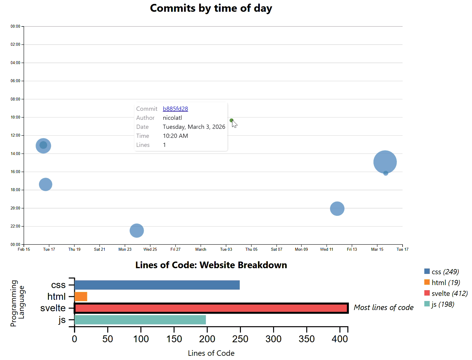
Step 5.1. Prepare Filtered Data for the Bar Chart
First, we need to edit our data passed to our horizontal bar chart svelte component (BarHorizontal.svelte) to only include lines from the selected commits – if commits have been selected. Importantly, you’ll want to show a bar for each language in the website, even if some commits have 0 lines in that language. Otherwise, the bar layout might distractingly change as commit selections change.
I ended up recreating the array barData from scratch to meet these requirements using the following steps:
- Use a conditional operator to check if any commits are selected. If so, use flatMap() to map the
linesof yourclickedCommitsinto an array of selected lines. If not, use all the lines of code. - Use
d3.rollup()to generate a map of language types to counts from your list of selected lines. You should be able to reuse some of your existing logic from Lab 6 here. - Generate a list of all programming languages in the codebase. For this, you can use
map()to map all of your lines of code inlocDatato their languagetype. You can then create anew Set()of this array so that it only lists each language once. Finally, convert this set back to an array usingArray.from(). - Use
map()again to map your list of all programming languages to the proper input format for your bar chart, where each language is a label and each value is the line count. You can get line counts from your list from #2 using.get(). If you can’t.get()the count for a language because it’s not in the selected list, use 0 instead.
Check your answers here!
Note: these solutions assume you used the same input format for your horizontal bar chart as for the vertical bar chart in Lab 6: an array of JSON objects with label and value fields.
// 1.
$: selectedLines = (clickedCommits.length > 0 ? clickedCommits.flatMap(d => d.lines) : locData);

//2.
$: selectedCounts = d3.rollup(
    selectedLines,
    v => v.length,
    d => d.type
);

//3.
$: allTypes = Array.from(new Set(locData.map(d => d.type)));

//4.
$: barData = allTypes.map(type =>  ({ label: String(type), value: selectedCounts.get(type) || 0 }));
If you’ve followed along, your bar chart should now dynamically update as different commits are selected, providing a visual breakdown of programming languages.
(You may need to make your viewport narrow to see both the scatter plot and bar chart at the same time. We’ll fix this in Step 5.5)
Step 5.2 Conditional title
Right now, my bar chart title says it’s a “Website Breakdown,” but that’s only true if I have no commits selected. Now, let’s add logic to change the title if commits are selected. To do this:
- Make
export let title=""be a variable accepted by your horizontal bar chart svelte component as input. Replace the title you gave it with{title}. Now, when you create an instance of the component on your Meta page, you’ll do so like<BarHorizontal data={barData} title={...}/> - Use a conditional operator to set the
...depending on if you have selected commits or not.
Here’s how this should look:
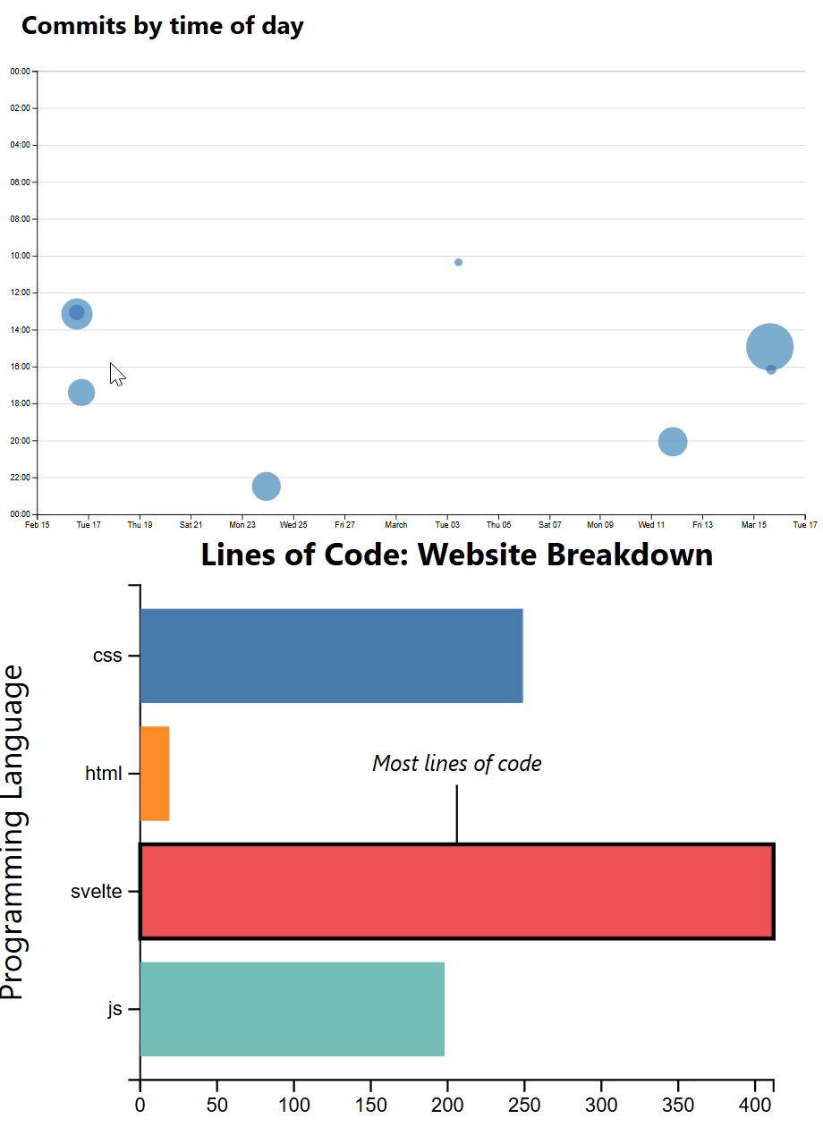
Step 5.3 Bulletproof Positioning: Annotation
You might notice that as your horizontal bar chart dynamically renders, your annotation moves to cover other bars, axes, and/or the chart title. We don’t want this! Unfortunately, floating-ui only works for DOM elements, not SVG, so we can’t use the solution from Step 3.6. Feel free to try any solution you come up with; for me, it was easiest to position my annotation to the right of my longest bar. Here’s what I did in my BarHorizontal.svelte component template:
- Remove the leader line
- Adjust the annotation
text-anchorto “start”- Adjust the annotation
xandysuch that the text starts at an appropriate place to the right of the bar- Adjust the annotation text size and component
margin.rightso that the annotation never overlaps with the legend
Step 5.4 Limiting the horizontal axis to whole numbers
If you have any 1- or 2-line commits, you’ll see tick marks on your x-axis for fractions of lines. This doesn’t make sense with this dataset! We had a fix for this issue in Step 3.3 of Lab 6, but this exact fix isn’t good for this new data; there, we created a tickmark for each whole number, but here we sometimes have hundreds of lines, so we’d have hundreds of ticks.
In this case, use d3’s axis.ticks() max(), and min, to set the number of ticks to be either the maximum bar height or 10, whatever is smaller.
Check your answer here!
    $: if (xAxis && yAxis) {
        d3.select(xAxis).call(
            d3.axisBottom(xScale)
            .ticks(Math.min(d3.max(data, d => d.value), 10))
        );
        d3.select(yAxis).call(d3.axisLeft(yScale));
    }
Step 5.5 Resizing
As we saw in Step 5.1, right now we need to keep the viewport narrow to see both the scatter and bar charts at the same time. Let’s fix this by making the bar chart a bit smaller. Play with the following settings in BarHorizontal.svelte until the bar chart fits easily on the viewport with the scatter plot:
- Reduce the
height- Reduce the
font-sizeof.chart-title,.axis-label, and.annotation.- You may want to use
<tspan>to break a long axis title into 2 lines.- With the annotation taking up less space, you may want to reduce
margin.right.- Reposition the
xandyposition of labels and components as needed.
Now is also a good time to synchronize heading alignment and sizing for a consistent information hierarchy. Here’s my result:
Step 5.6 Deploy
Commit and push your changes if you haven’t already, and check them on your deployed site. If all your lines of code show as a part of the same commit, something is wrong.
If this is the case for you, you’ll want to add fetch-depth: 0 to your checkout operation in your .github/workflows/deploy.yml to fetch all history, like so:
- name: Checkout
  uses: actions/checkout@v4
  with:
    fetch-depth: 0
Commit and push. If this still does not fix your issue, configure your git in the same file. Before you Generate loc.csv, add the following:
- name: Configure git
  run: |
    git config --global user.email "YOUR_USER_EMAIL"
    git config --global user.name "YOUR_USERNAME"
If you’re not sure what to put for user.email or user.name, run git config --list in your terminal to see what the variables are set to. Commit these edits to deploy.yml, wait for the build, and all your commits should now show.
Once you’ve verified that your deployed site works, you’ve finished the lab! Well done. We look forward to interacting with your charts :)
-
Actually, it will only include commits that still have an effect on the codebase, since it’s based on lines of code that are currently present in the codebase. Therefore if all a commit did was change lines that have since been edited by other commits, that commit will not show up here. If we wanted to include all commits, we’d need to process the output of
git loginstead, but that is outside the scope of this lab. ↩